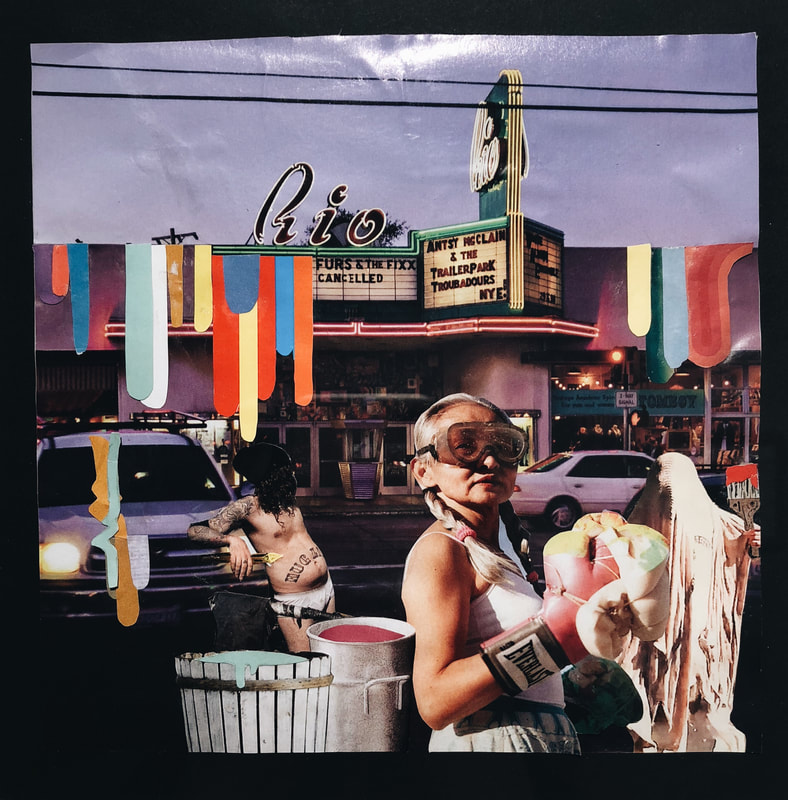
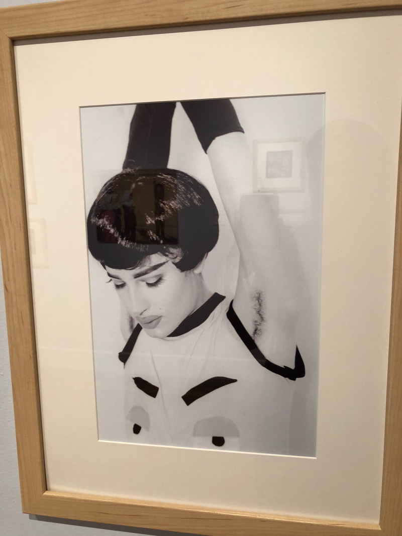
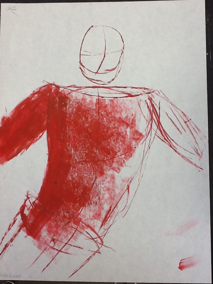
 This week, I made some progress with my collage magazine piece. I started layering photographs and using blending layers to make them a lot less visible. I did this with a photo of a girl as well as some text. I think I'm going to be able to finish this piece for the next sustained investigation project so that is my goal.
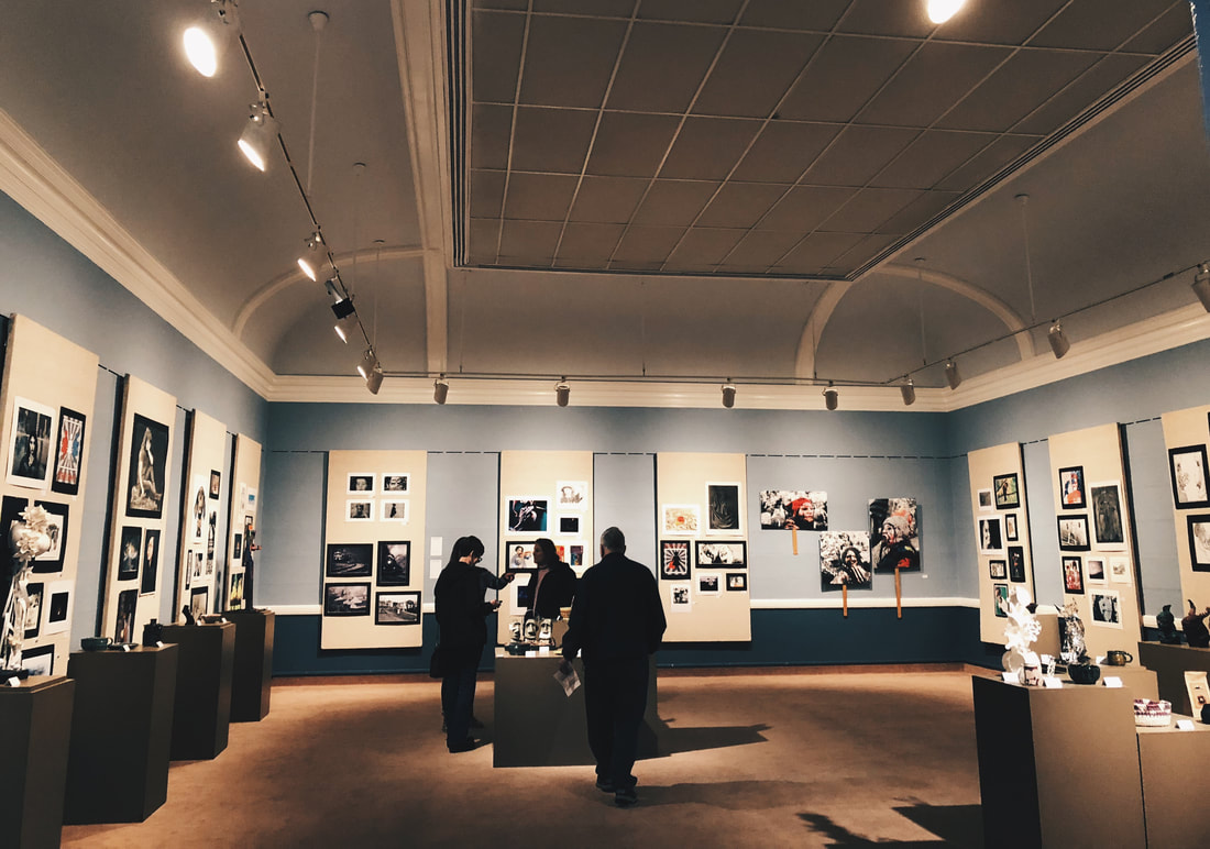
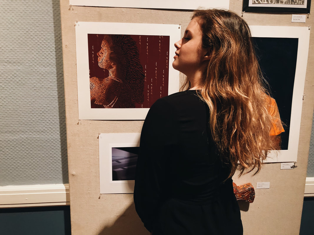
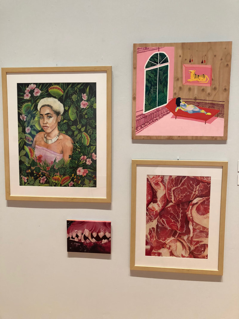
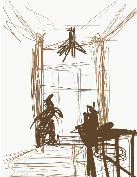
For observation, I drew from a photograph on adobe draw. It's very rough but it's a window and the Arnot. And obviously, I have a ton of pictures from the museum including my own work hanging up! This was so cool and I had so many people come to support me, I am very grateful. A local artist that was on stage and I believe on the panel that was shaking hands with all of the winners told me that my work was very sensitive. All of the other work that they had up in the museum was so cool to look at, I can't wait to go back.
0 Comments
How does your work fit into the Quality, Concentration, and/or Breadth section of your portfolio?
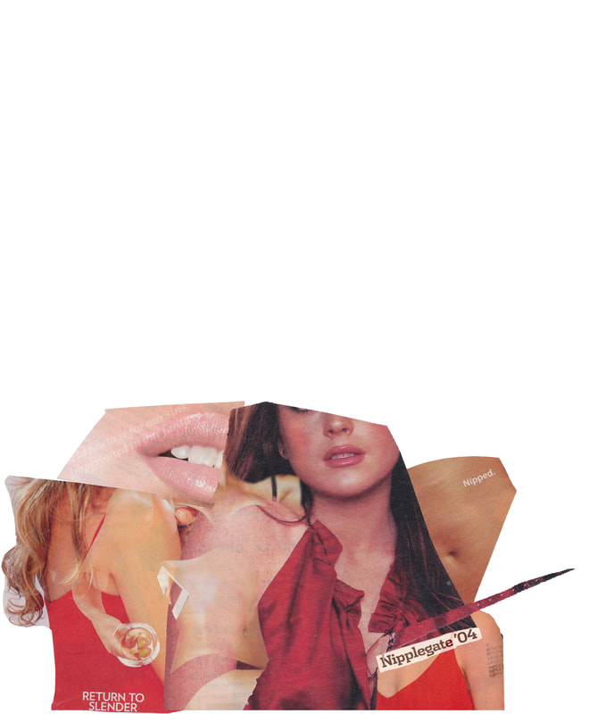
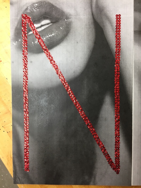
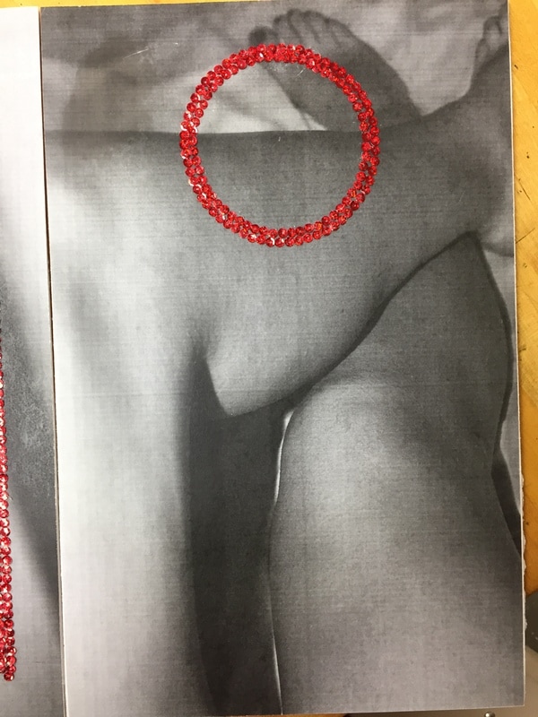
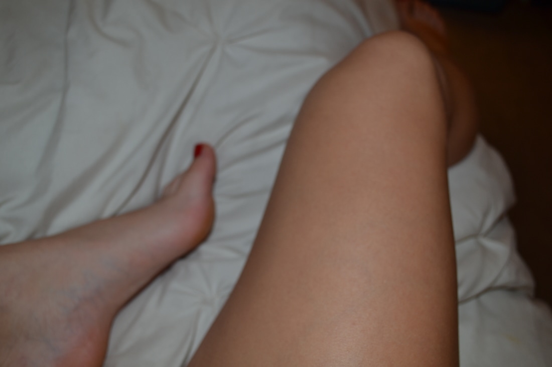
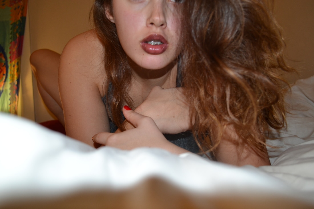
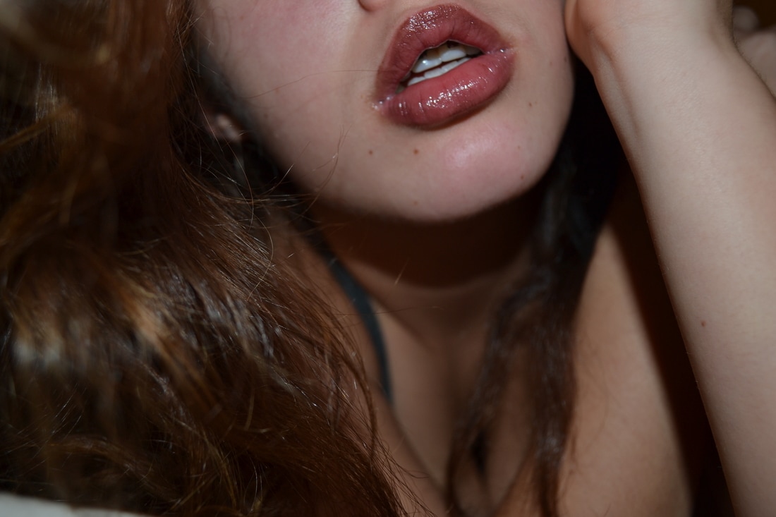
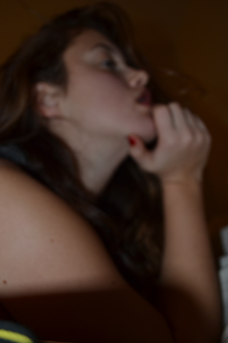
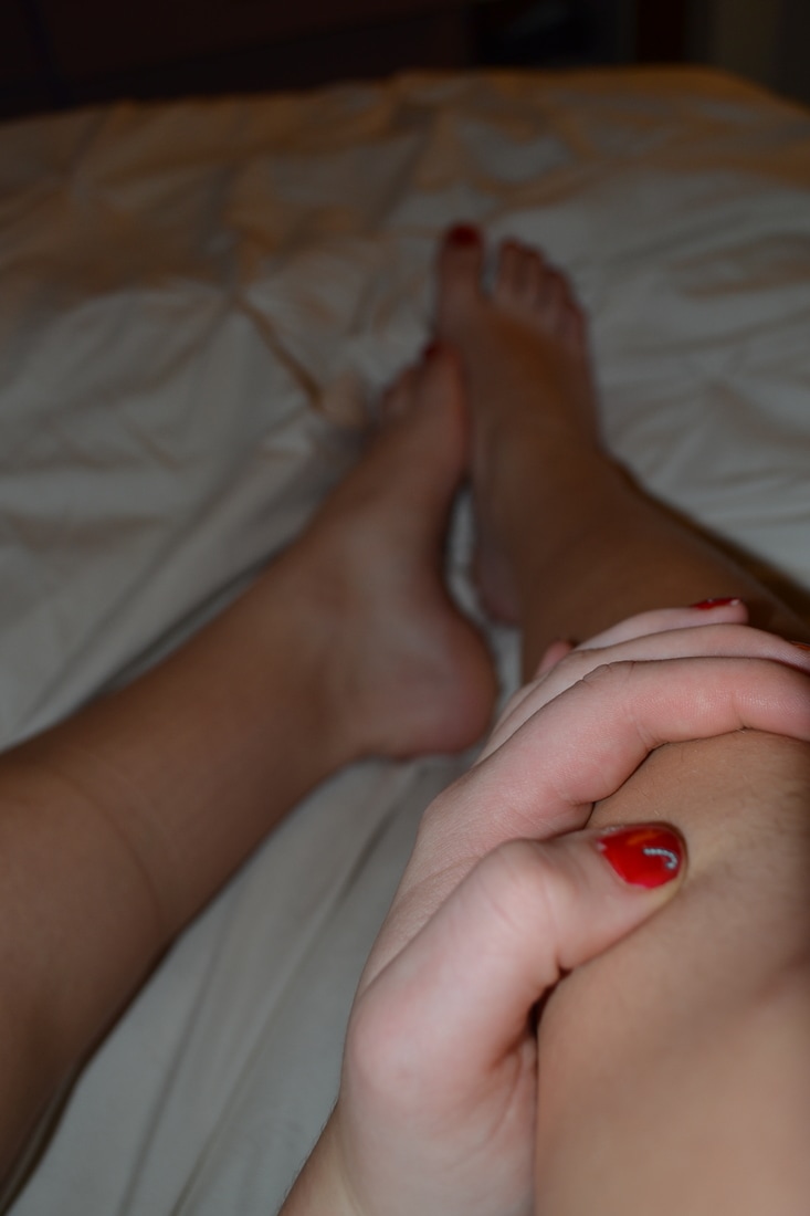
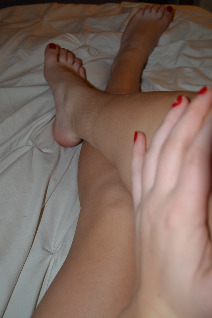
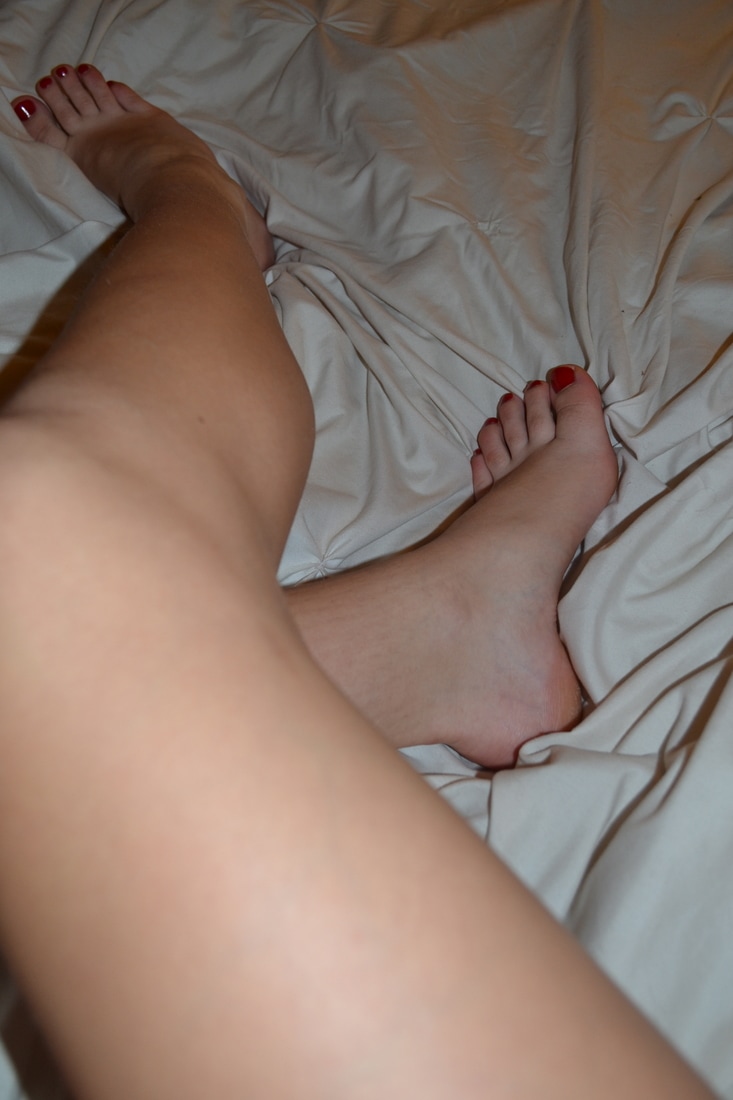
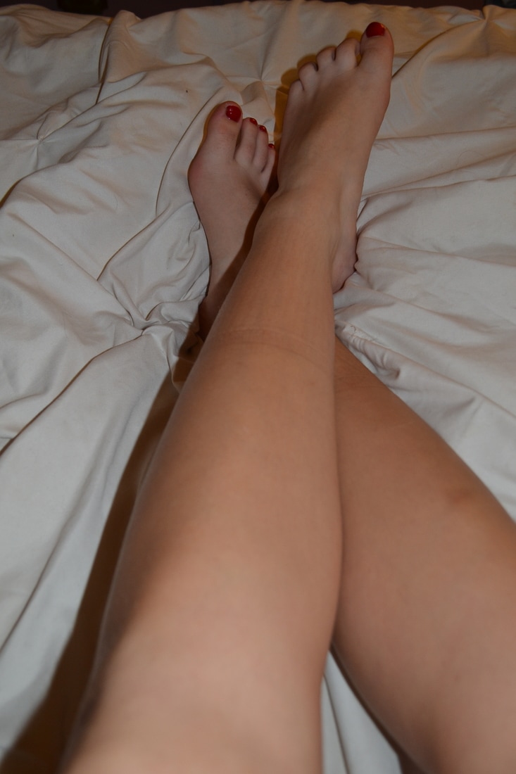
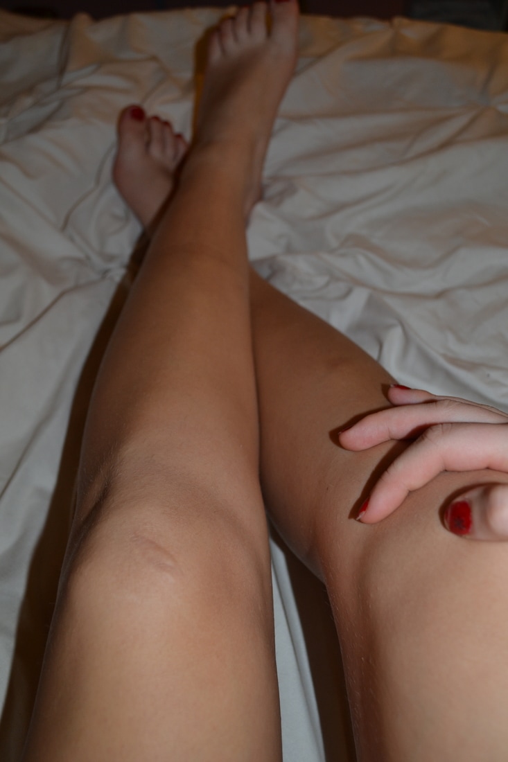
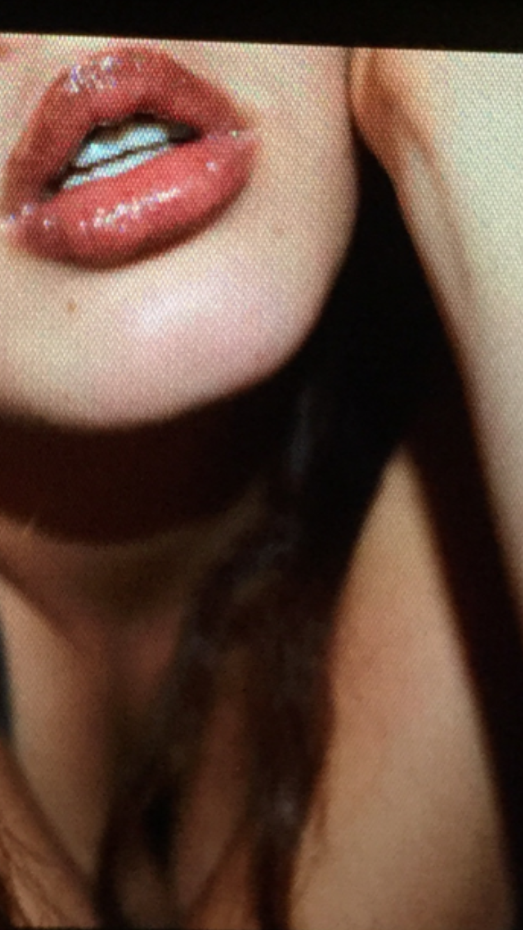
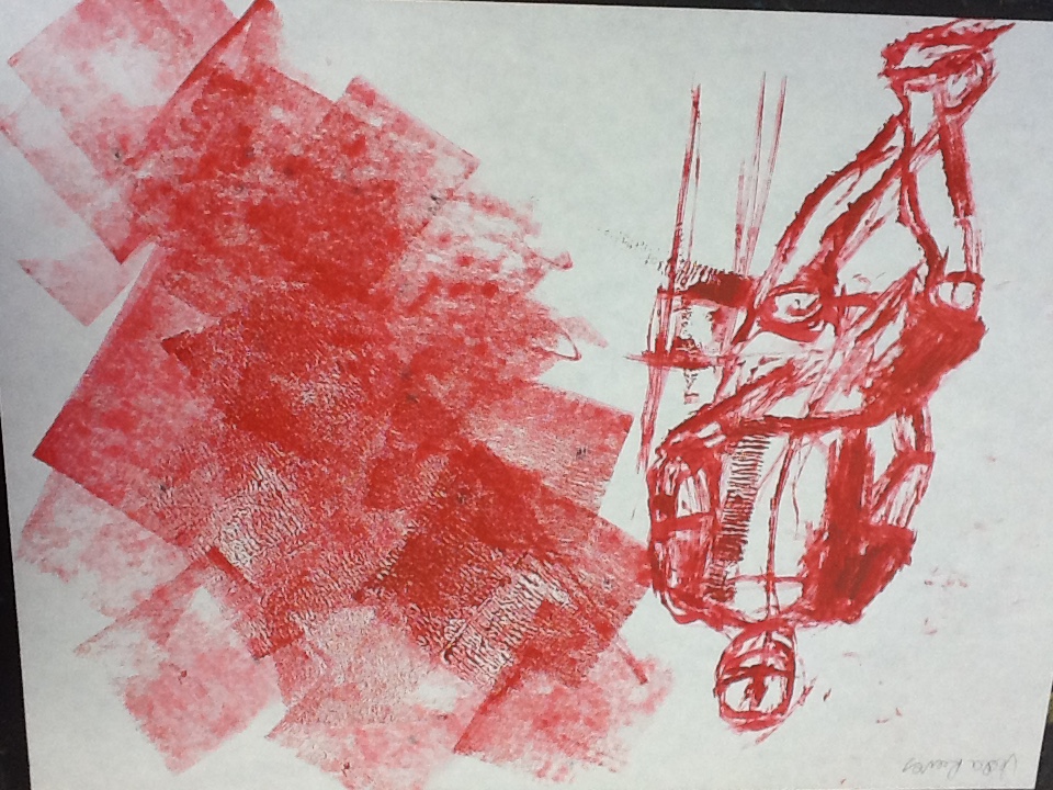
How do your works of art relate to each other in terms of visual and conceptual content? What were some of the decisions you faced in creating your artwork? This piece, like the others based around my concentration, features women and highlighters their power. It is a political piece, centered around rape and the idea that women's bodies are theirs and only theirs. Like a few of my other pieces, this art is making a clear statement regarding society and their views upon women. It is portraying the idea that a woman should be able to feel free to express her sexuality and her internal self, whatever that may look like, without feeling that she owes anything to anyone. More specifically a man who claims “she was asking for it” regarding a woman's promiscuity when defending the act of rape. The provocative photos say, I don’t care what I look like to you... I don’t live my life for you, and regardless -- no still means no. The pieces that I could consider for my concentration all have the common theme of depicting strong women -- which is obvious considering the central idea of my concentration. However, visually my pieces are unified through the reoccurring color red. I identify strength and especially feminine strength with the color so I tend to use it in almost every project -- I see it as almost a stronger pink. I also use glitter and sequins frequently throughout my pieces, usually to put words over the art. I knew from the moment I took the photo feature behind the ‘N’ that I would be using that in the piece because of the shine of the lipstick and the placement of the hair, it felt like a perfect photo for what I was trying to do. However, I didn’t want two photos of my face, head, or hair so it as difficult for me to come up with another, just a visually pleasing fitting for the second shot. I took photos of my hands and knees and even my back. The legs I kept coming back to because it was hard to get them in a good position that looked interesting when photographed. Eventually I picked out a photo of my legs that I thought would work and cropped it strategically so that it would fit that much better with the first photo. I also decided to keep the ‘o’ in ‘No’ small to add a sense of fashion and high class to the piece. It’s a reference many women will understand to Chanel and it's just an added layer of symbolism as well as it created an interesting visual appearance to the piece. It was unexpected. 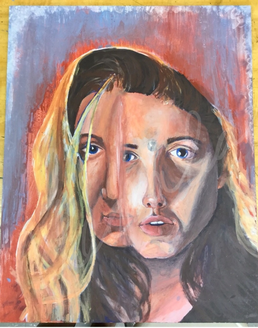 What was your inspiration for creating this artwork?
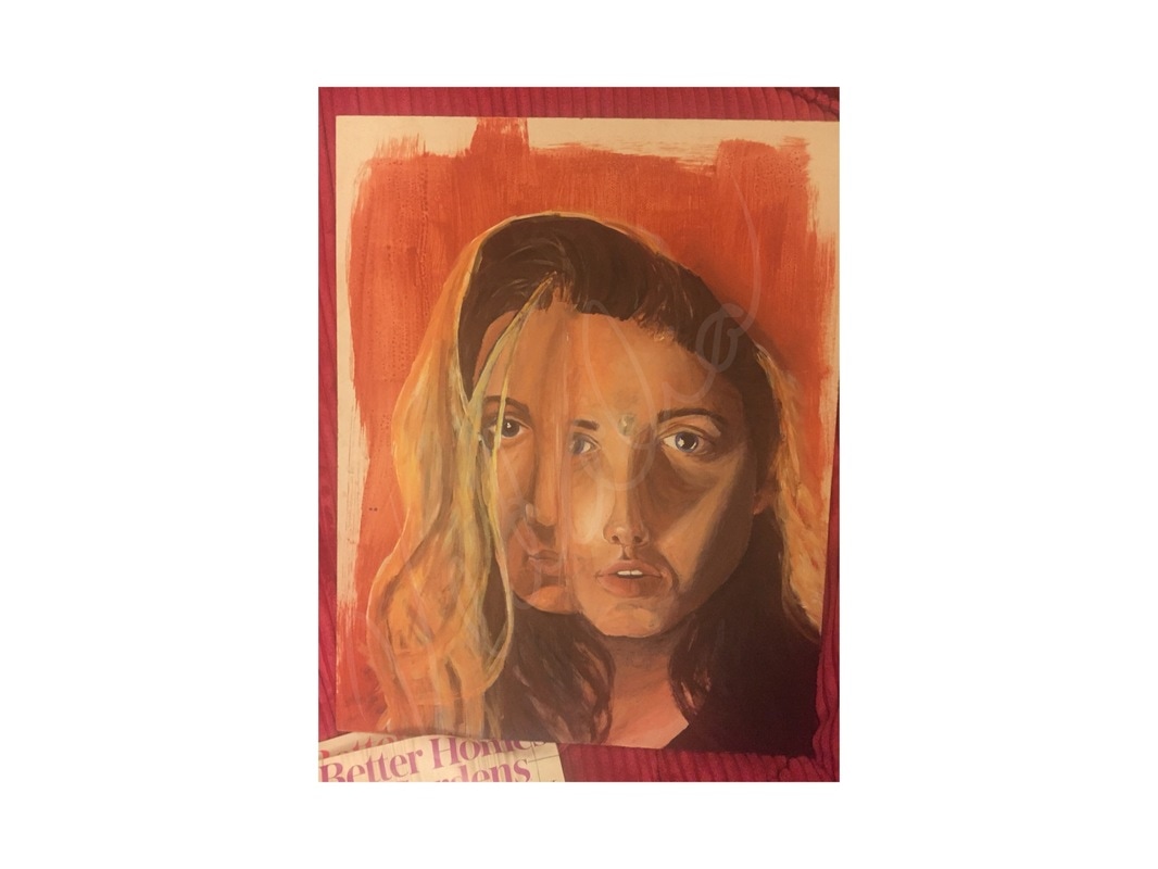
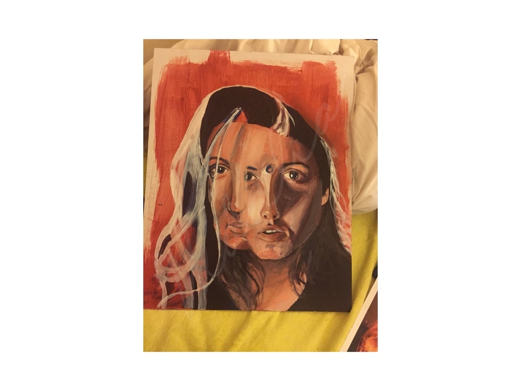
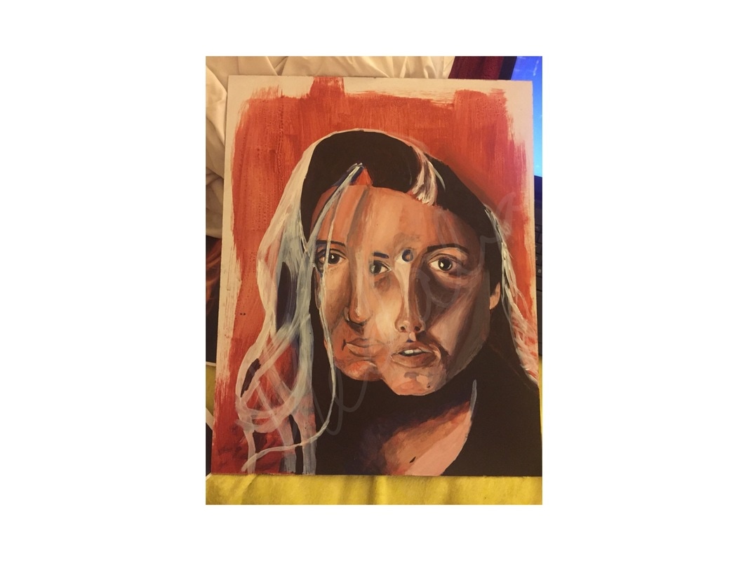
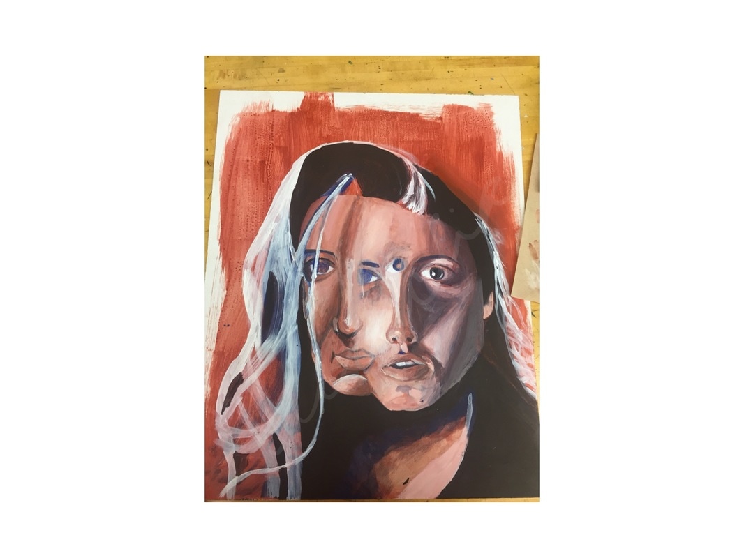
Which are the most successful aspects of your work? Is there anything about your work that you now think you should have done differently? If so, please explain what and why. My mother is the most important person in my life and I had already planned on doing a portrait piece of her so when I heard about this project I thought it was a good idea to incorporate her. I first planned on the piece being just of her but then I had the idea to also add me to demonstrate the bond we have. I had a couple of ideas, only knowing that I would want to include half of both of our faces. I ended up merging our faces together, demonstrating the idea that she is me and I am her. Also, I made part of our faces transparent where they meshed so some parts of her face were visible in my face and that worked out well with her eye in the center of my forehead which portrays the idea that she is my third eye, my intuition, and my guiding force. The background mix of blue and red also defines us as individuals coming together as her favorite color is blue and I identify with the color red. On top of that, I fingerprinted around the edges of the piece in the wet paint which adds a personal aspect even further. I think my technique with layering the paint was fairly successful because the dark values of the shadows and the light of the highlights created great form in the faces. They seemed to pop off the page especially on the right hand side of my face with the large shadow of my nose. I feel that I was able to follow the colors and shadows shown in the reference photos quite well. The underpainting technique was what took most of my time but it helped tremendously. I actually favored the aesthetic of the paint strokes in the underpainting over the cleaned up version of the finished product. However, the underpainting colors were not realistic enough to stand alone in this piece. I also think that my risk of forming the two faces together was successful. I love how some of the faces are transparent are you are able to see pieces of each face in the other. When I was in the process of mapping out the portrait by removing the red oxide paint to form the highlights in the faces, I don’t believe I paid enough attention to space and proportion. Because of this, and because I didn’t realize it until I had done enough work to fix it, The faces we a bit unproportional to the ones in the reference photos. Because I did notice this however, I was able to keep that into consideration and elongate all of the features so that the portrait in the piece was proportional to itself, though it wasn't fully accurate. I also think that more detail could have been added to the facial features such as the eyebrows, eyes, and mouths so that they were more realistic as well. 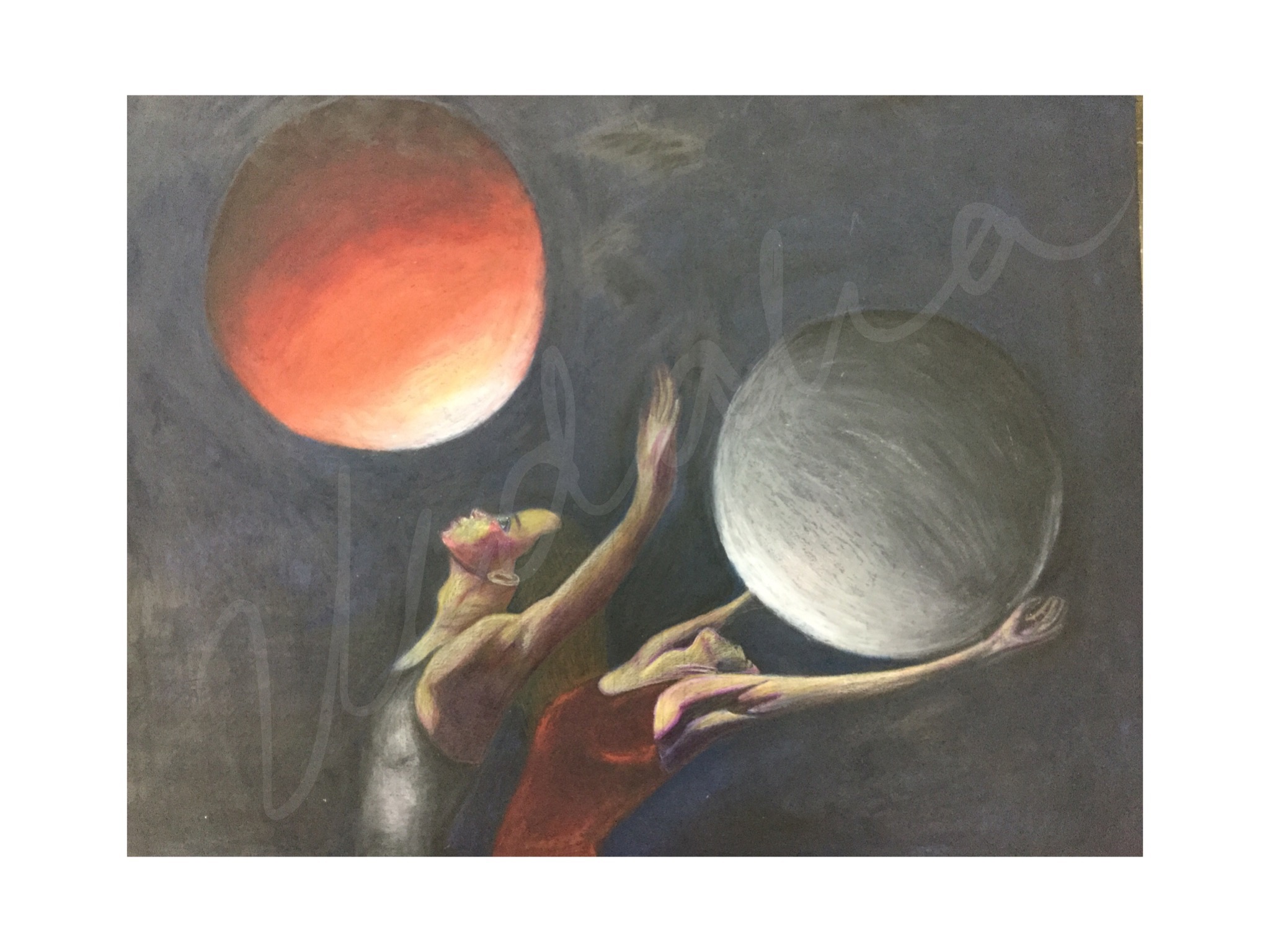 Questions:
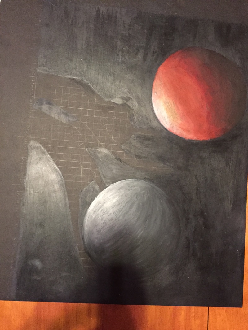
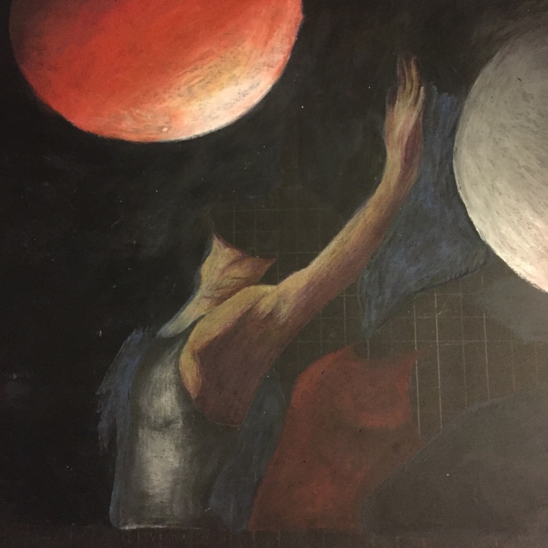
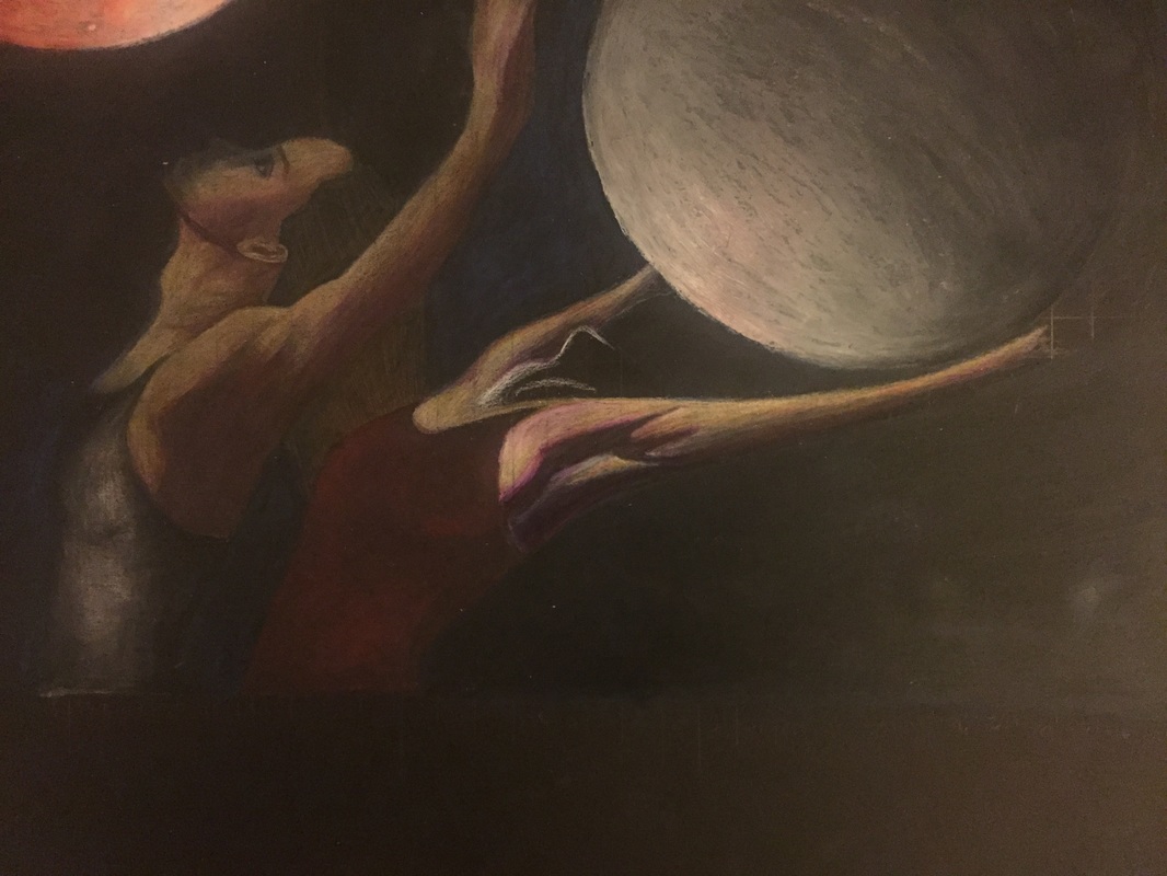
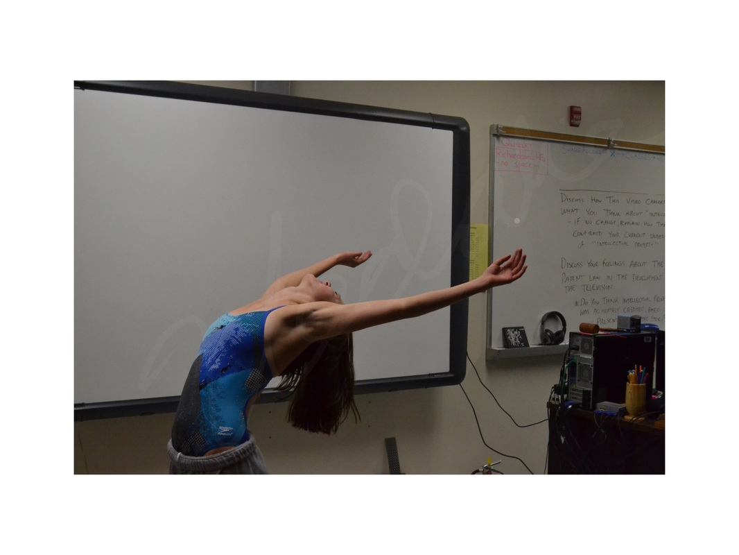
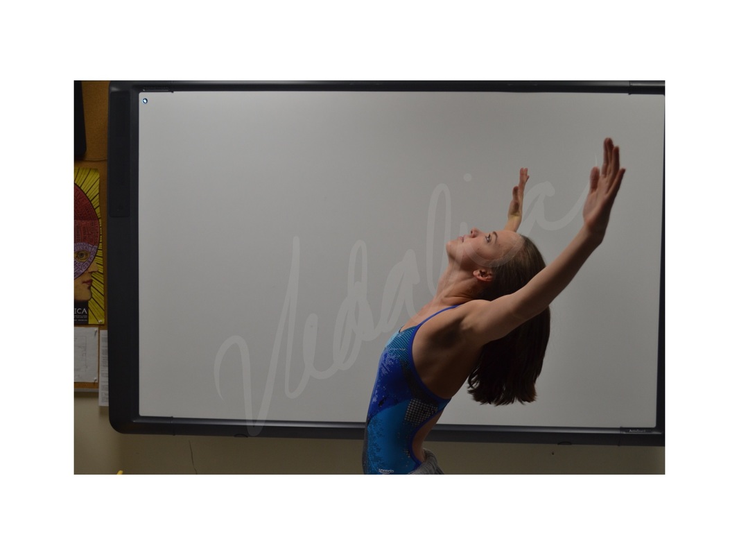
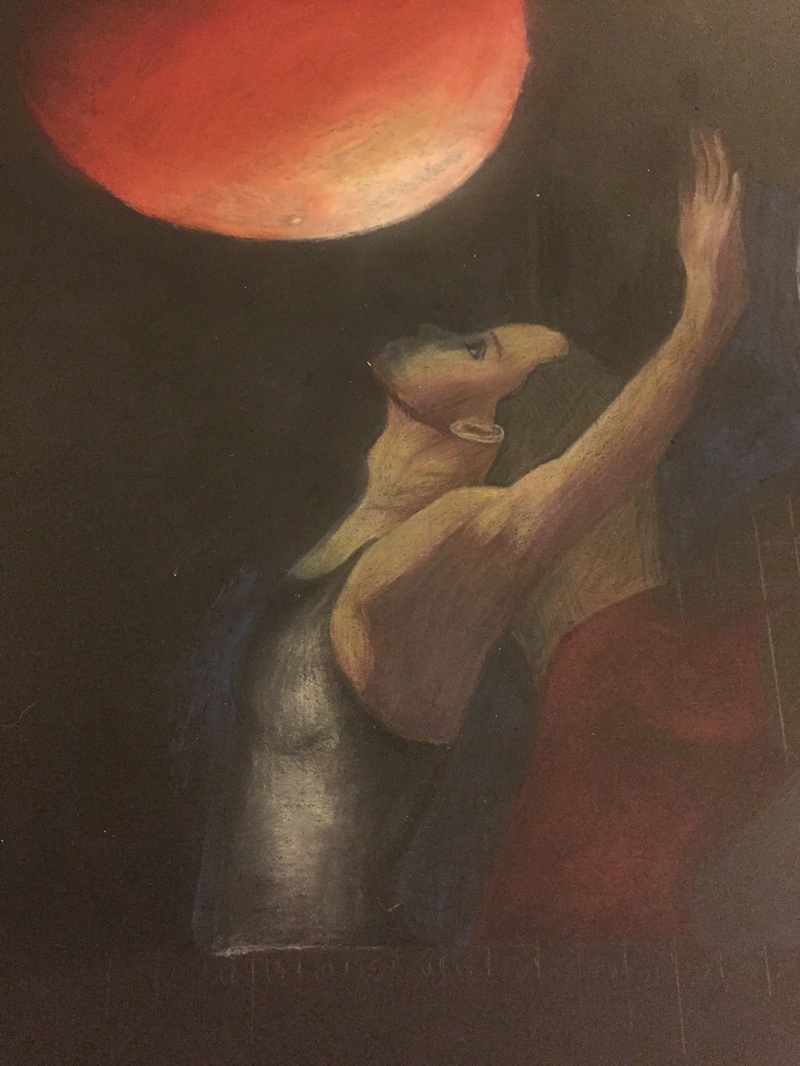
Which media, techniques, and work processes did you use, and why did you make those choices? Which are the most successful aspects of your work? Did you encounter any difficulties when creating your artwork? How did you work through them? To begin my work, I photographed my friend to have photos to draw from. In photoshop, I merged the two photos of her and the two moon photos into one piece that I would grid and work from. I used very small grid squares, 1/2 an inch, to make sure the proportions and details were correct. Never before have I attempted to create a piece in which I had to create realistic coloring for skin. In the past, I have drawn people but with unrealistic, vibrant colors. This was a risk for me because I did not practice first. I ended up using purple to create dark shading in many instances but the figures were still realistically colored which was a great compromise for me. I ended up with realistic coloring and shading that I had never attempted before but was happy with. I decided to take an artistic risk and create my own black for the background even though I was working with black matte board already. I added black, blue and purple to the background which created a richer color. However, it was uneven in many places and my fingerprints were visible, so I decided to paint a matte medium over the black, but the matte medium did not blend well with the textures under it and it came out very patchy and created an odd glare. So I had to use sandpaper to take the medium off. However, since i worked on the background before anything else, I accidentally overlapped the medium with the first woman's face making it difficult to layer colored pencil over it. I had to use a water colored pencil to layer white on top of the spots that wouldn’t pick up colored pencil and use colored pencil over that.  I experimented with layering the watercolor, sometimes with different colors (my main was purple. For example, the darkest darks were created by adding a dark blue to the purple and continuously layering the two. The lightest lights were created with a light pink and distribution of that with water as the purple was almost too harsh in some instances. Most of the time, I blended the layers with their surrounding so that they were unseen, but i experimented some with leaving the brush strokes to add texture in places like the folds of the shirt. The contrast of the background blue and pink shadows, I believe successfully created a great emphasis on the purple figure drawing. The shadow colors were not completely random as the pink and blue were incorporated into the figure through the shading and highlighting. Although they weren’t visually popping out of the figure could be seen in certain parts such as both legs. This created unity between the background and the person, which was also displayed through the same color paint splatters. When splattering the purple, pink, and blue paint, I did not want the paint splatters to overlap with the figure drawing, however I did not make a cover for it. This required me to continuously blend any specs that made it to the figure quickly before it dryed permanently into the art. Which was another challenge I face, the watercolors uneven drying time. Depending on the amount of water used with the color, the watercolor would dry quicker or faster if there was more water. It was fairly easy to work with quick drying parts because with the addition of a little water, the consistency would return. However, if too much water was accidentally added, the colors would blend together by pooling which was hard to recover from. The only thing I could do was attempt to blend out the intense watercolor. |


 RSS Feed
