|
Photography: 1 hour
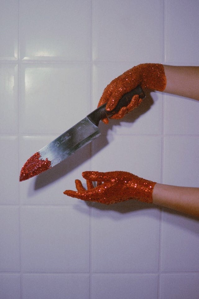
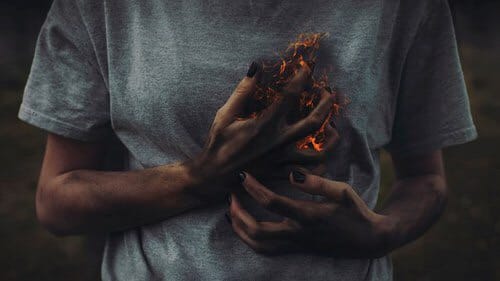
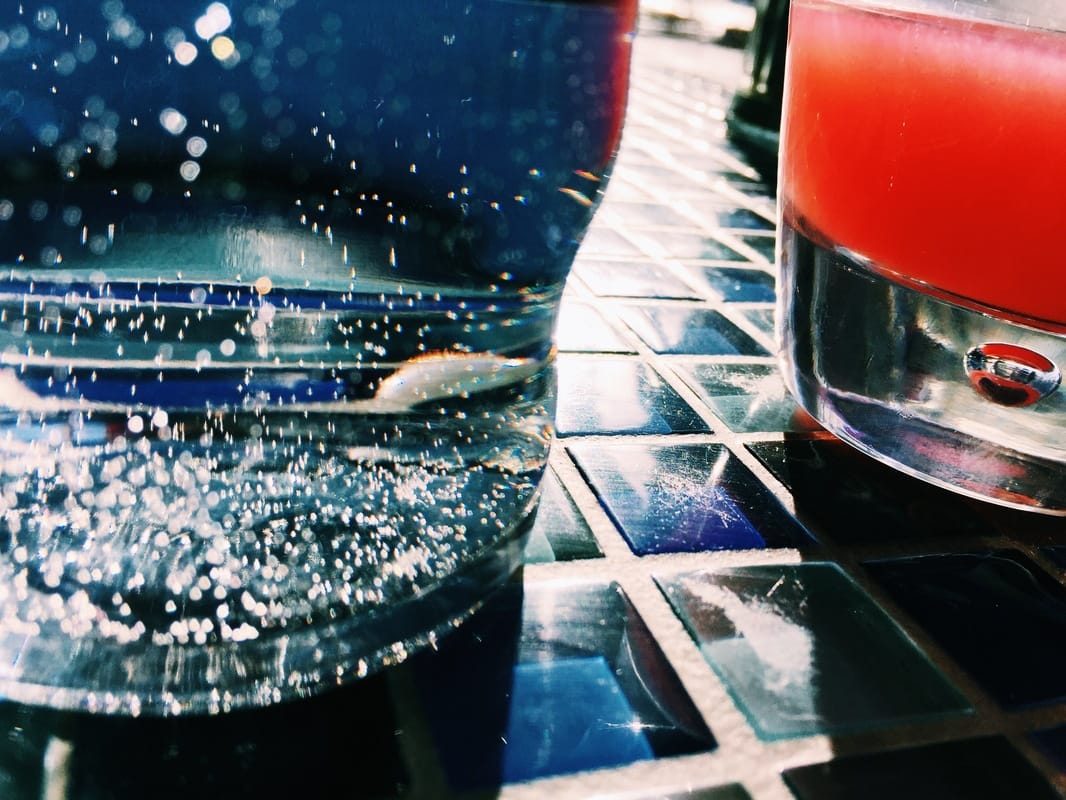
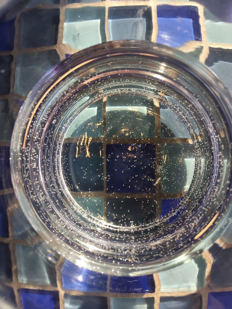
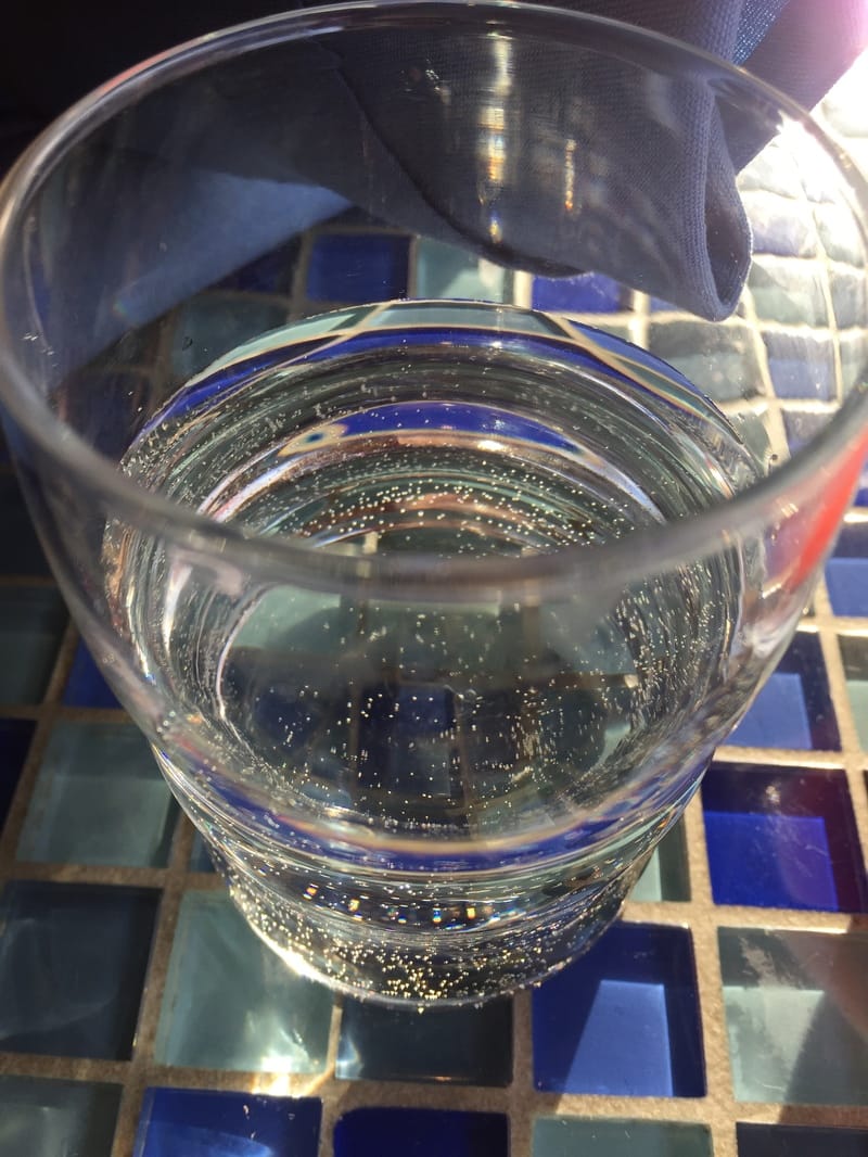
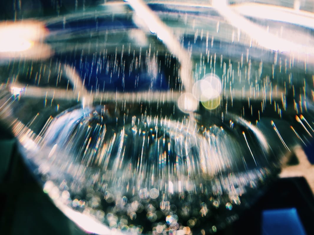
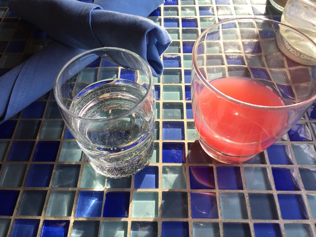
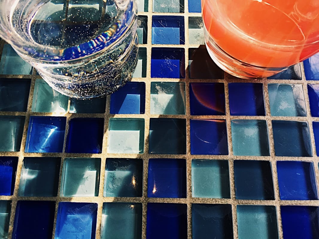
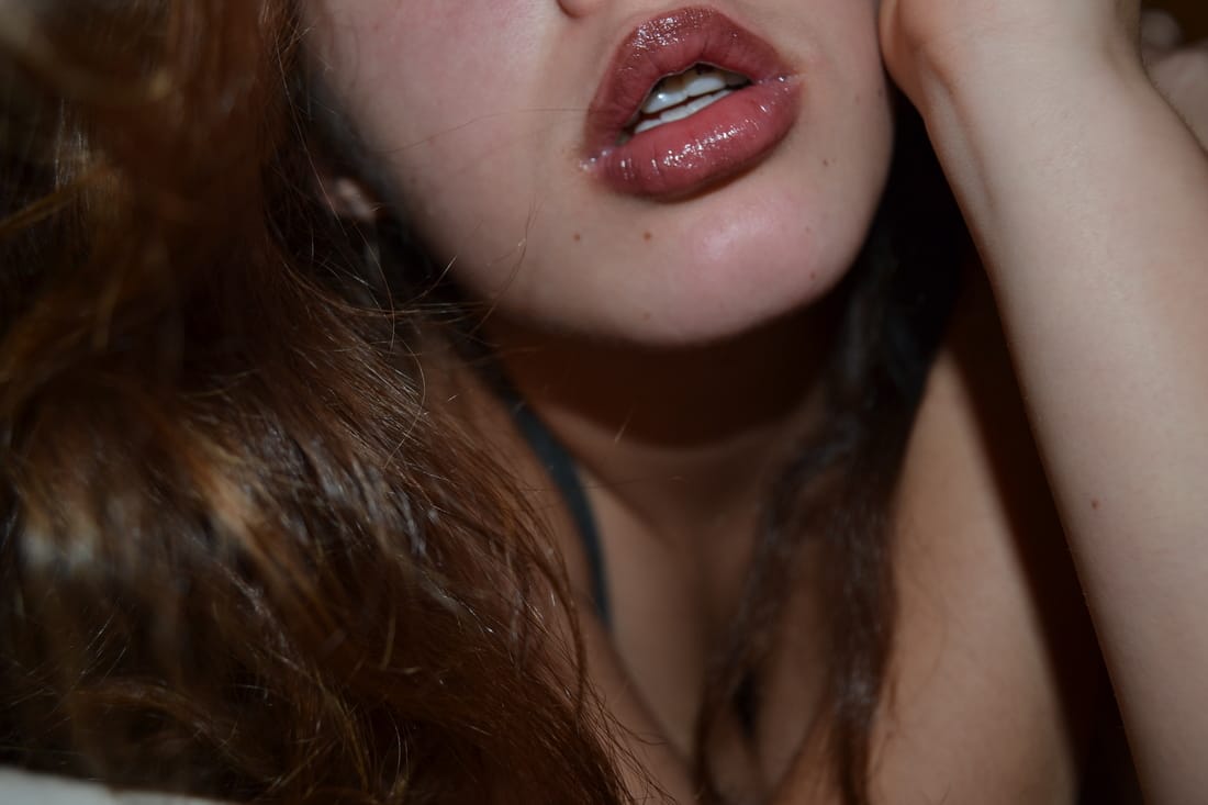
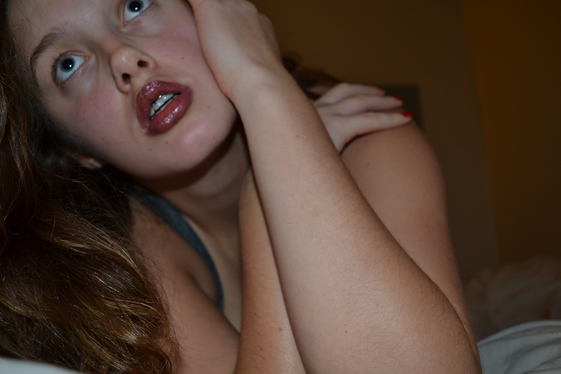
Visual Research: 3 hours I spent some time playing with different angles while photographing glasses at brunch this weekend. I found a few pictures I liked and edited them a bit in VSCO. I also took some time scrolling through tumblr and finding inspiration for projects in the future. Some of them were photography and some were mixed media I believe. They were all coresponding with my concentration. I really loved the photo of the shirt being burned where the heart is, I think that photoshop and digital. I also loved the sparkley hands with the knife because that is so up my alley in terms of conctration, theme, and mood. It's pretty much everything I do mushed together.
0 Comments
Sketchbook: 5 Hours
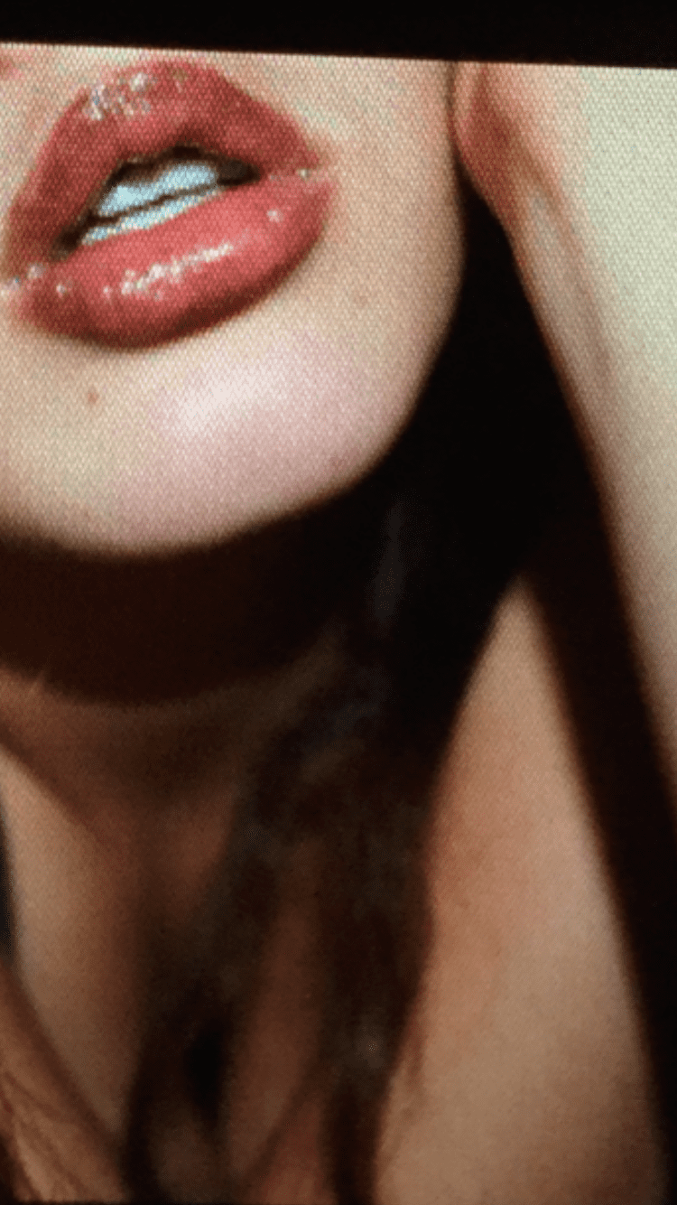
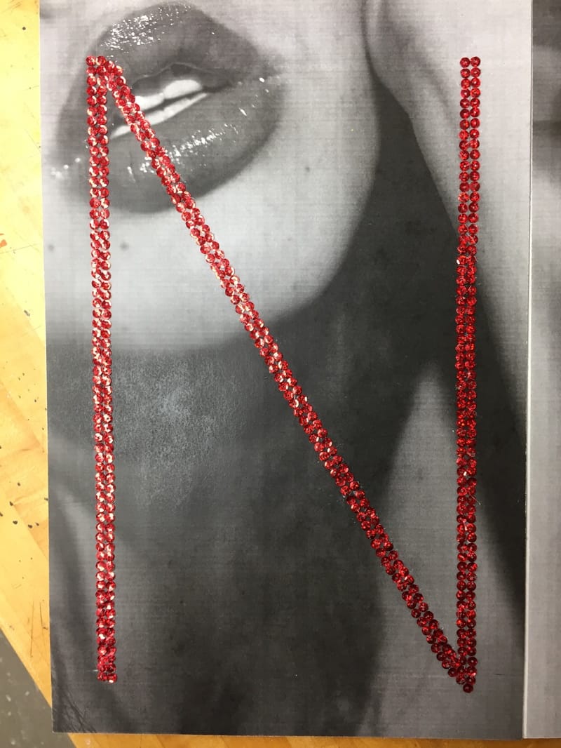
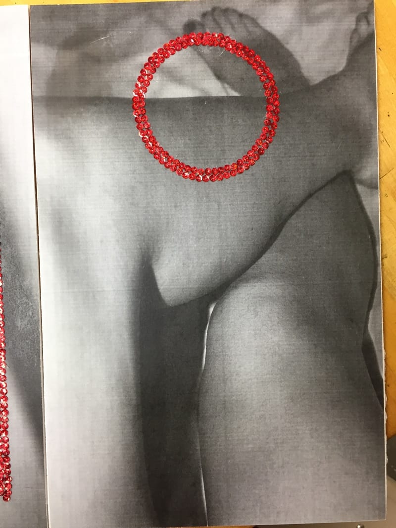
I spent more time this week gathering materials for the project because the first set of sequins that I got weren't exactly what I was looking for. I finished my project that was due next which incorporated the photos I took the week before and I did that mostly outside of school. I glued the photos onto foam core with spray adhesive. I also hot glued all of the sequins on which by far took the longest amount of time. I made the decsion to create a smaller o to make the photos have a sense of high fashion, like Chanel No5.
 Questions:
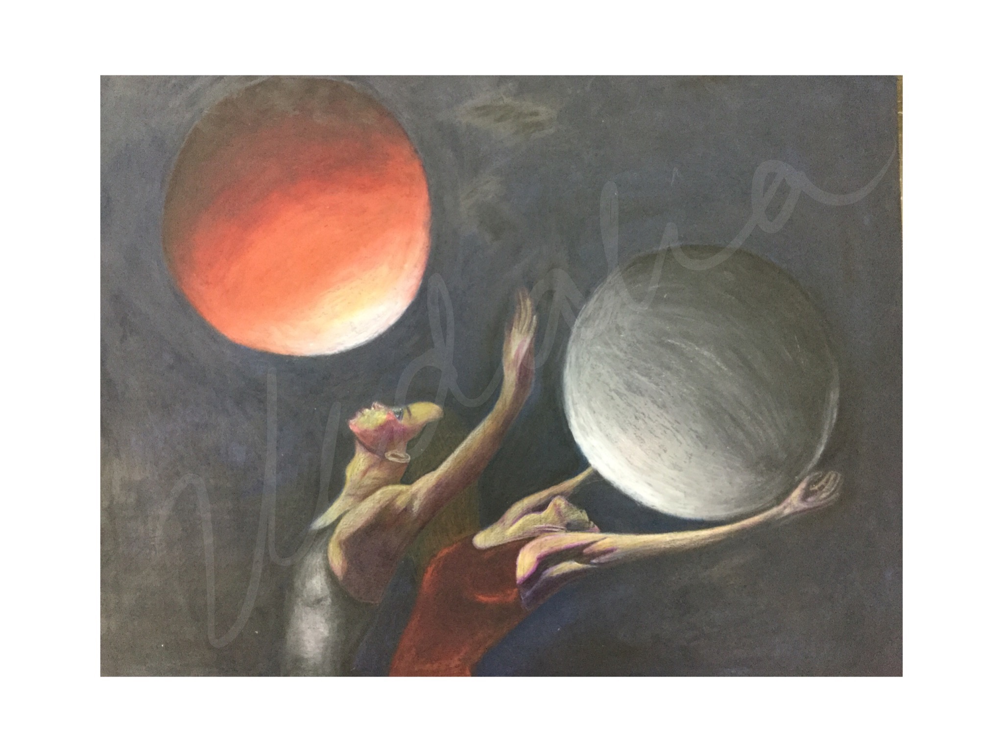
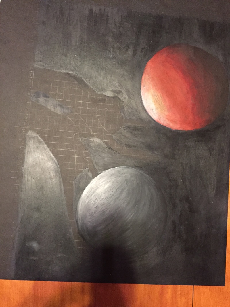
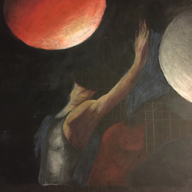
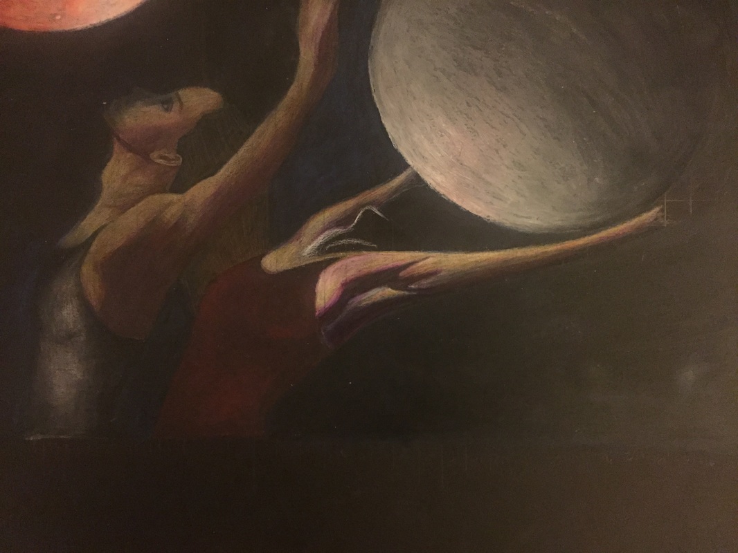
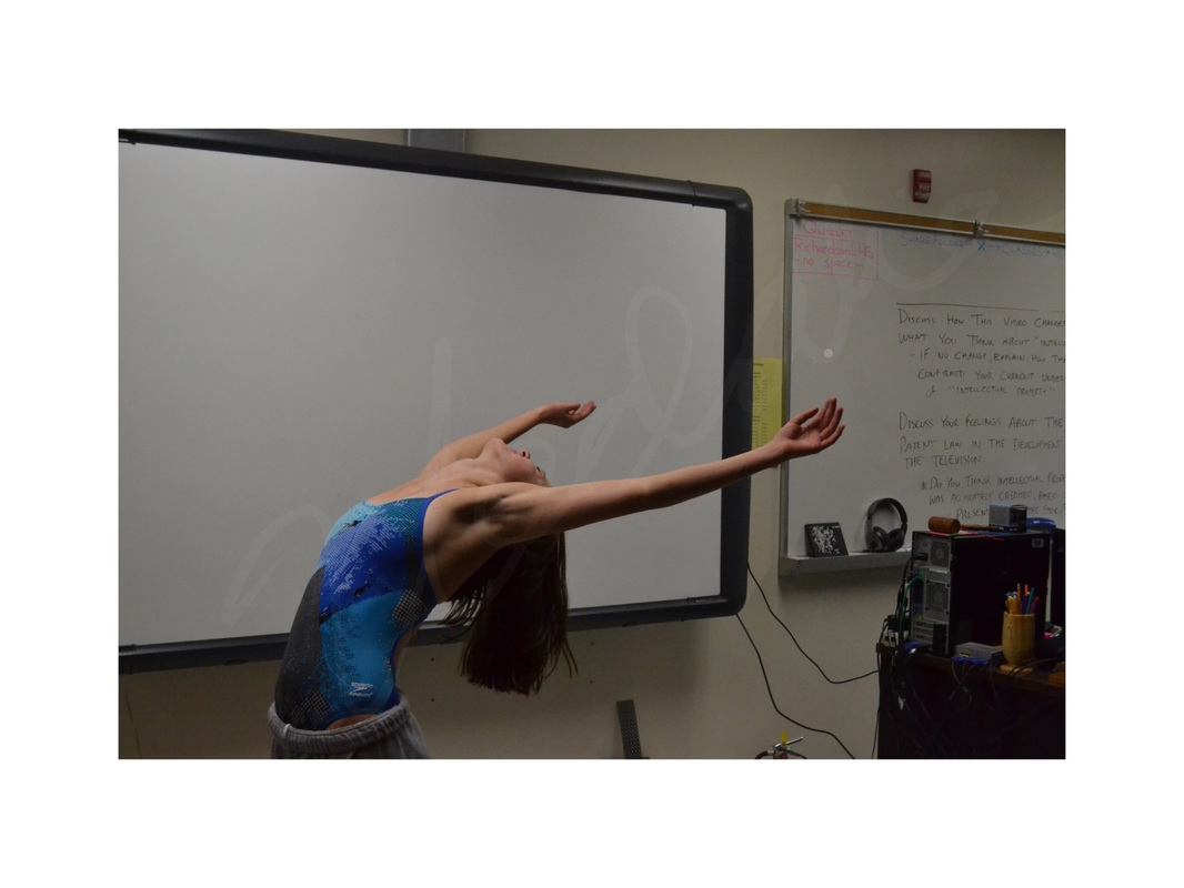
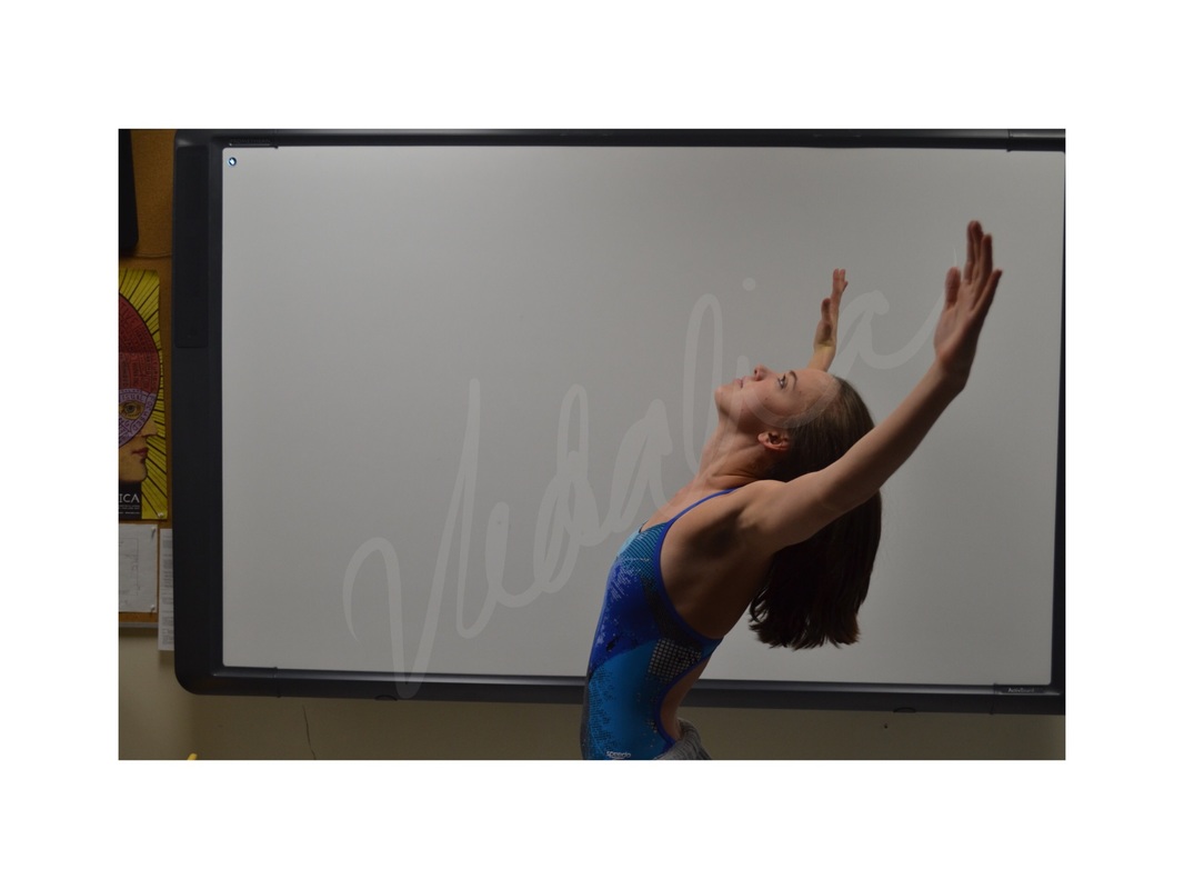
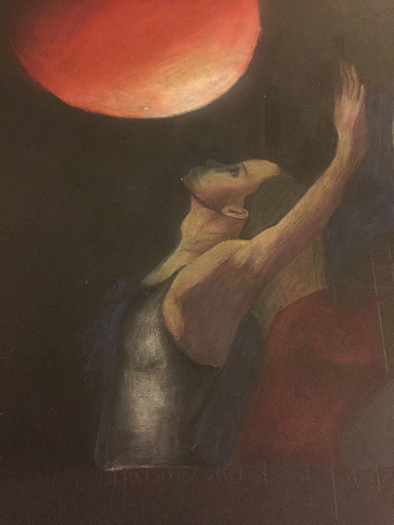
Which media, techniques, and work processes did you use, and why did you make those choices? Which are the most successful aspects of your work? Did you encounter any difficulties when creating your artwork? How did you work through them? To begin my work, I photographed my friend to have photos to draw from. In photoshop, I merged the two photos of her and the two moon photos into one piece that I would grid and work from. I used very small grid squares, 1/2 an inch, to make sure the proportions and details were correct. Never before have I attempted to create a piece in which I had to create realistic coloring for skin. In the past, I have drawn people but with unrealistic, vibrant colors. This was a risk for me because I did not practice first. I ended up using purple to create dark shading in many instances but the figures were still realistically colored which was a great compromise for me. I ended up with realistic coloring and shading that I had never attempted before but was happy with. I decided to take an artistic risk and create my own black for the background even though I was working with black matte board already. I added black, blue and purple to the background which created a richer color. However, it was uneven in many places and my fingerprints were visible, so I decided to paint a matte medium over the black, but the matte medium did not blend well with the textures under it and it came out very patchy and created an odd glare. So I had to use sandpaper to take the medium off. However, since i worked on the background before anything else, I accidentally overlapped the medium with the first woman's face making it difficult to layer colored pencil over it. I had to use a water colored pencil to layer white on top of the spots that wouldn’t pick up colored pencil and use colored pencil over that. |


 RSS Feed
