|
Sketchbook: 3 hours
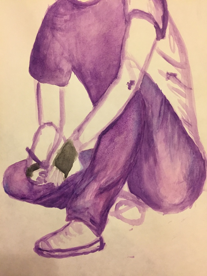
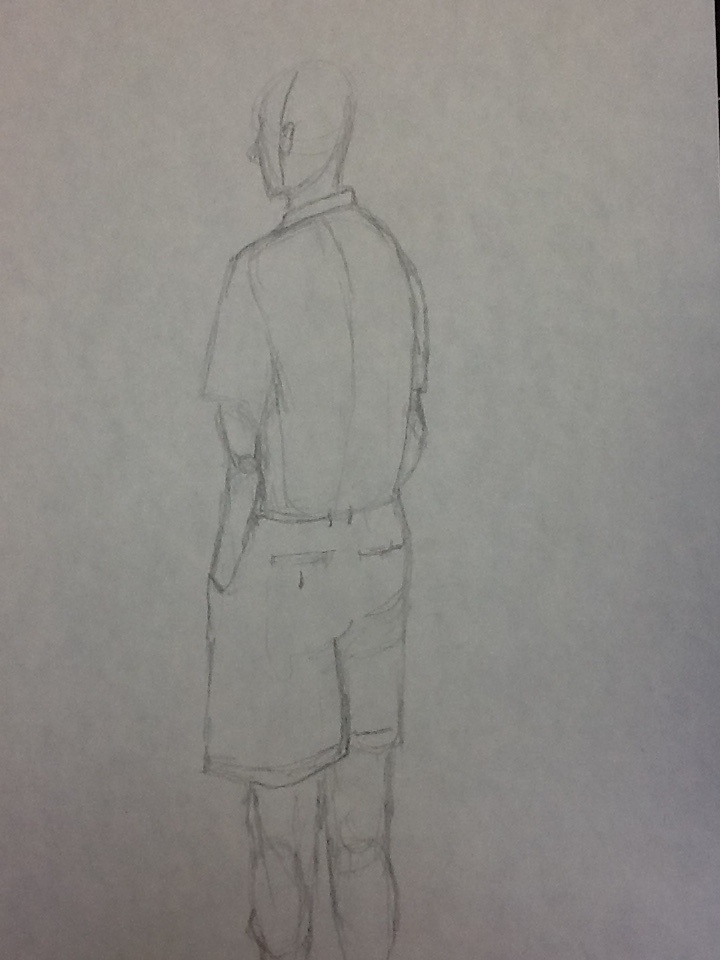
I continued shading the shirt and even darkened some shadows on the jeans. I started to color in the shoes but will continue with those next time, same with the arms, the shading is very harsh, especially on her right arm, so i will need to go back into those and work on them a bit. I also want to add more creasing to the shirt. I also decided, since I had already been using dark blue to create darker shadows, it would look nice if I created background shadows with that same blue. I am happy with how it looks for the most part, so far. I still have much to complete on this project but I'm going more content with its visual quality.
0 Comments
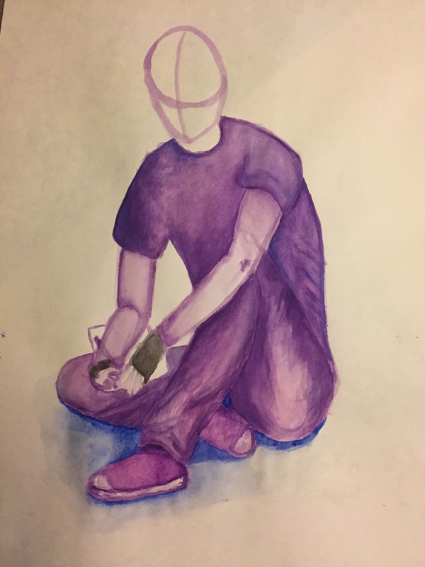
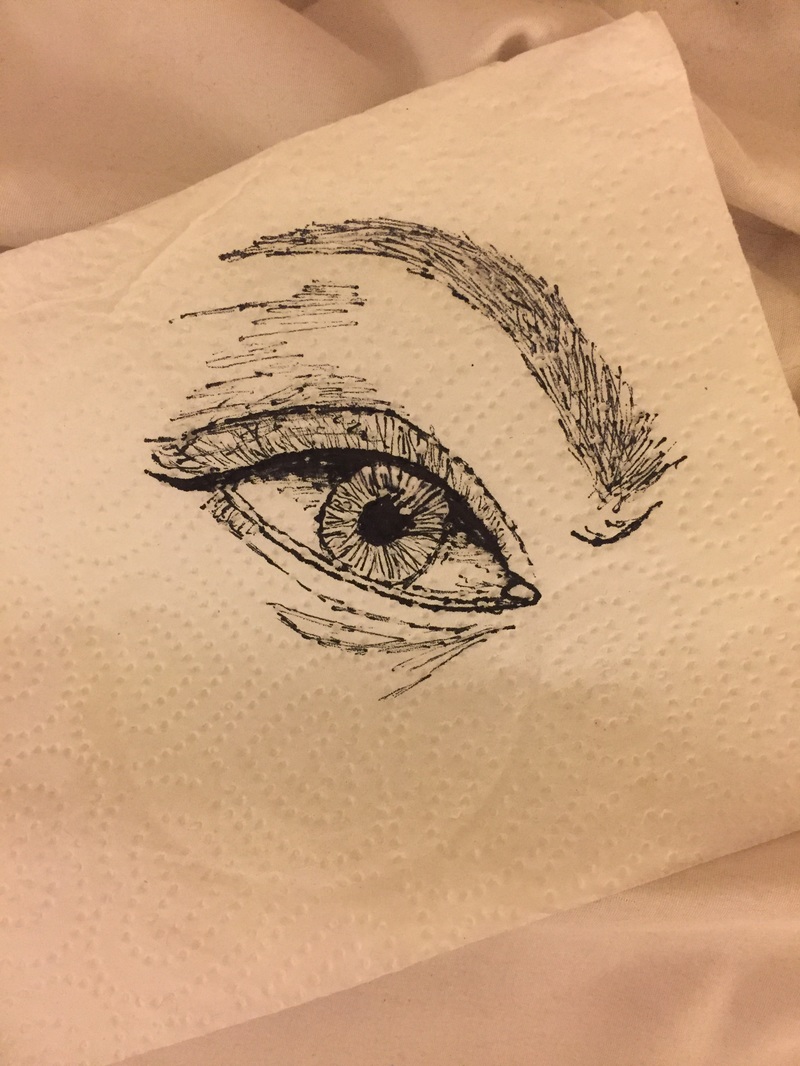
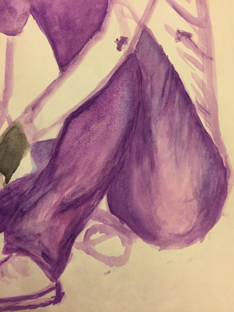
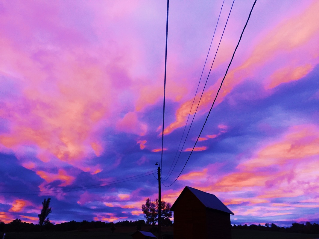
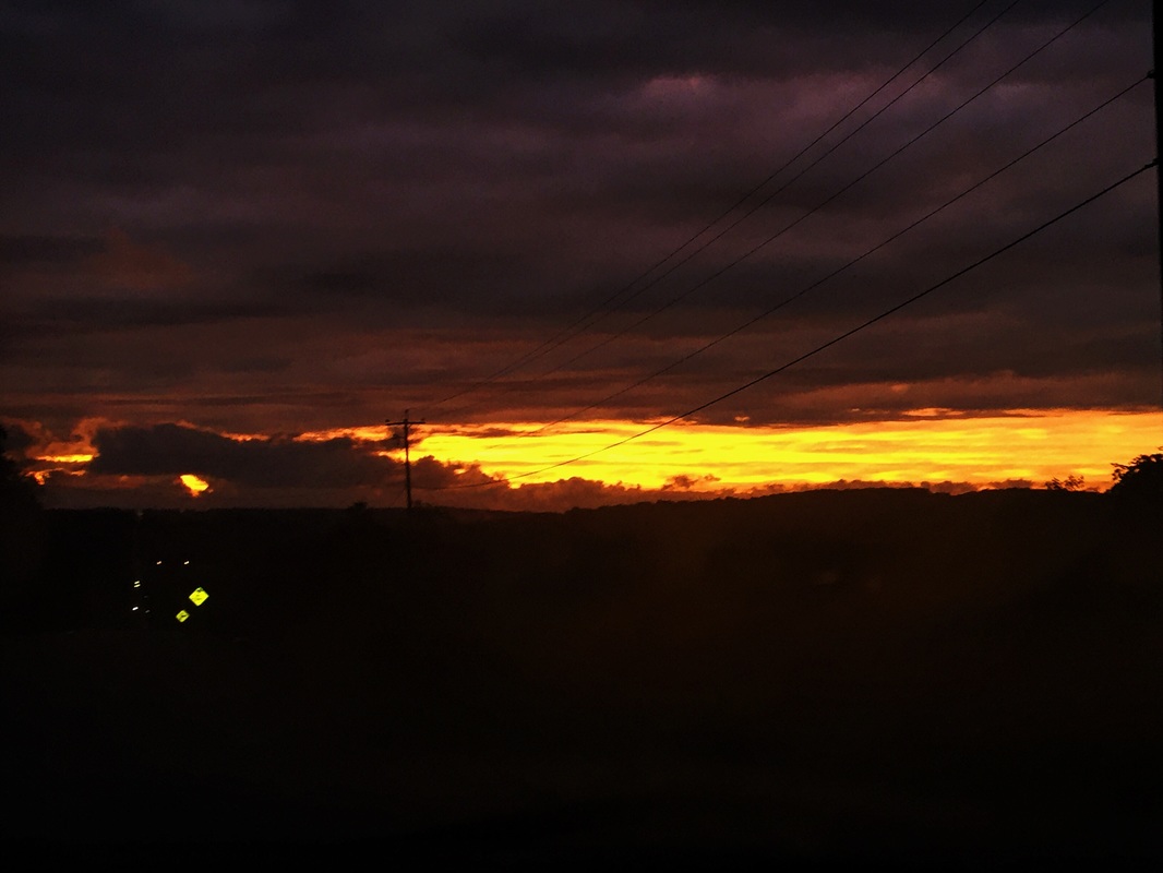
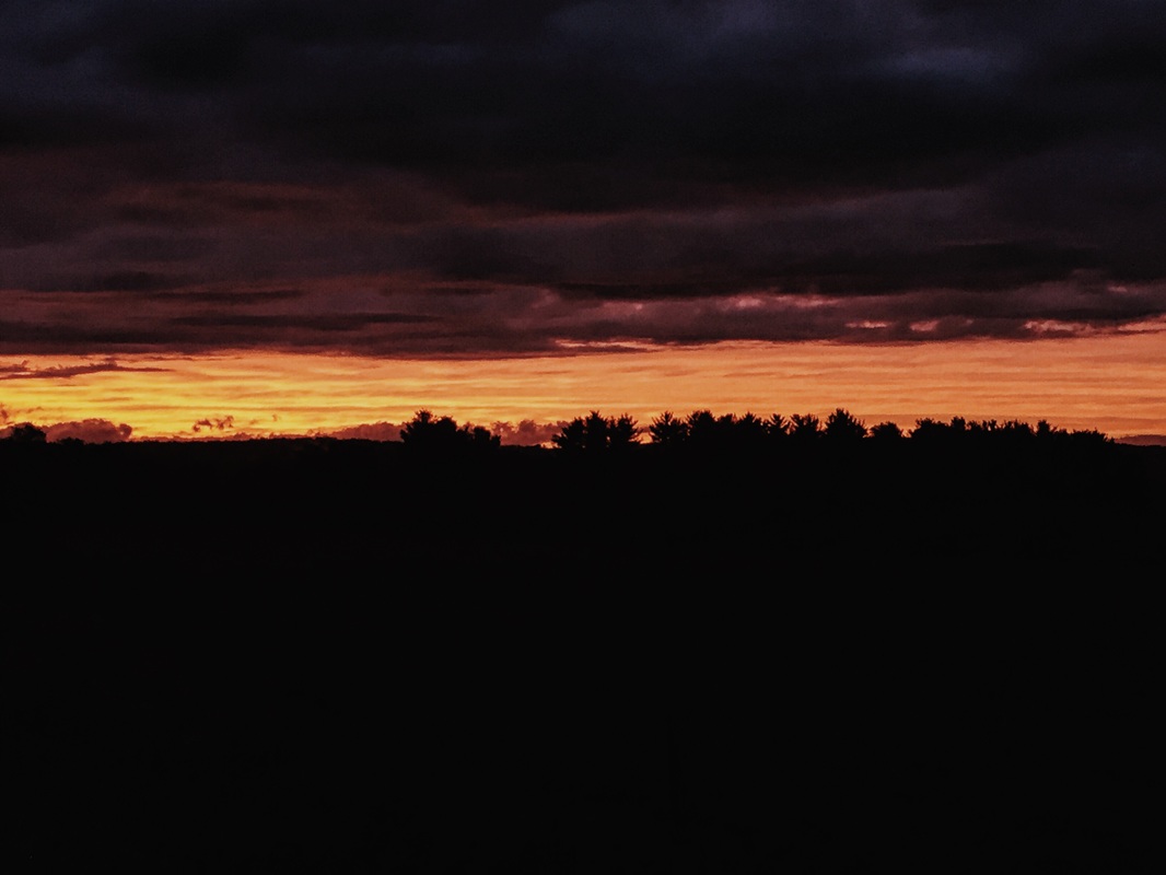
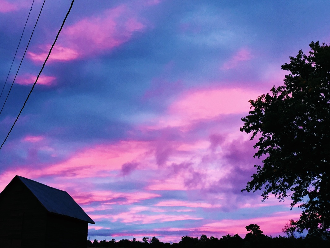
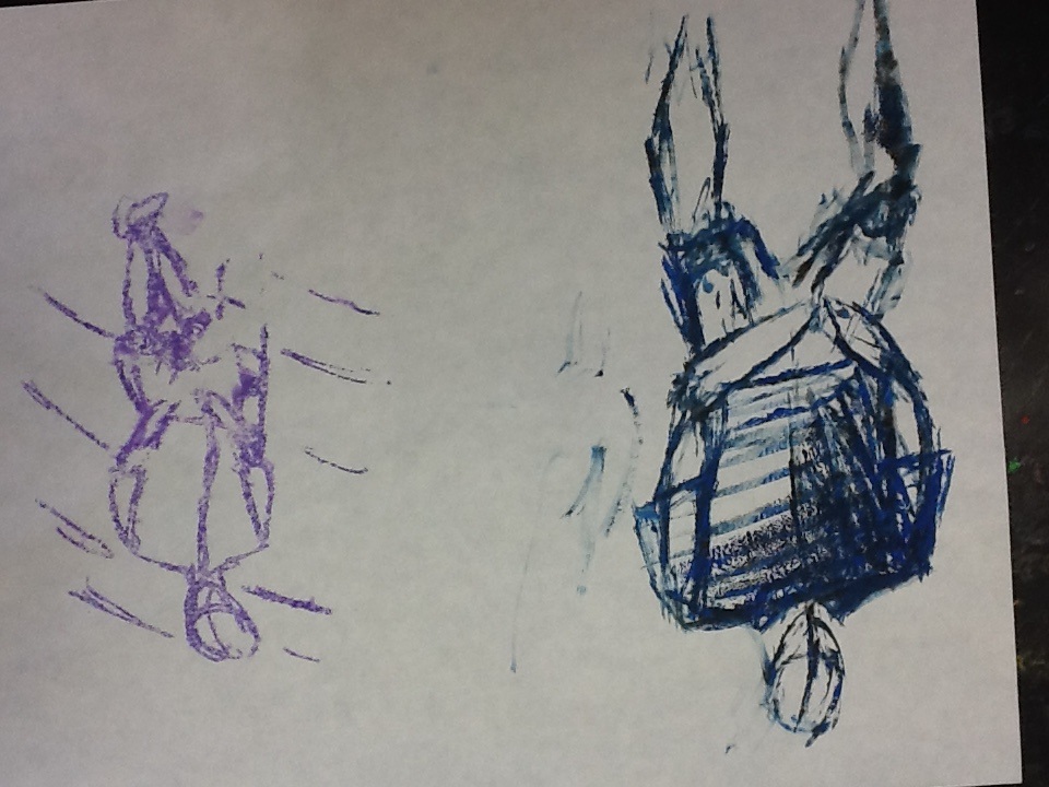
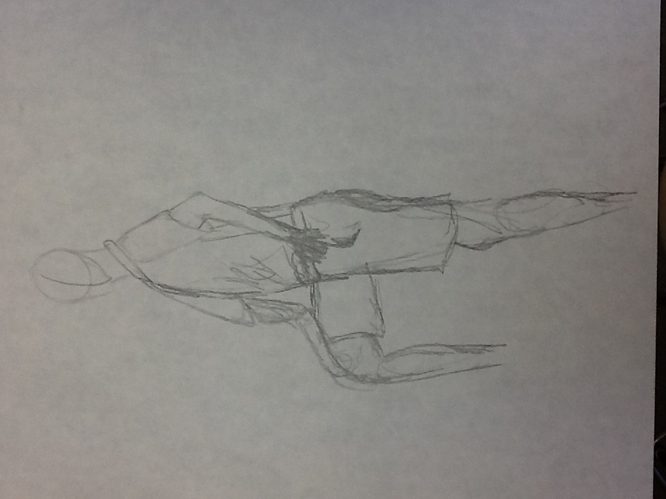
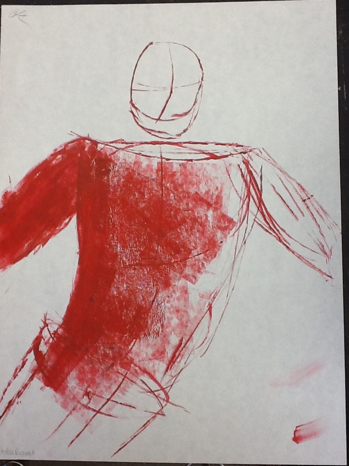
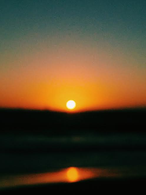
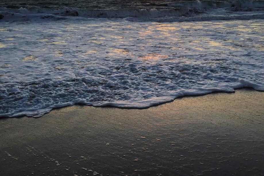
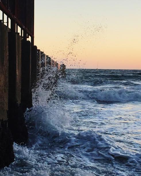
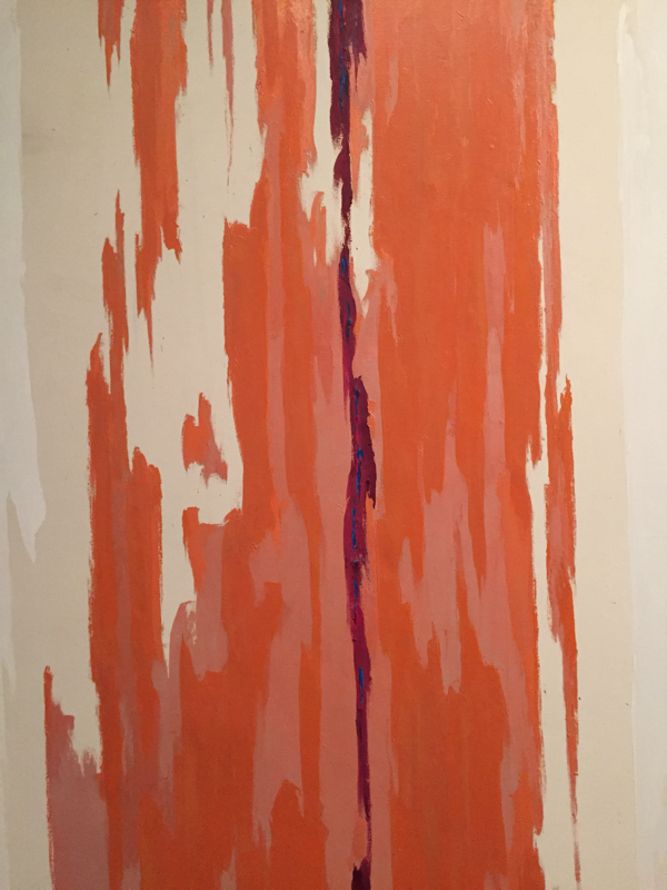
I'm starting to rework the practice figure drawings we did of Emily in class for my final figure drawing piece. I for use on the pant legs and filled in some of the shirt but without texture. I also starting adding some more colors in addition to the purple to shade like pink and blue. I also doodled this eye with pen on a napkin during dinner over the weekend. Sketchbook: eye - 20 mins figure drawing - 2 hours This past weekend, on Saturday, the sky was so beautiful that I sat outside for 40 minutes, and even drove around to catch different pictures of the changing sunset. First, it was pink and blue, then it was bright red (which I didn't get any good photos of), then orange, and then a dark magenta, which I also didn't catch any successful photos of. These were taken on my phone, with exposure, contrast, and clarity editors on VSCO Cam. I think I might start to take my camera more places with me in case there are things I would like to take pictures of and I'm not stuck with only my phone. Sketchbook: 40 mins 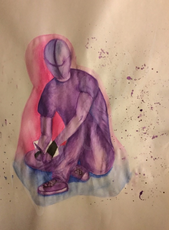 I experimented with layering the watercolor, sometimes with different colors (my main was purple. For example, the darkest darks were created by adding a dark blue to the purple and continuously layering the two. The lightest lights were created with a light pink and distribution of that with water as the purple was almost too harsh in some instances. Most of the time, I blended the layers with their surrounding so that they were unseen, but i experimented some with leaving the brush strokes to add texture in places like the folds of the shirt. The contrast of the background blue and pink shadows, I believe successfully created a great emphasis on the purple figure drawing. The shadow colors were not completely random as the pink and blue were incorporated into the figure through the shading and highlighting. Although they weren’t visually popping out of the figure could be seen in certain parts such as both legs. This created unity between the background and the person, which was also displayed through the same color paint splatters. When splattering the purple, pink, and blue paint, I did not want the paint splatters to overlap with the figure drawing, however I did not make a cover for it. This required me to continuously blend any specs that made it to the figure quickly before it dryed permanently into the art. Which was another challenge I face, the watercolors uneven drying time. Depending on the amount of water used with the color, the watercolor would dry quicker or faster if there was more water. It was fairly easy to work with quick drying parts because with the addition of a little water, the consistency would return. However, if too much water was accidentally added, the colors would blend together by pooling which was hard to recover from. The only thing I could do was attempt to blend out the intense watercolor.
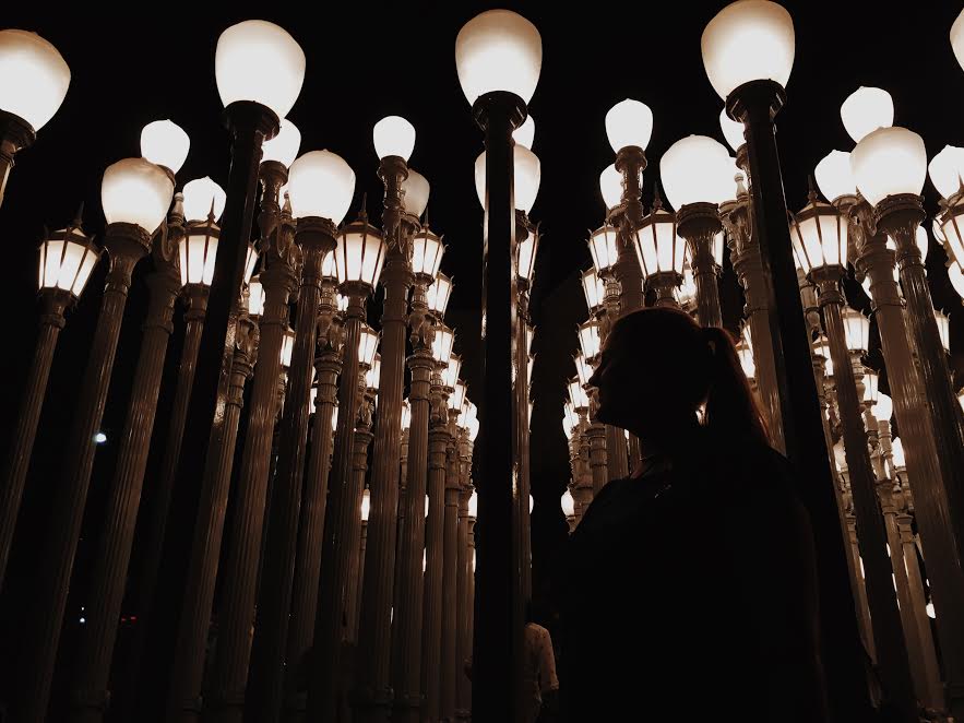
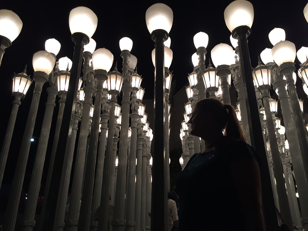
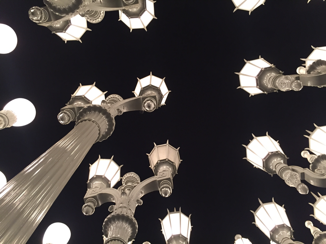
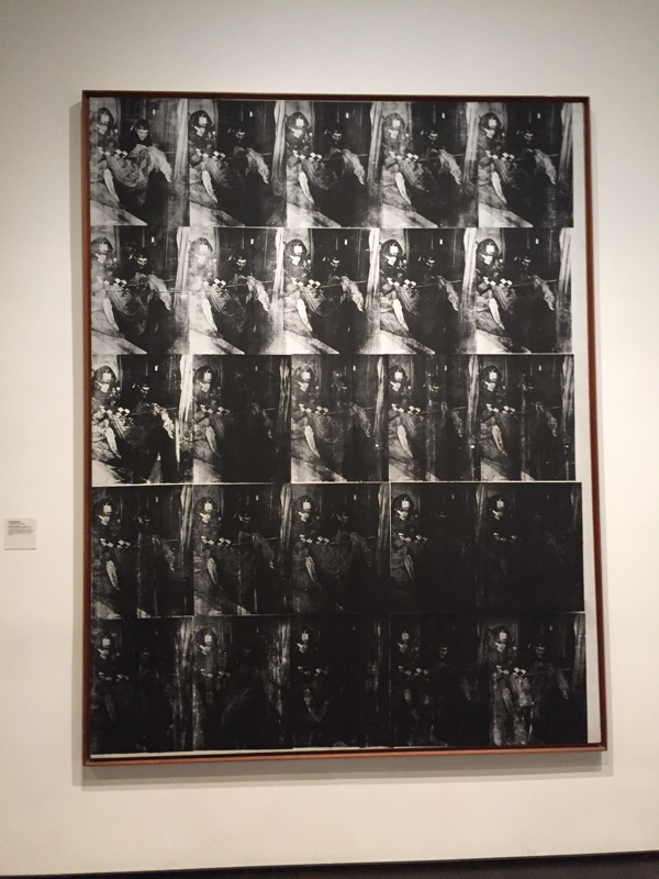
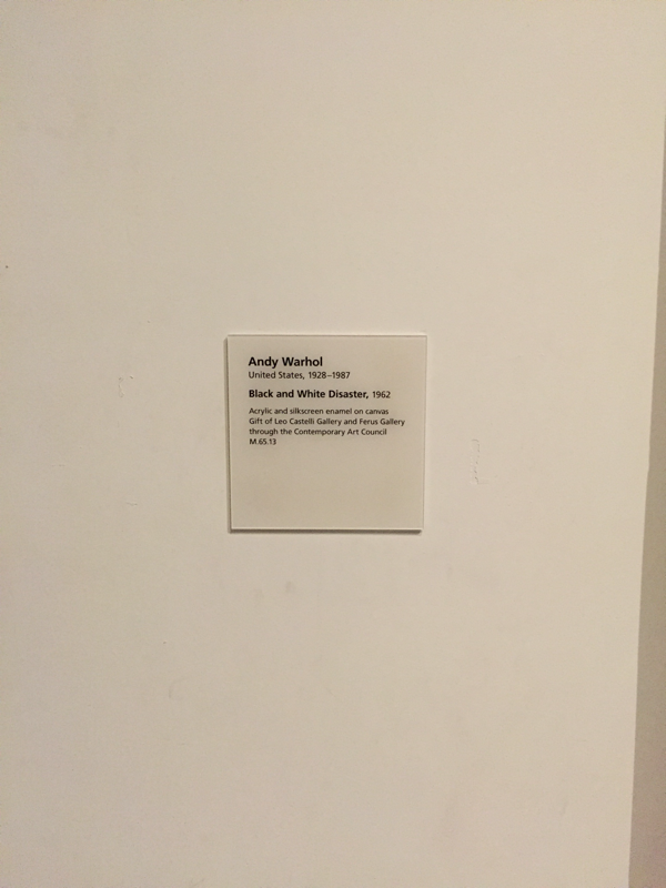
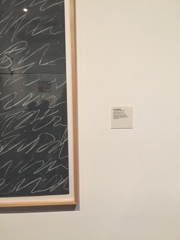
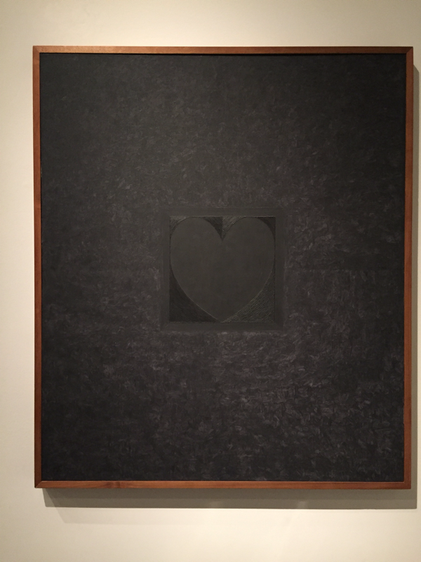
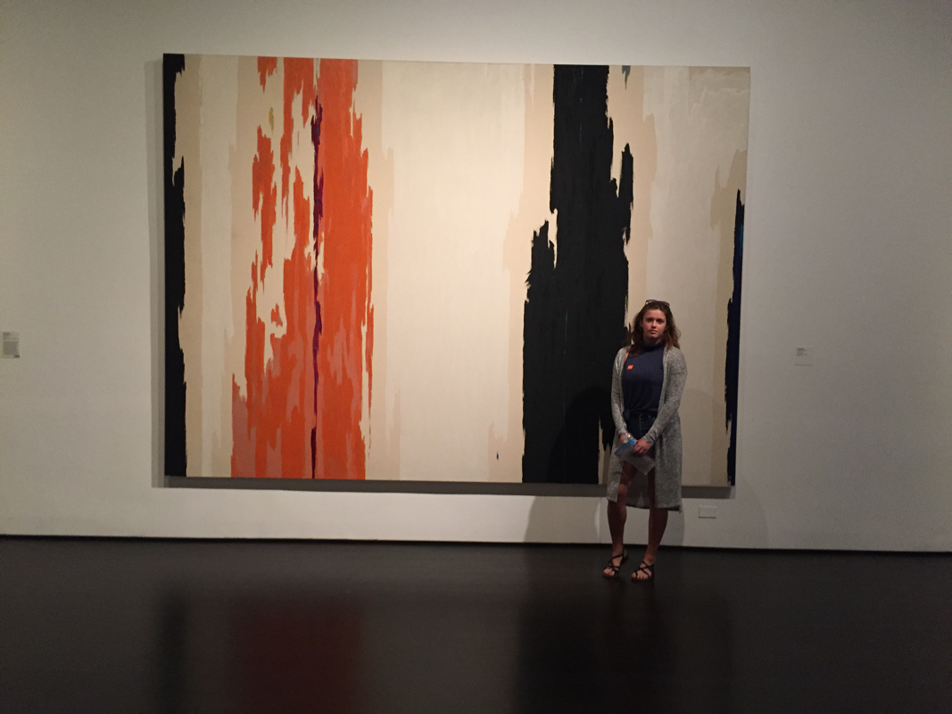
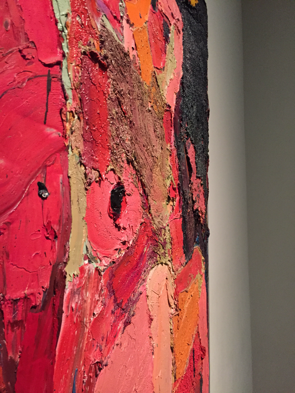
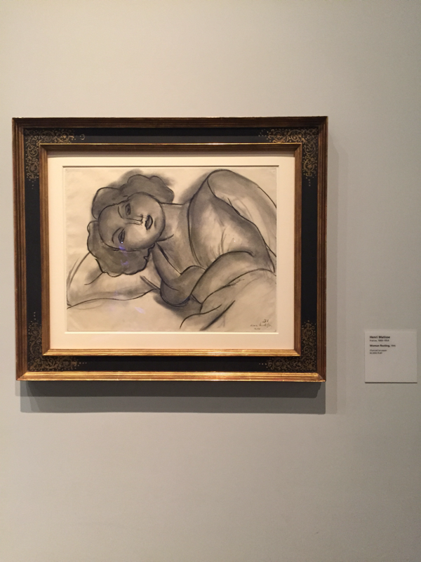
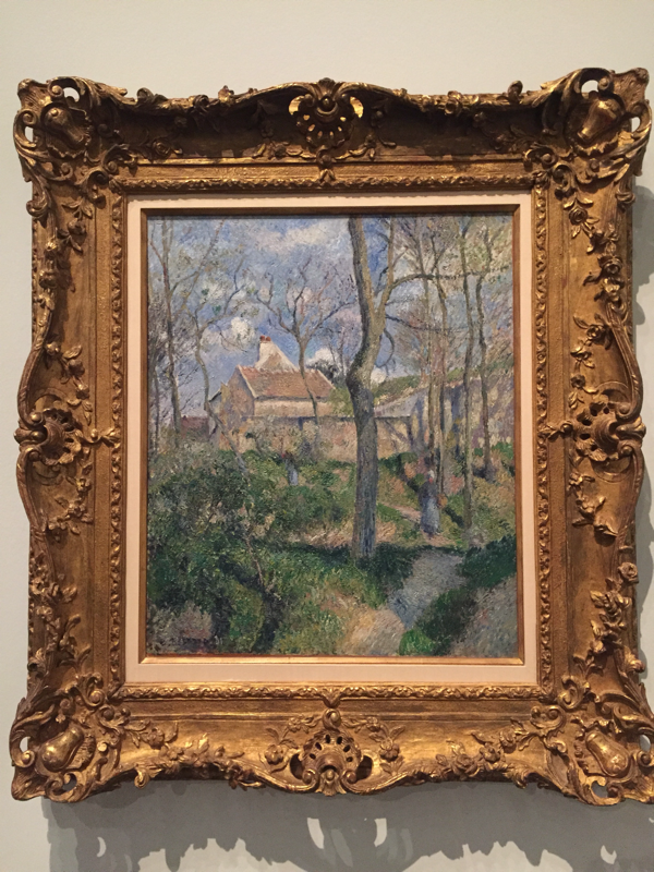
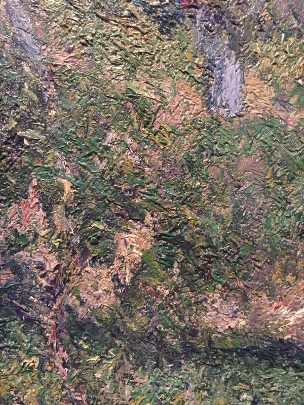
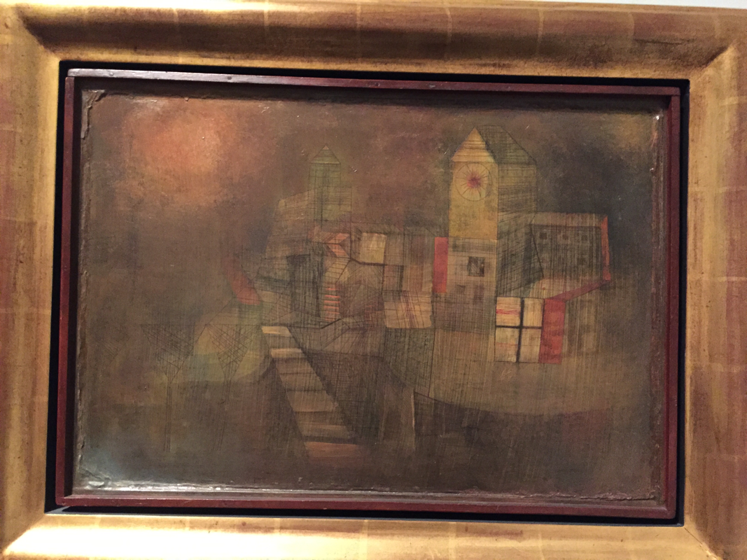
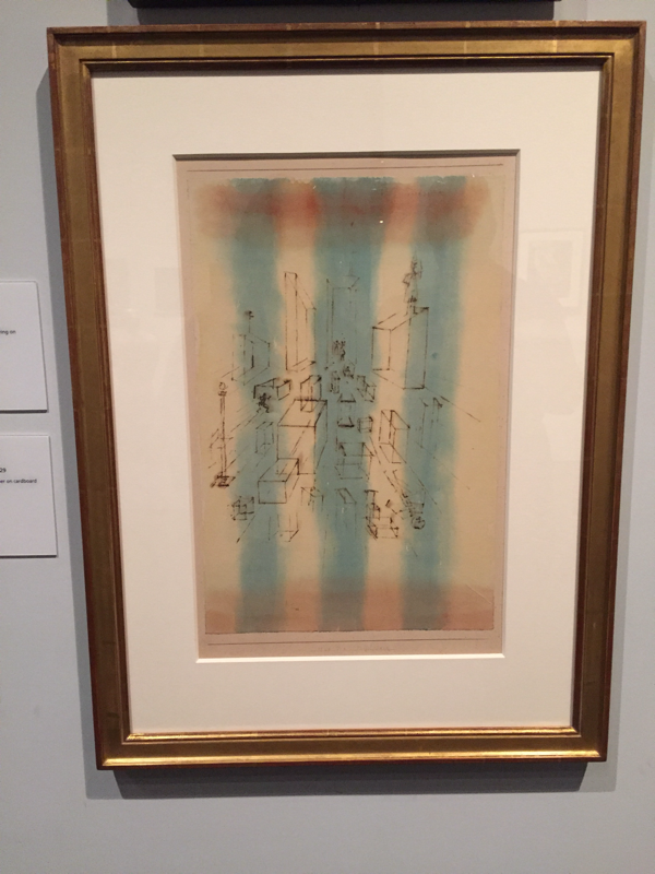
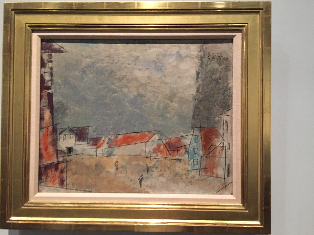
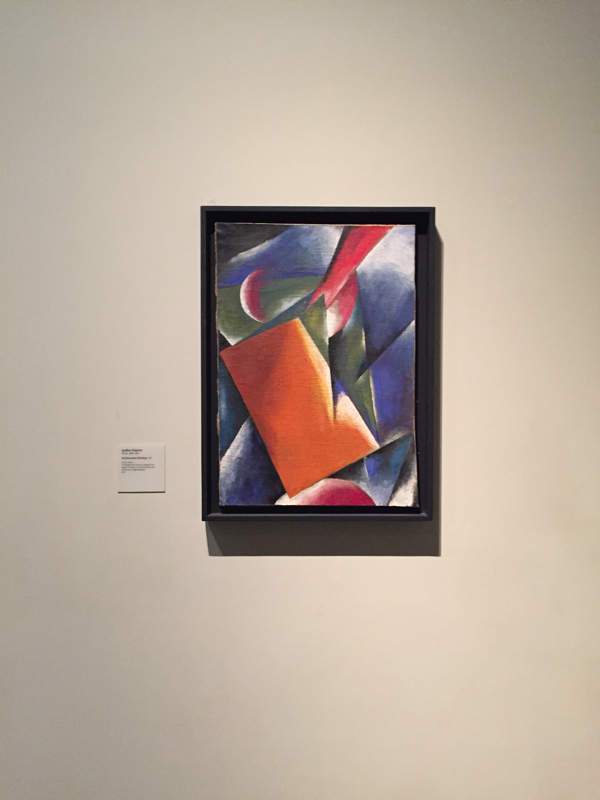
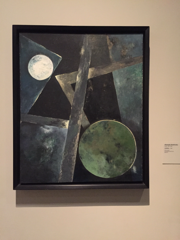
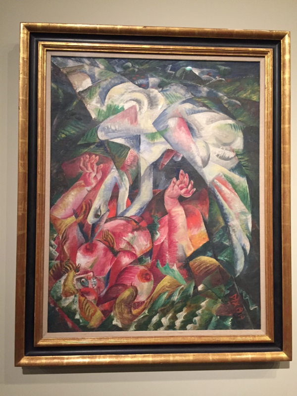
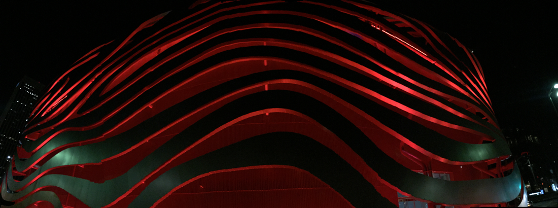
My mom and I got to spend only about an hour at the Los Angeles County Museum of Art, which got us through barely the first floor, and it was incredible. I can't remember the last time I've been to an art museum and if I could, I would remember how I probably didn't care as much as I do now. The art was incredible. The collections we viewed included Matisse, Andy Warhol, Lichtenstein, Pollack, and my favorite, a billion dollar Picasso exhibit which allowed no phones, water, and it was required that we were to stand at least 2 feet away from the pieces which was unfortunate for me because I forgot my glasses and I'm nearsighted. My favorite of Picasso's was Head of a Bearded Man with Cigarette. I realized that I am really attracted to the bright colored paintings with visible shading because from a distance I would go "Ooh!" and bolt towards those types of pieces. I also loved the political silk screen Black and White Disaster, which displayed the police brutality toward specific races. Honestly, everything was so incredible that each piece was better than the next. Since we had very little time to be there we went outside where there was a jazz show and of course the lamp posts which were so beautiful, and when you walked through them it was like it was daytime. I ended up not bringing the camera that I borrowed from the school so all photos were taken with my iPhone. I really loved the one that I took of my mom in front of the lights. After we left we walked by the Peterson Automotive Museum and the architecture was amazing so I included a photo of that too. Time spent looking at art: 1 hour Outdoor photography (light fixtures): 30 mins |


 RSS Feed
