|
Photography: 4 hours
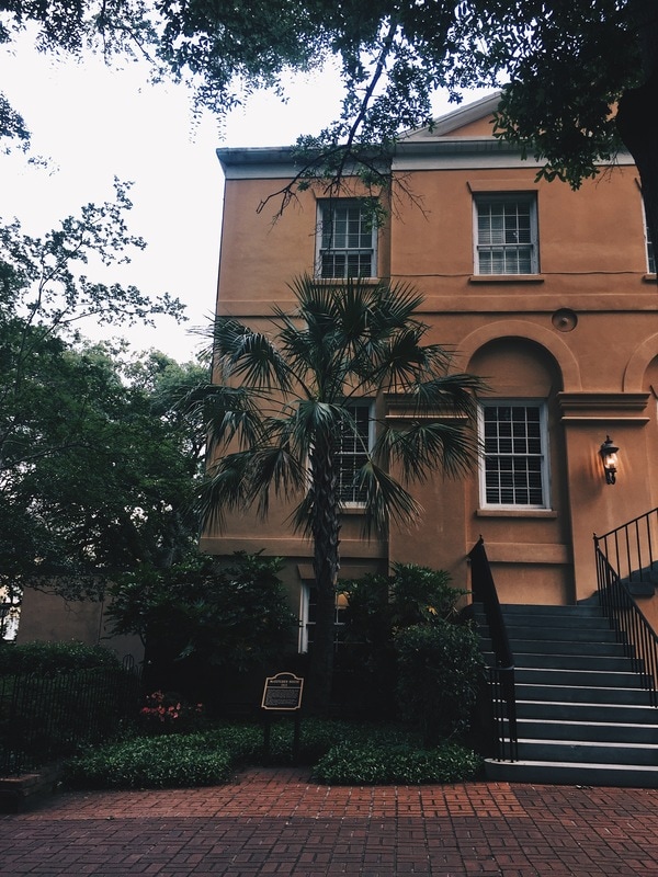
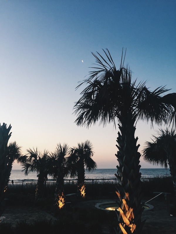
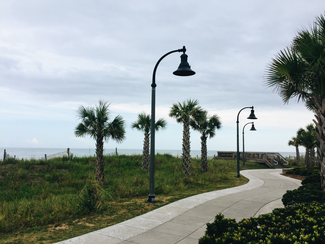
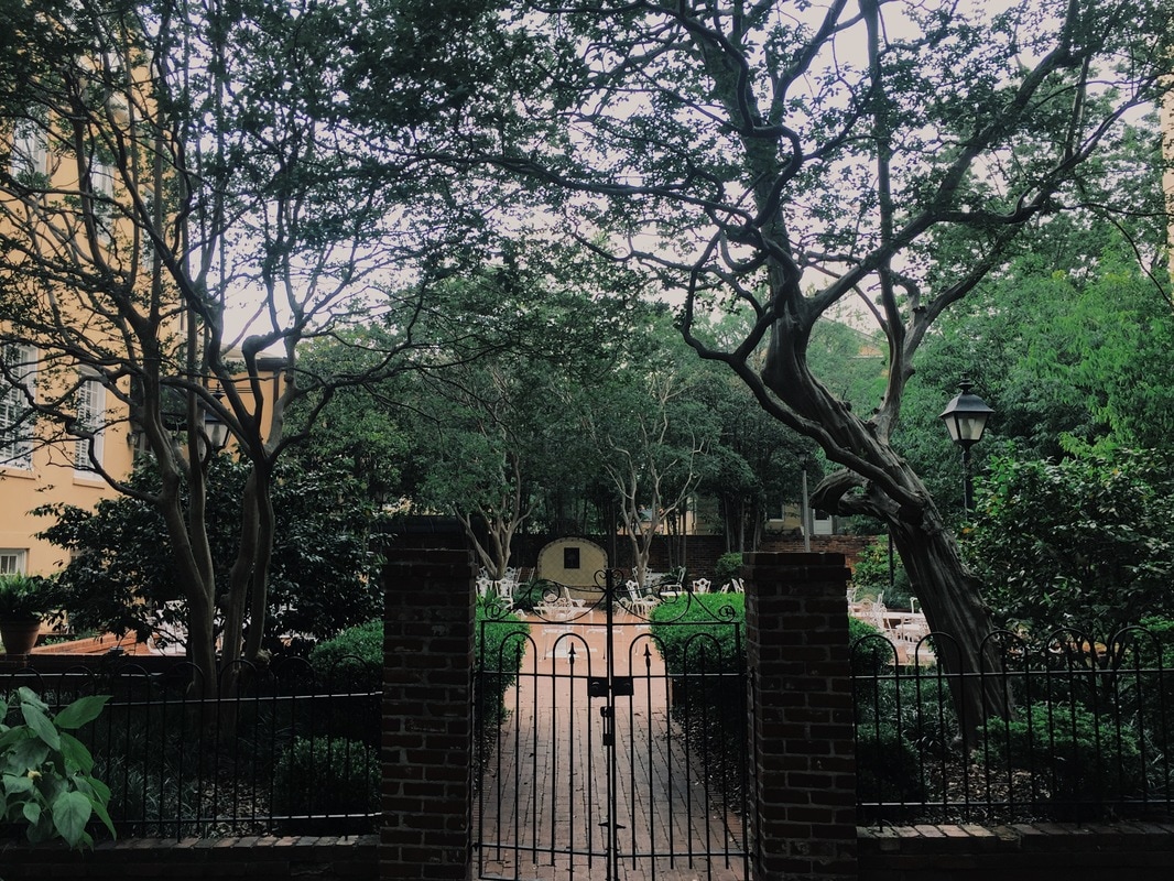
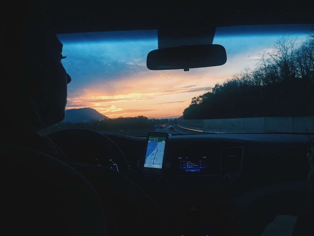
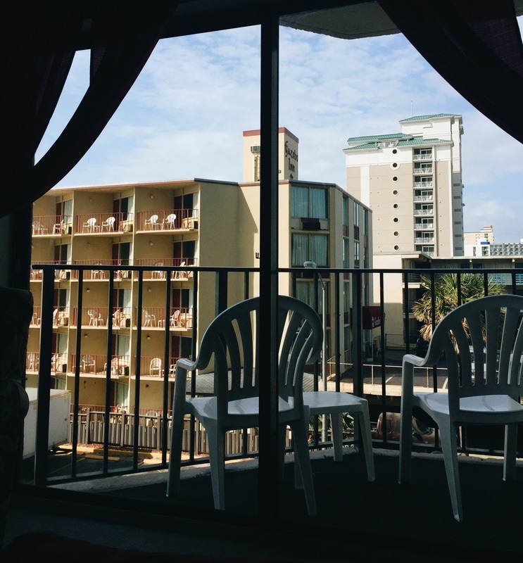
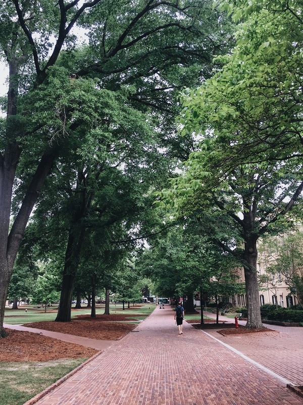
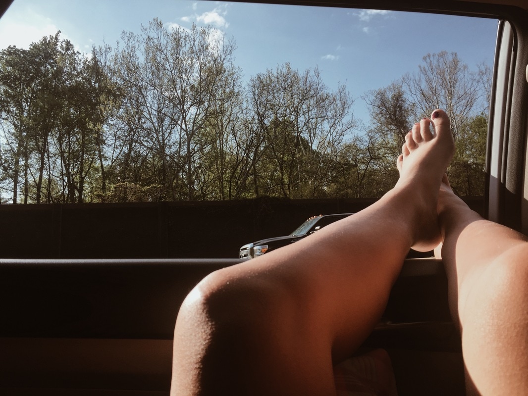
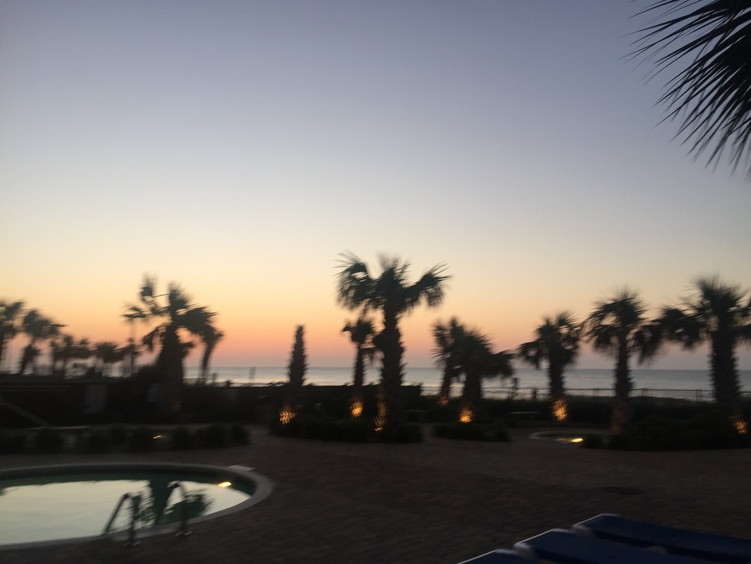
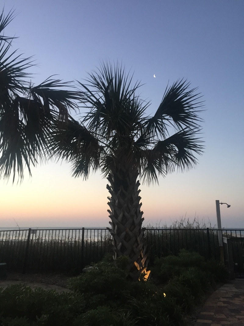
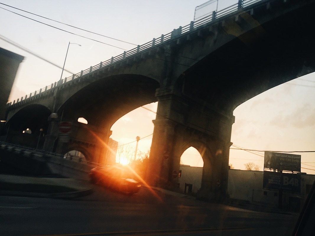
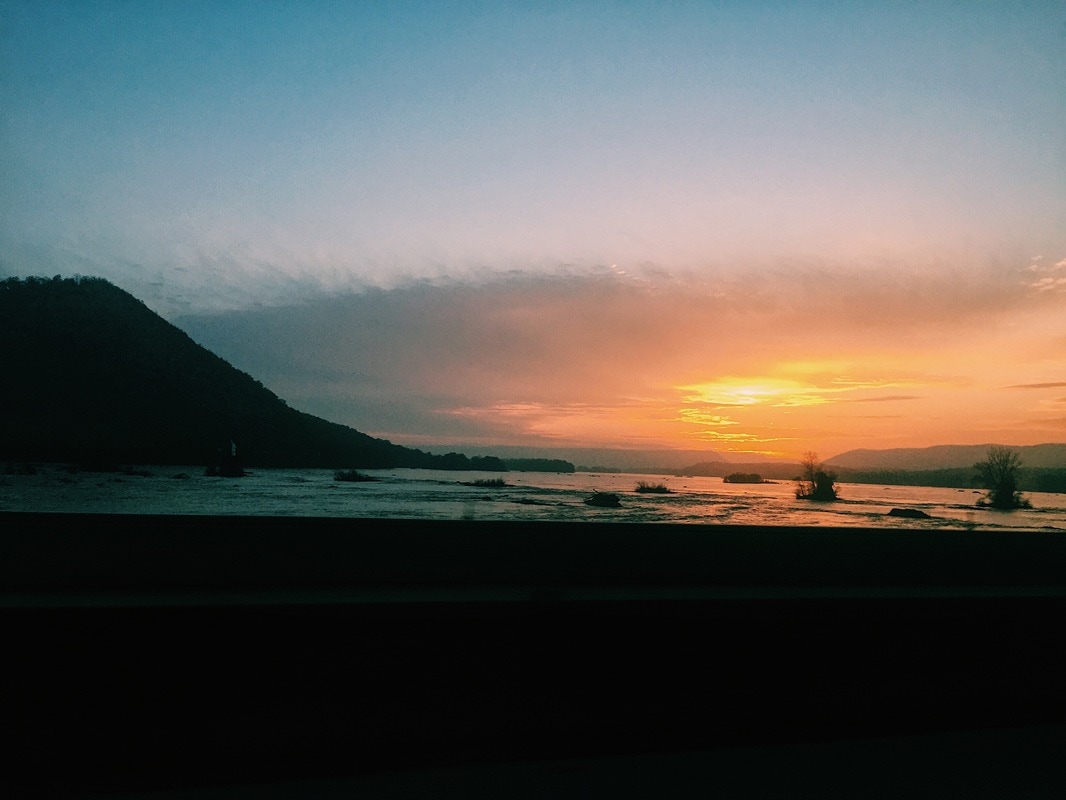
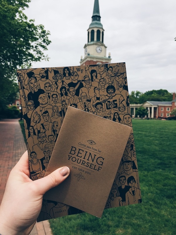
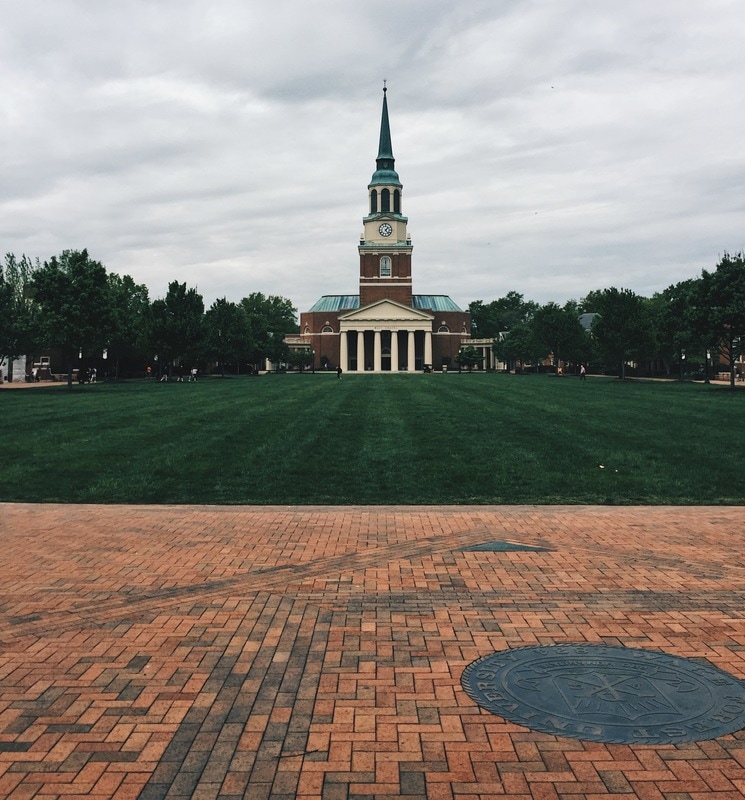
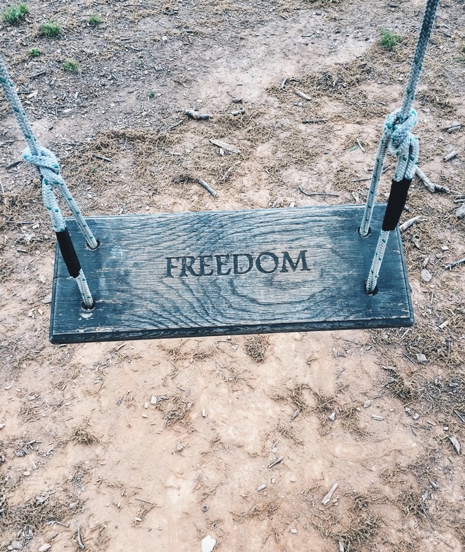
Tuesday we left in the morning to head for Winston-Salem to see Wake Forest. My mom was upset we didn't get to drive to Appalachian state, and we might go back to visit because that's where she really thinks I would like to go. Wake Forest didn't impress me at all which was surprising because that was my top choice going into the trip. It shows how important college visits are. But there I took photos of the courtyard and these swings that they had in different places. We also visited their student art gallery and I wish I took more photos but my mom told me I shouldn't. There were many woman bres. After, we drove to Columbia South Carolina to see the University of South Carolina. We didn't see much of the campus but it was gorgeous how it blended with the city. The courtyard also had really pretty trees. I liked the fact that they had palms too. I took a bunch of photos there. After we drove to Myrtle Beach, South Carolina where we spend the rest of the break up to Friday when we drove all the way back to New York. On our way home we drove past the Susquehanna River which was one of my favorite parts of the trip. It was so vast and because I was in the car, I was unable to take many good photos of it.
1 Comment
Photography: 3 hours
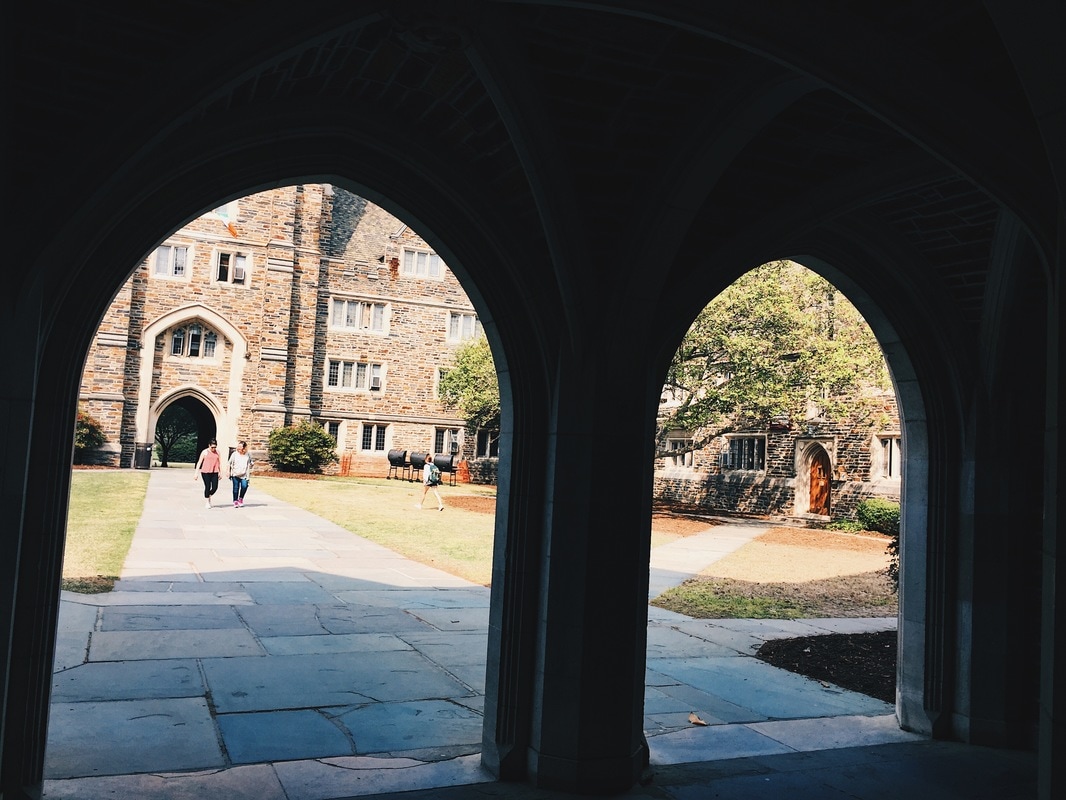
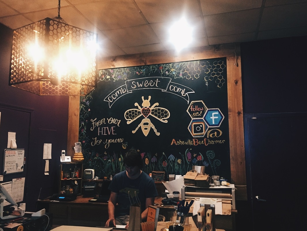
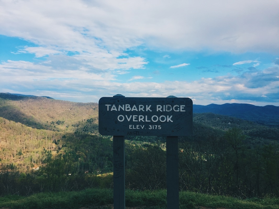
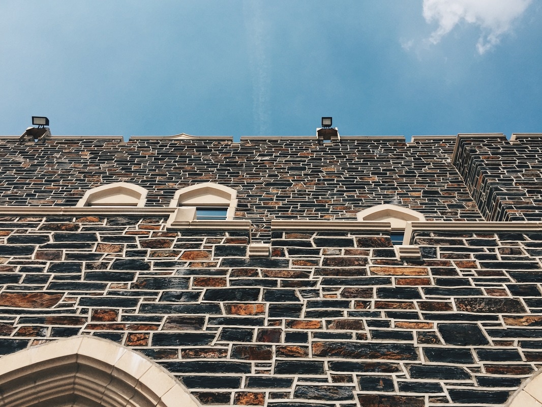
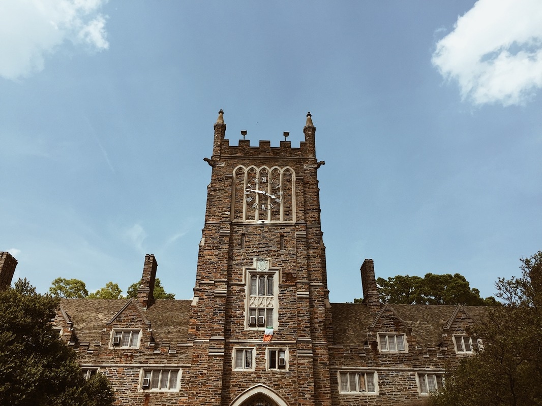
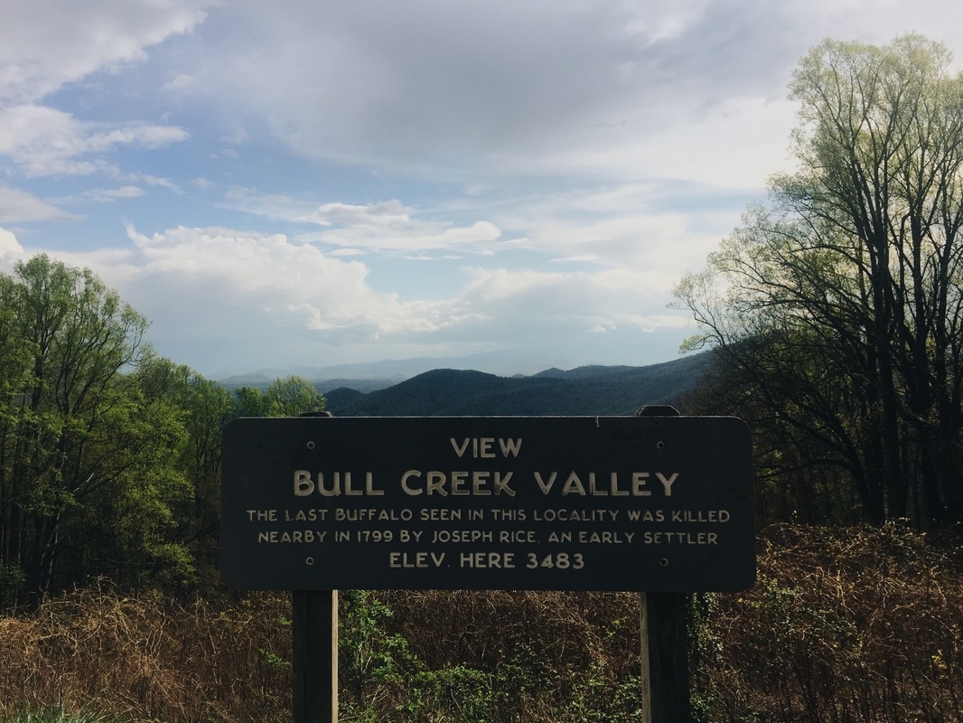
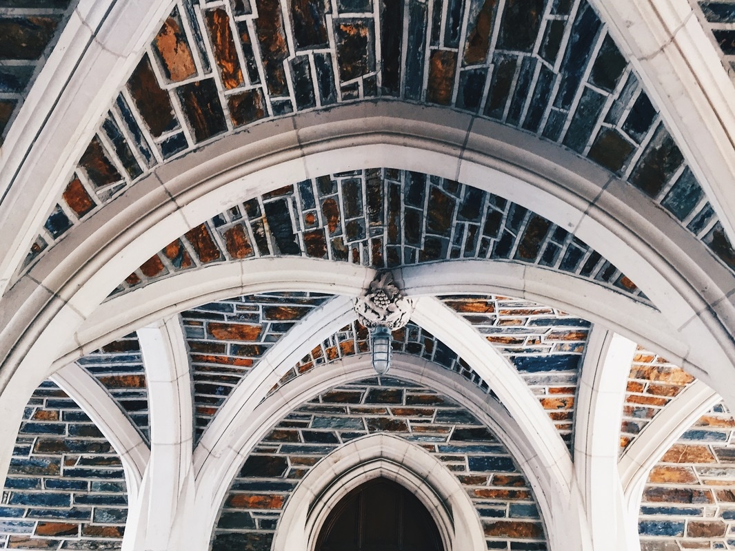
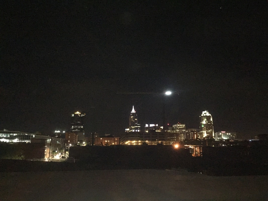
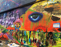
We drove to Raleigh, North Carolina starting Saturday morning and that night drove around the city. It was a beautiful place but I bet it would be even more so during the day. We didn't get to really see much of it because the next day we drove to Durham to see Duke University. We didn't get a tour but walked around ourselves and toured, self guided. I loved the buildings and how large the campus was. Also the trees around campus were really gorgeous to me -- I got made fun of for always pointing them out. My mom really thinks Durham would be a great place to live because it's progressive. I am definitely considering attending Duke. After Duke, we drove to Asheville and got to our house there. It's one of my moms favorite towns. We got dinner and walked around the city a little, but I wasn't impressed at first. Monday, I visited University of North Caroline Asheville, not expecting too much but loved it. It reminded me so much of Ithaca and Cornell, the campus was so pretty. The only thing I didn't like was how small it was and that it didn't have club volleyball. I wish I took more pictures because I don't think I got many except for the student painted mural in one of the cafeterias. We got to explore the city which is so much like Ithaca. My favorite place was the aSHEville museum which was a women's museum and store. I actually got a print of art that inspired me and my concentration. I loved the town very much. After walking around we drove to the Vanderbilt home which was one of my most favorite places ever even though we didn't get to see the actual home. Then we drove the Blue Ridge Parkway and stopped at some lookouts which was beautiful. I took a ton of photos but it was hard to get good ones because the weather wasn't amazing though otherwise it would've been incredible. Visual Research: 2 hours
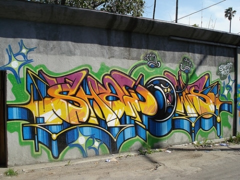
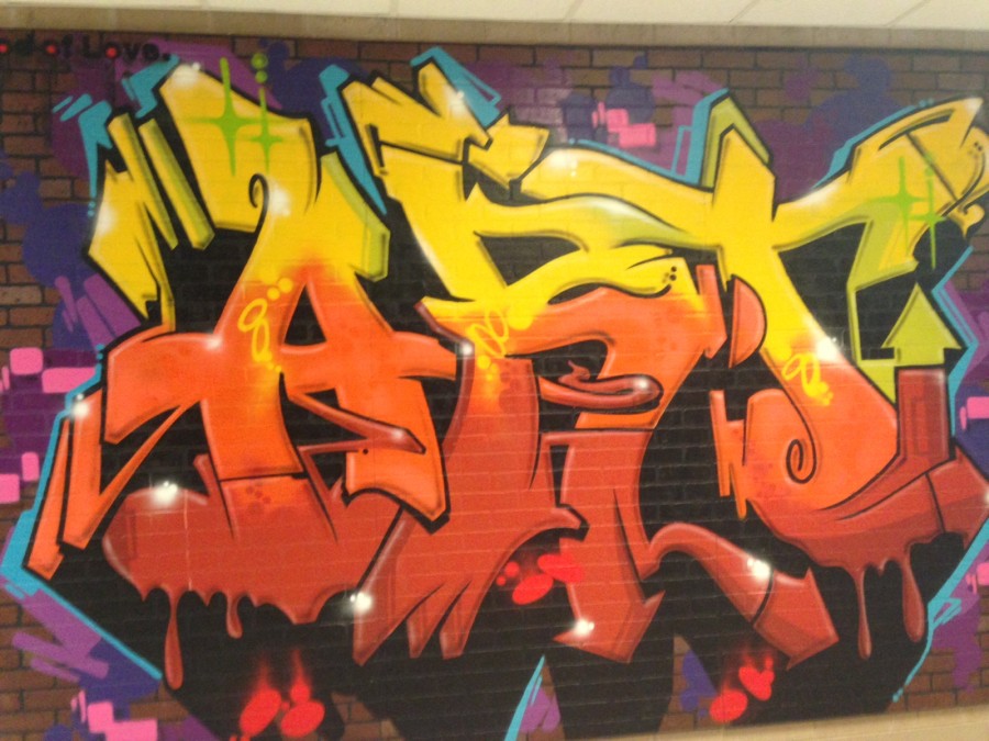
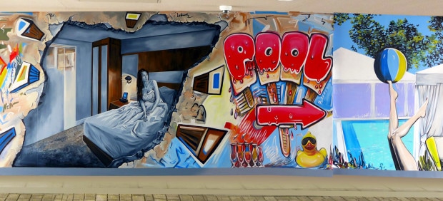
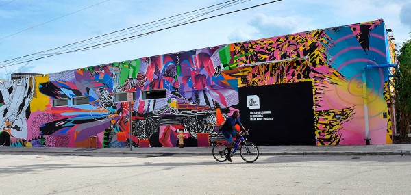
I have taken charge on a project presented to me by Ms. Plank to paint a mural at the Ithaca YMCA. They are looking for a mural in the cardio room, one with an urban, almost graffiti style. We are meeting to discuss ideas after school on Thursday so I wanted to have some pictures to brainstorm off of. My hope is that by the end of the week after we get back from break that we will have at least 2 sketches/designs to present to the people at the YMCA. Photography: 3 Hours
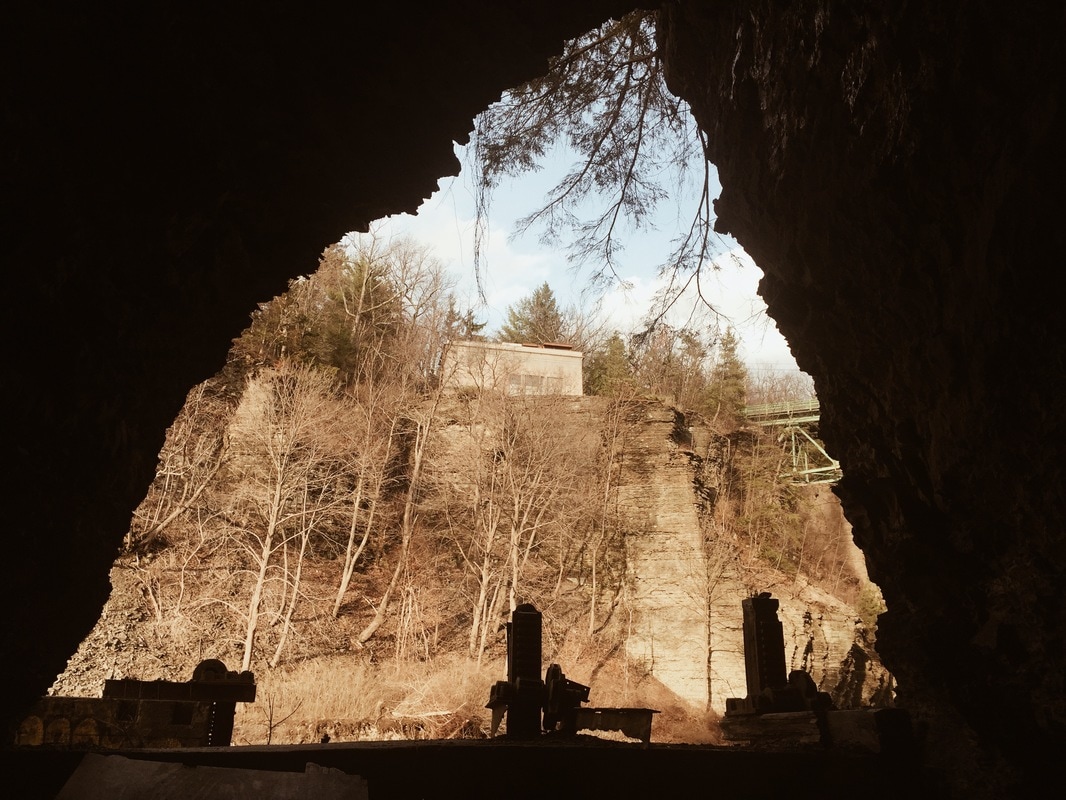
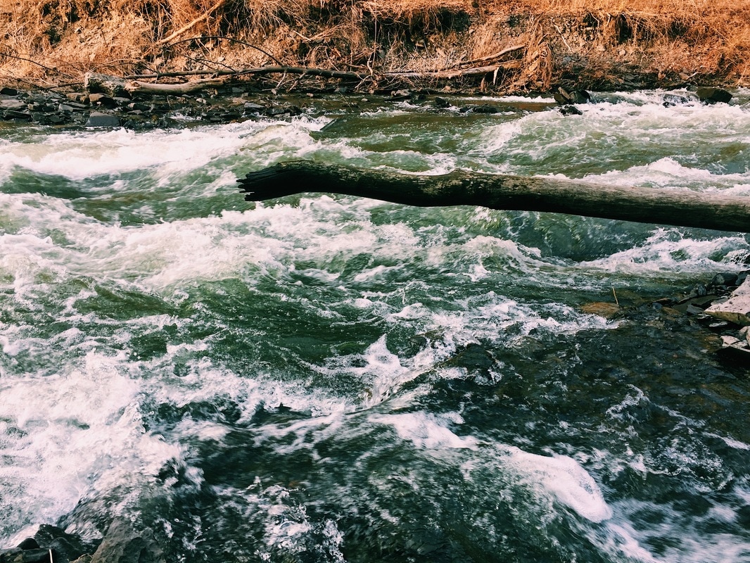
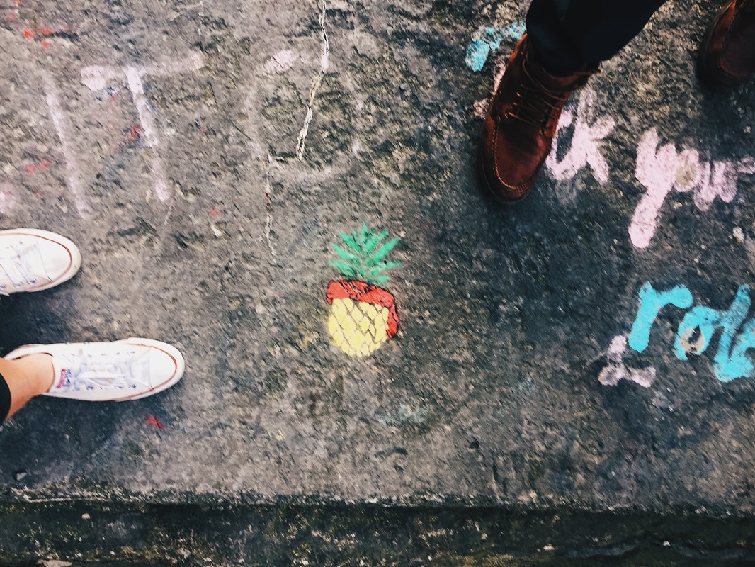
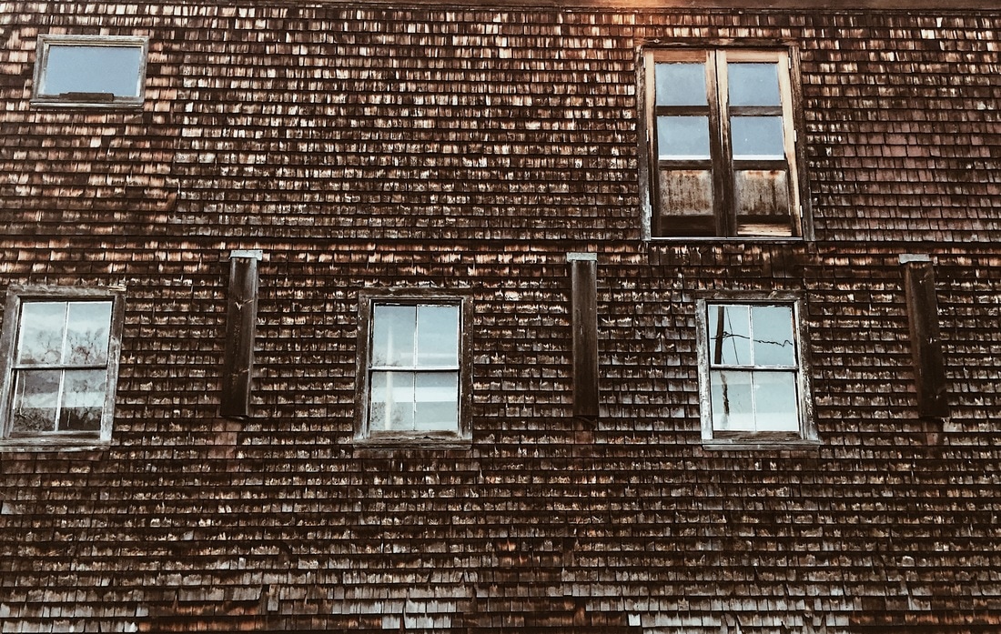
I spent a ton of time taking more photos for eArt on Sunday but also taking additional photos, not intended for the project. Most of the photos were taken at Ithaca Falls but also some at Stewart Park. One of my favorites is the photo of the building wall at Stewart Park, the texture of the siding I think is beautiful. I also loved the water picture, I took bunch of those but these are just a few of the photos. How does your work fit into the Quality, Concentration, and/or Breadth section of your portfolio?
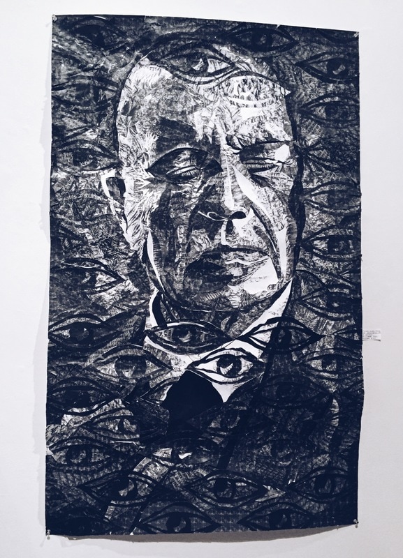
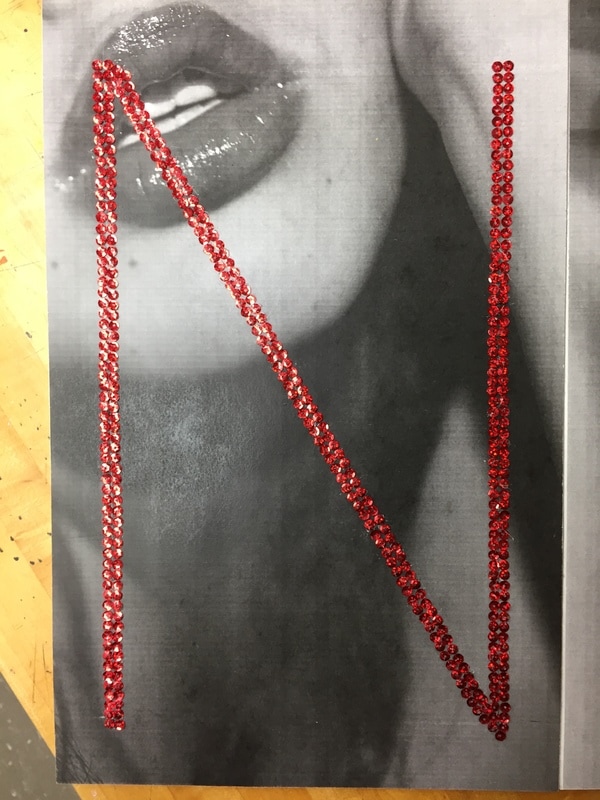
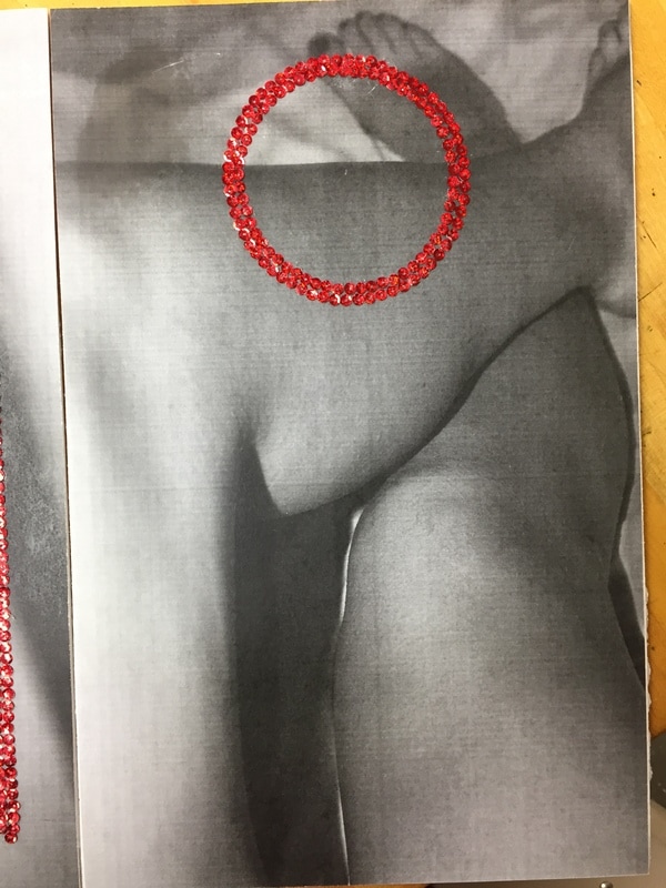
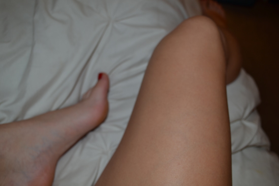
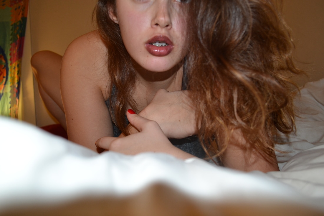
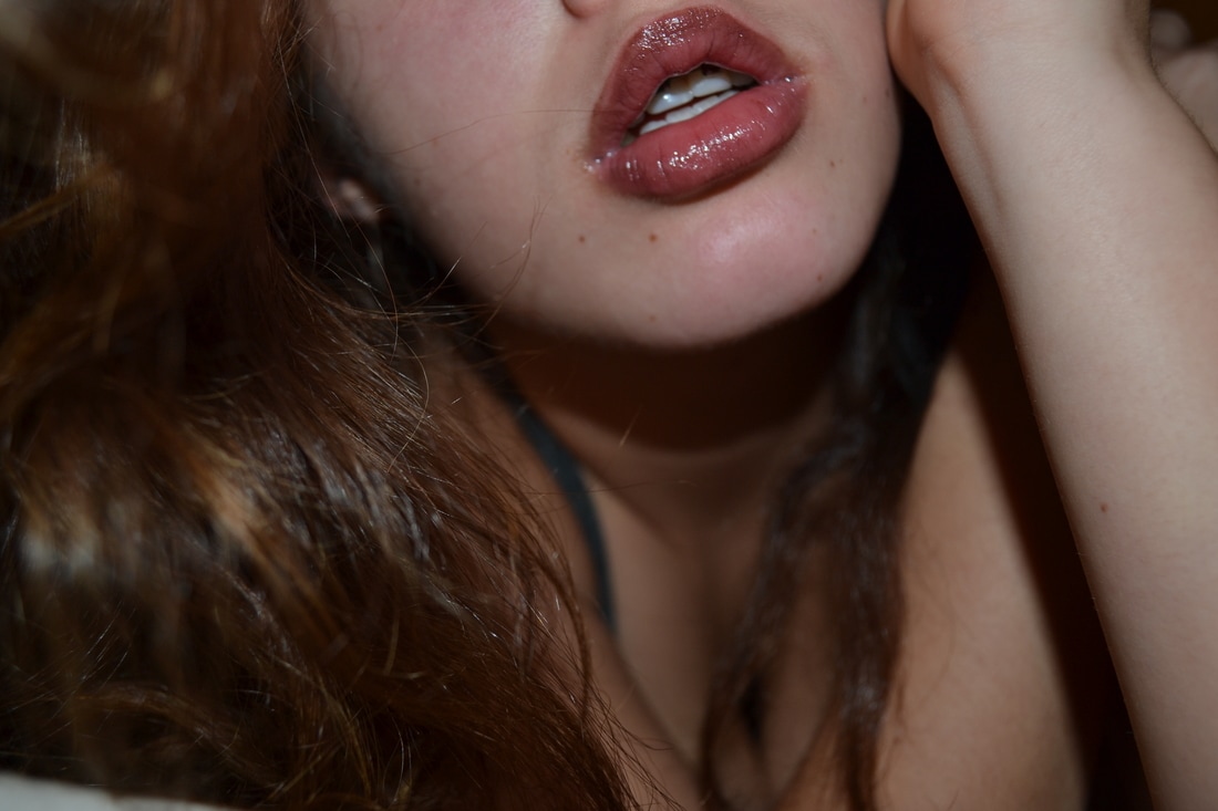
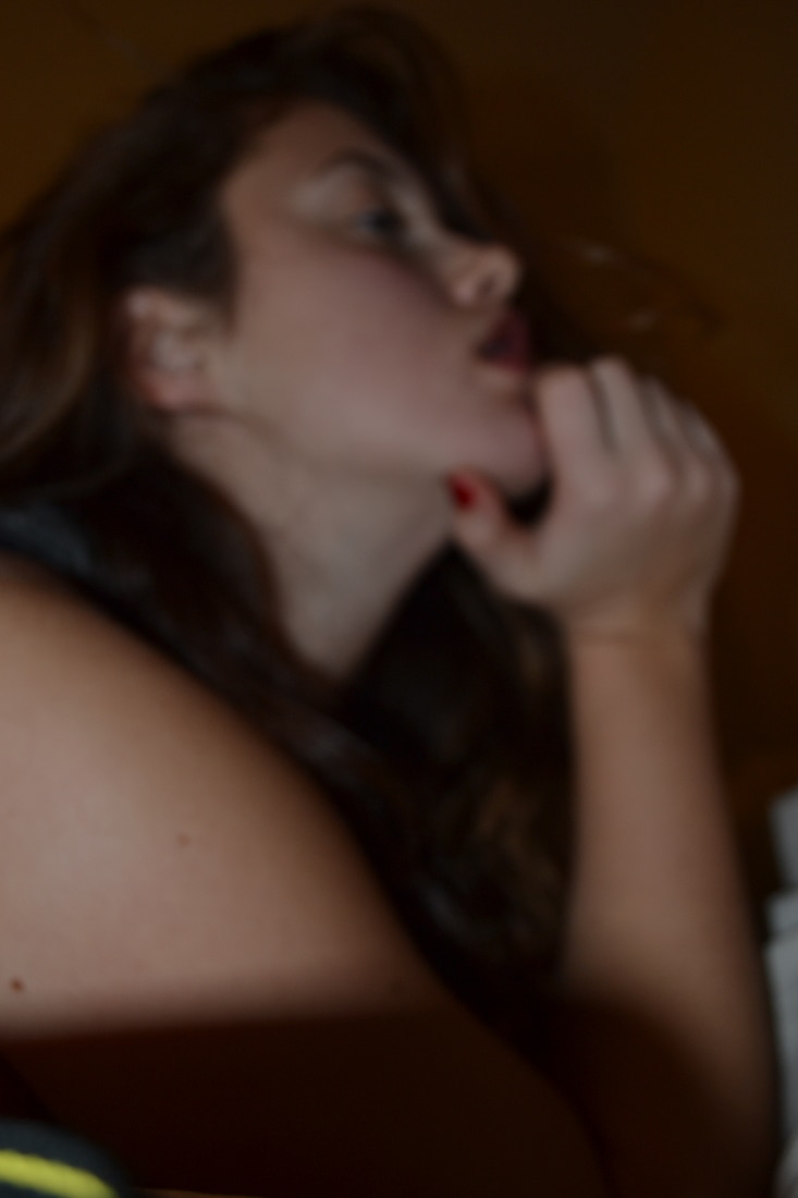
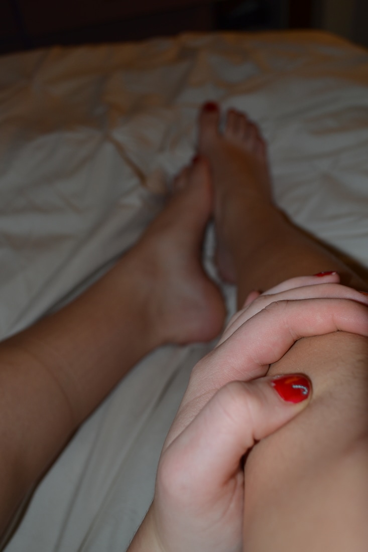
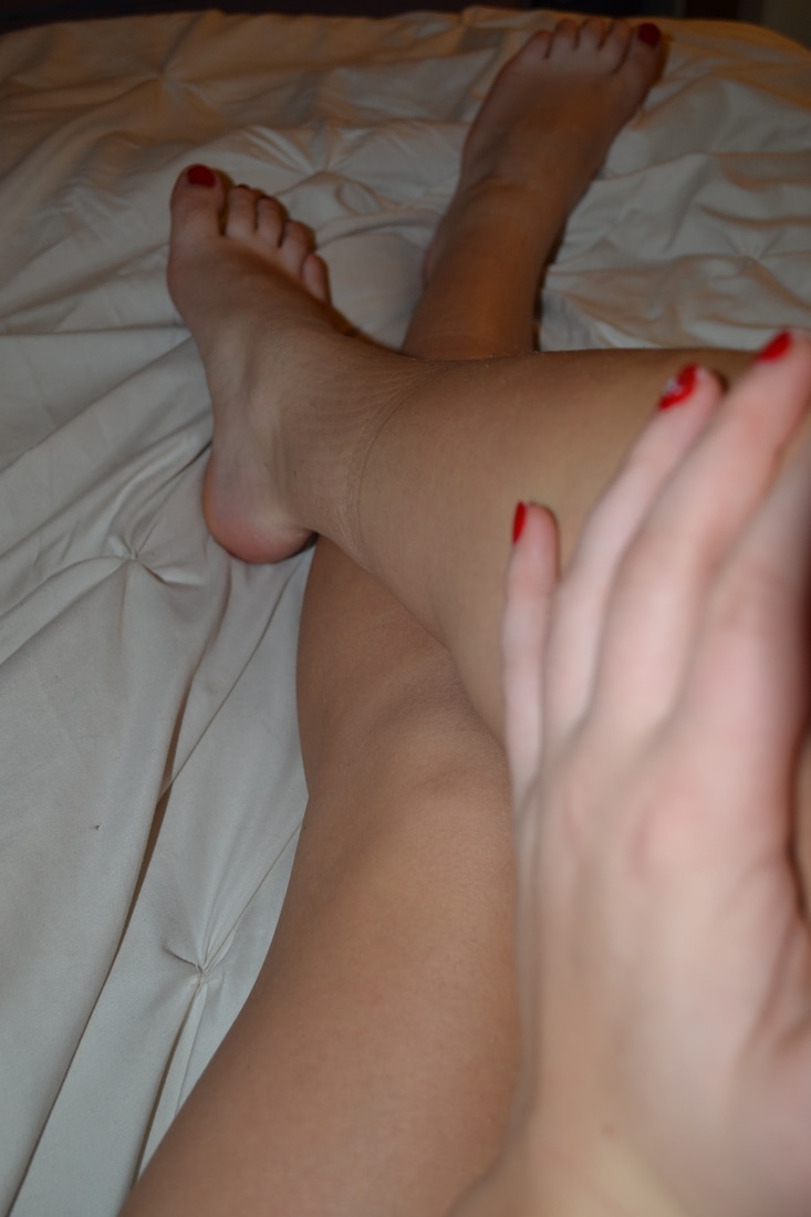
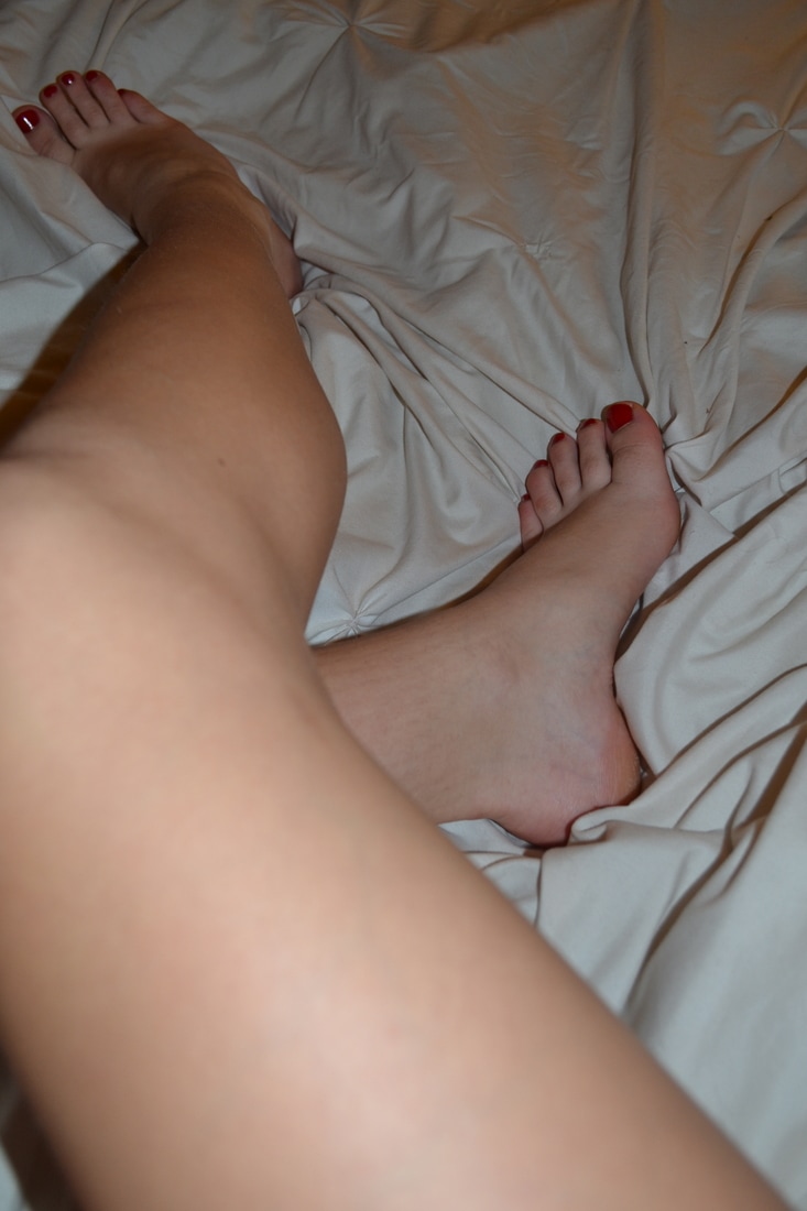
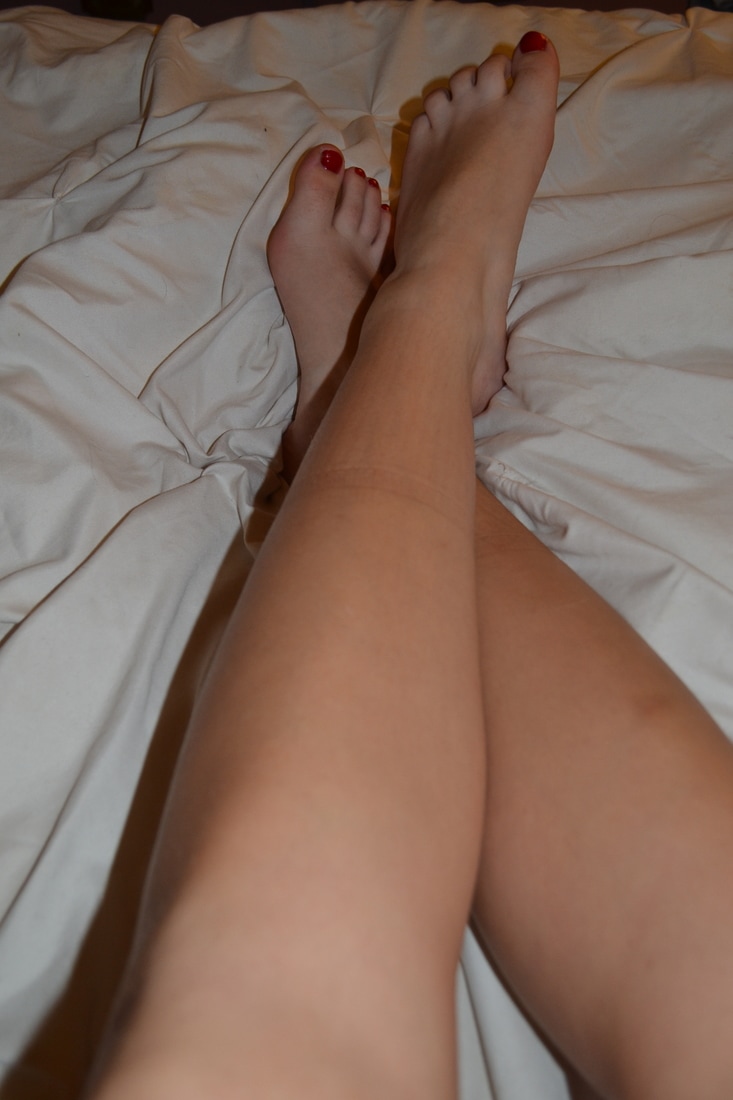
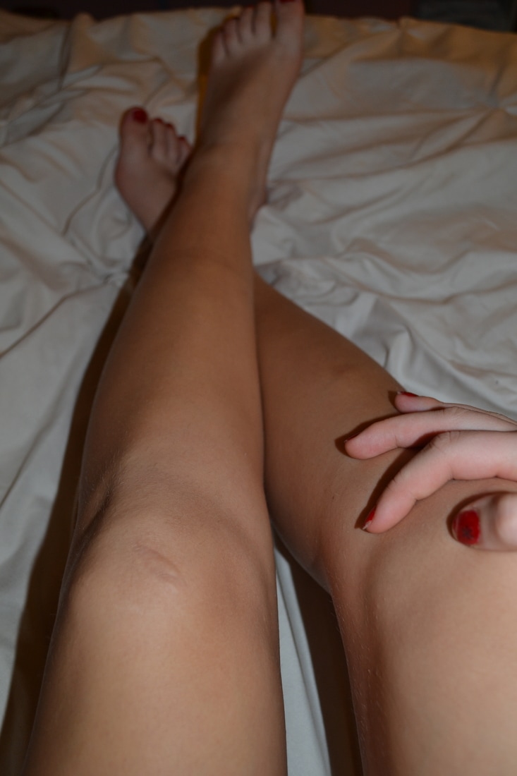
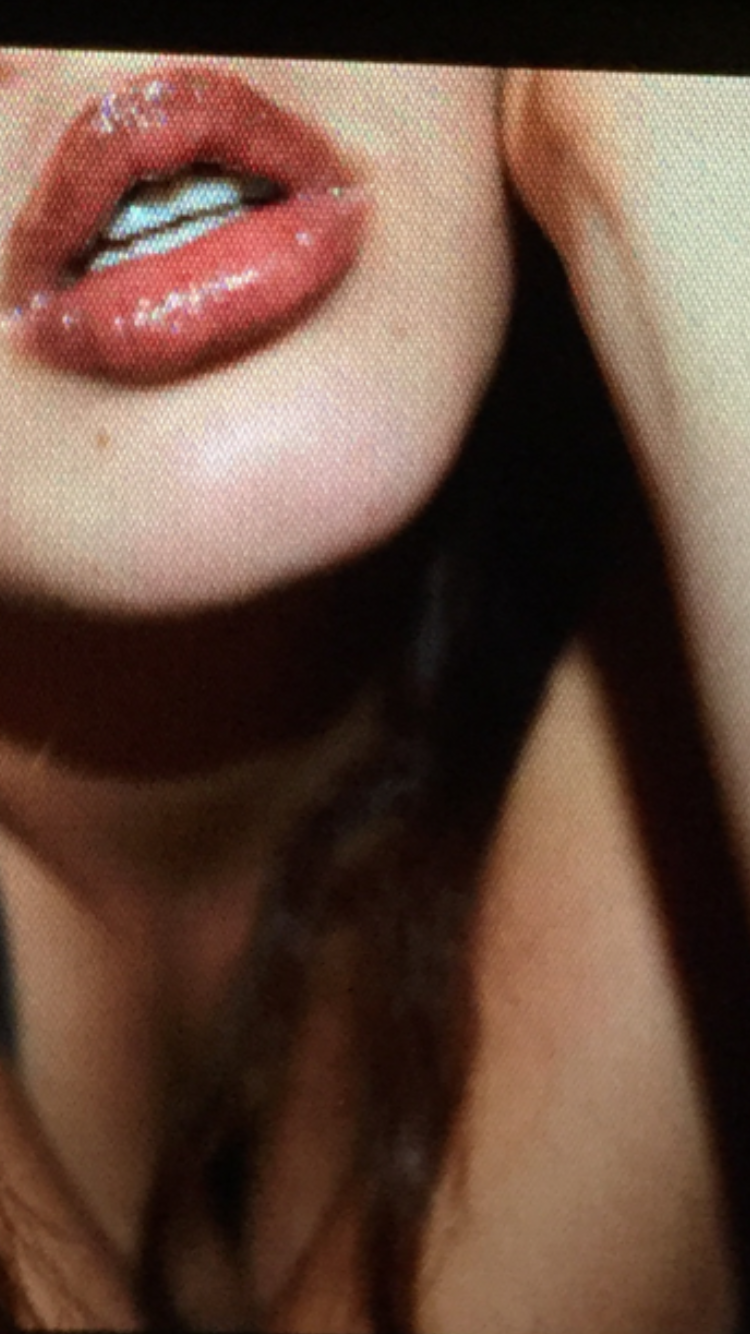
How do your works of art relate to each other in terms of visual and conceptual content? What were some of the decisions you faced in creating your artwork? This piece, like the others based around my concentration, features women and highlighters their power. It is a political piece, centered around rape and the idea that women's bodies are theirs and only theirs. Like a few of my other pieces, this art is making a clear statement regarding society and their views upon women. It is portraying the idea that a woman should be able to feel free to express her sexuality and her internal self, whatever that may look like, without feeling that she owes anything to anyone. More specifically a man who claims “she was asking for it” regarding a woman's promiscuity when defending the act of rape. The provocative photos say, I don’t care what I look like to you... I don’t live my life for you, and regardless -- no still means no. The pieces that I could consider for my concentration all have the common theme of depicting strong women -- which is obvious considering the central idea of my concentration. However, visually my pieces are unified through the reoccurring color red. I identify strength and especially feminine strength with the color so I tend to use it in almost every project -- I see it as almost a stronger pink. I also use glitter and sequins frequently throughout my pieces, usually to put words over the art. I knew from the moment I took the photo feature behind the ‘N’ that I would be using that in the piece because of the shine of the lipstick and the placement of the hair, it felt like a perfect photo for what I was trying to do. However, I didn’t want two photos of my face, head, or hair so it as difficult for me to come up with another, just a visually pleasing fitting for the second shot. I took photos of my hands and knees and even my back. The legs I kept coming back to because it was hard to get them in a good position that looked interesting when photographed. Eventually I picked out a photo of my legs that I thought would work and cropped it strategically so that it would fit that much better with the first photo. I also decided to keep the ‘o’ in ‘No’ small to add a sense of fashion and high class to the piece. It’s a reference many women will understand to Chanel and it's just an added layer of symbolism as well as it created an interesting visual appearance to the piece. It was unexpected. Artist Statement: 1 hour
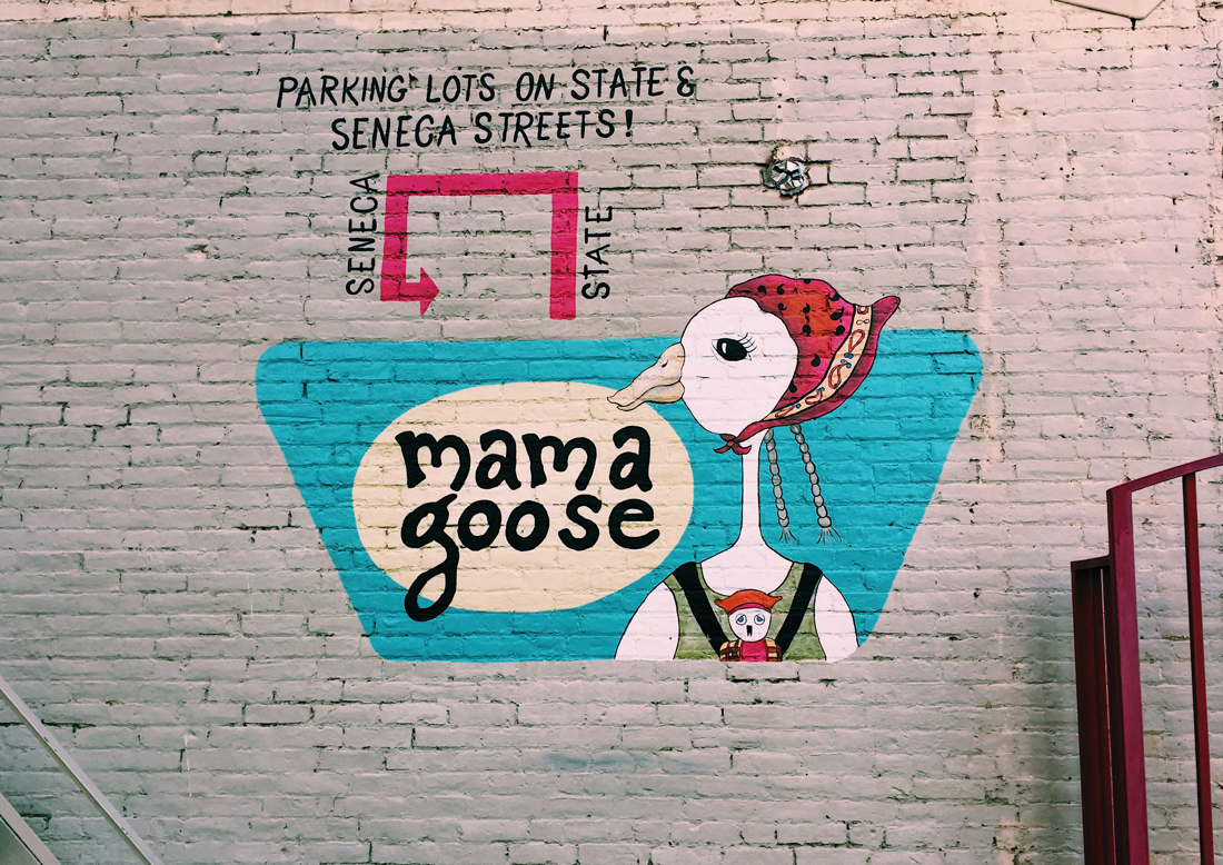
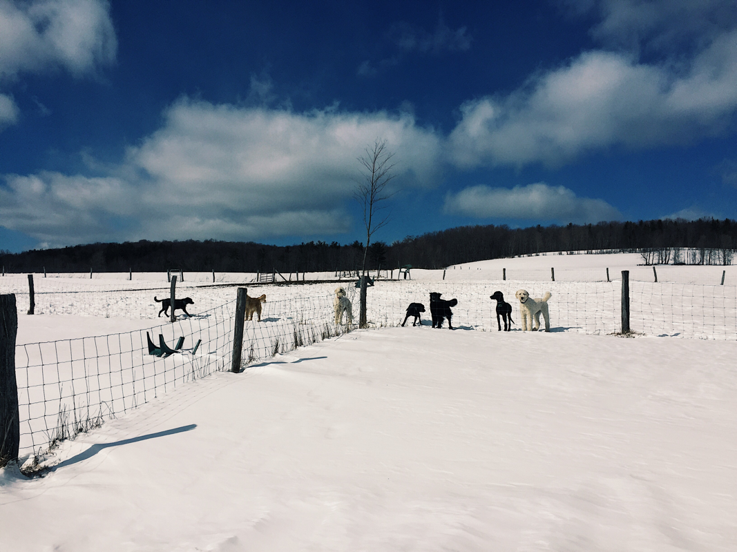
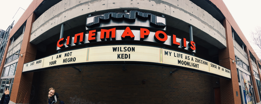
Photography: 2 hours While walking around downtown Ithaca, I took some photos of buildings, some I will use for the photography project in eArt but not all of them. For eArt I left the photos unfiltered but for these they were edited. I also took random photos, not of places as well. I also have a photo I took, well the only good one of many, of the dogs at the doggy daycare my mom and I dropped my dogs at for the week while she was gone. |
 RSS Feed
