|
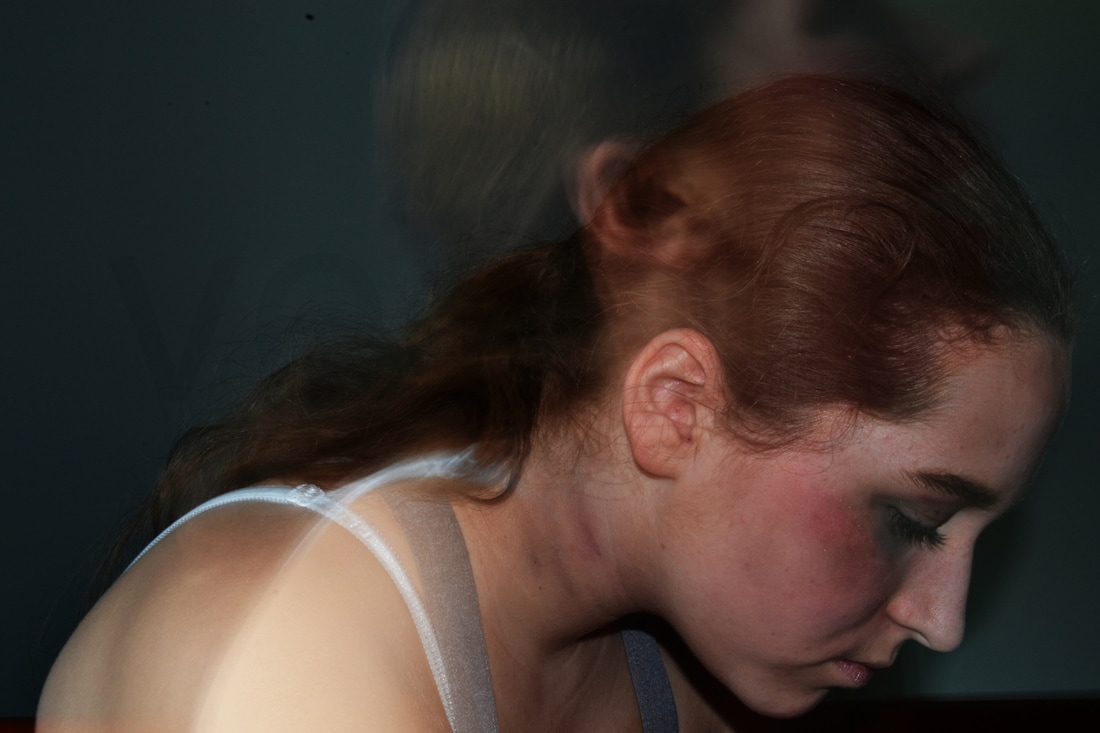
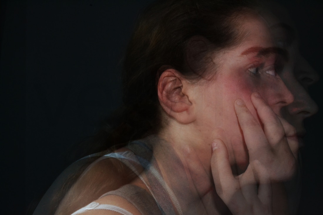
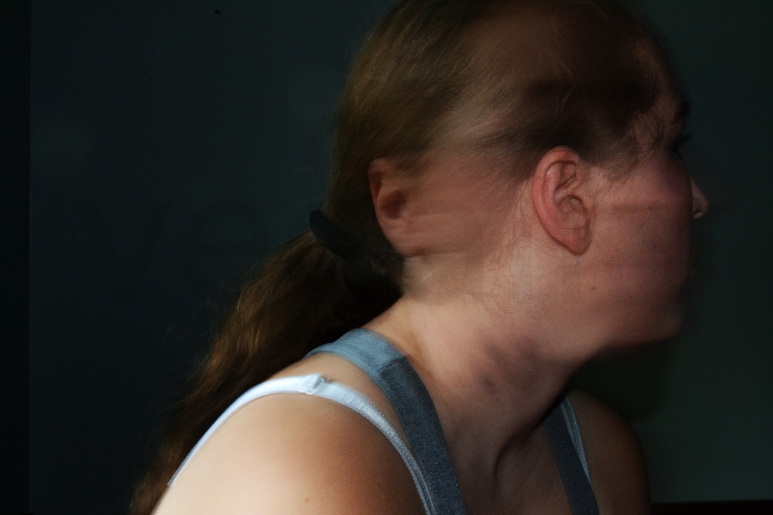
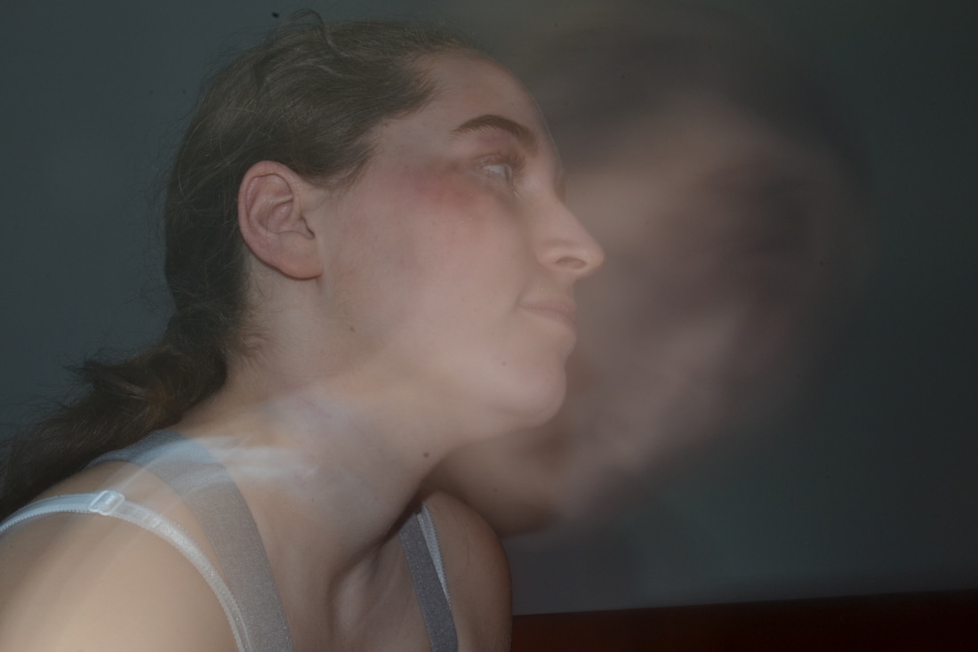
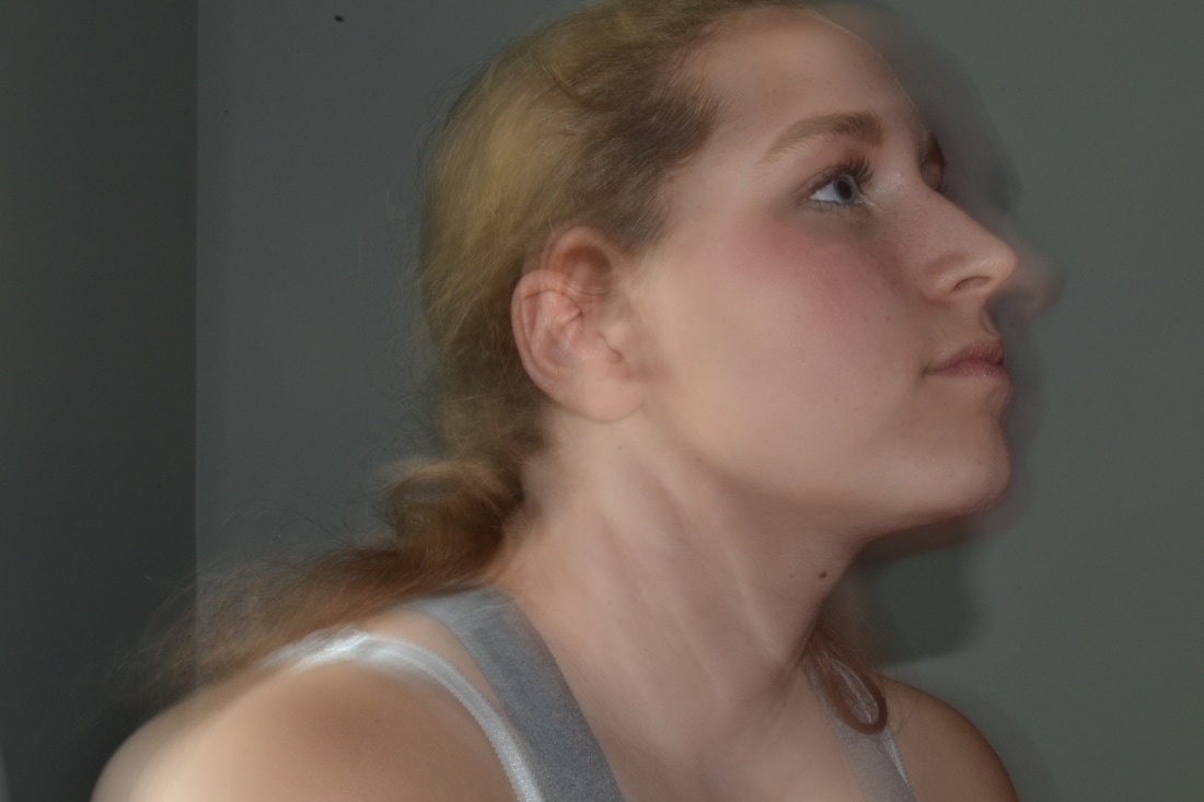
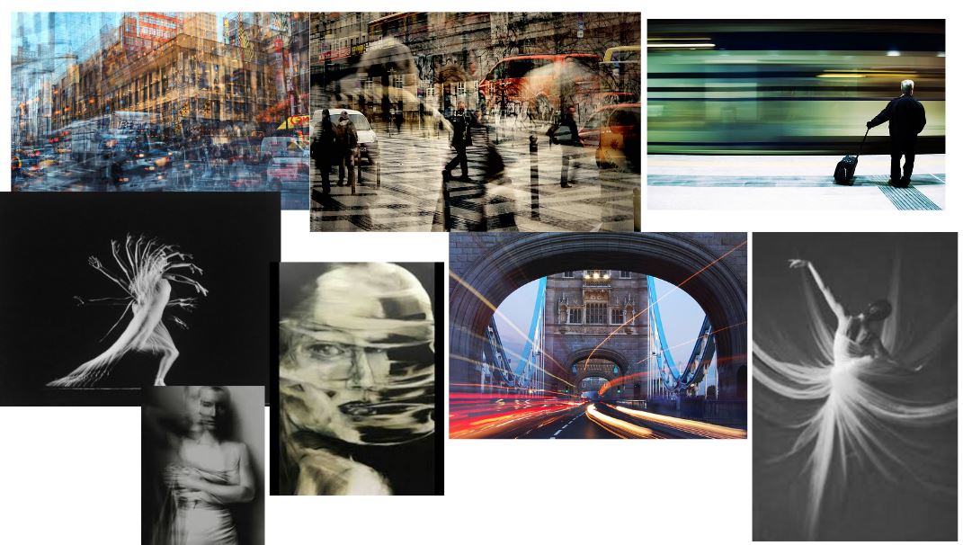
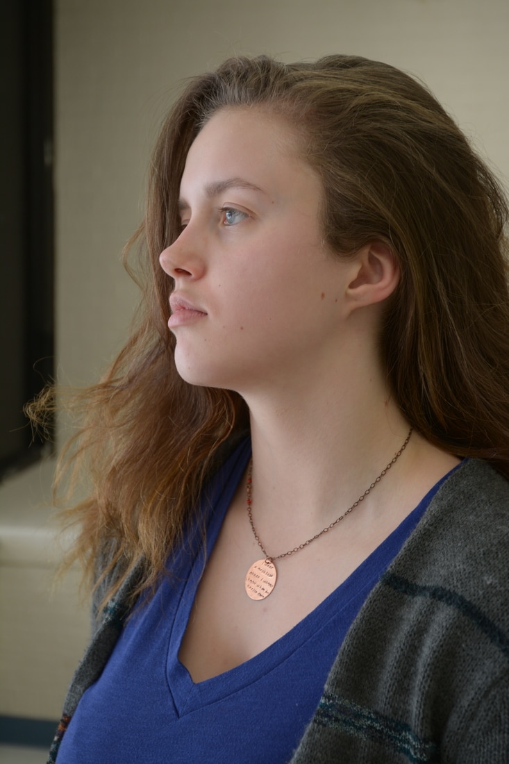
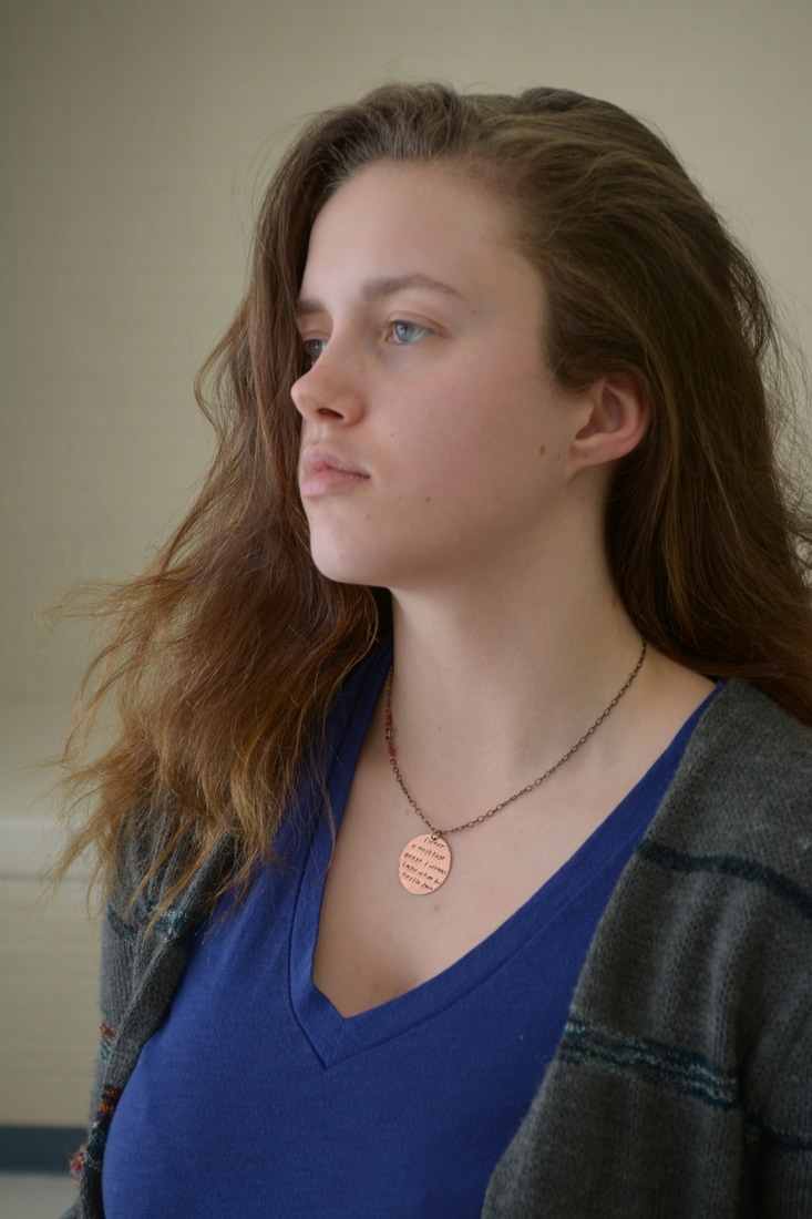
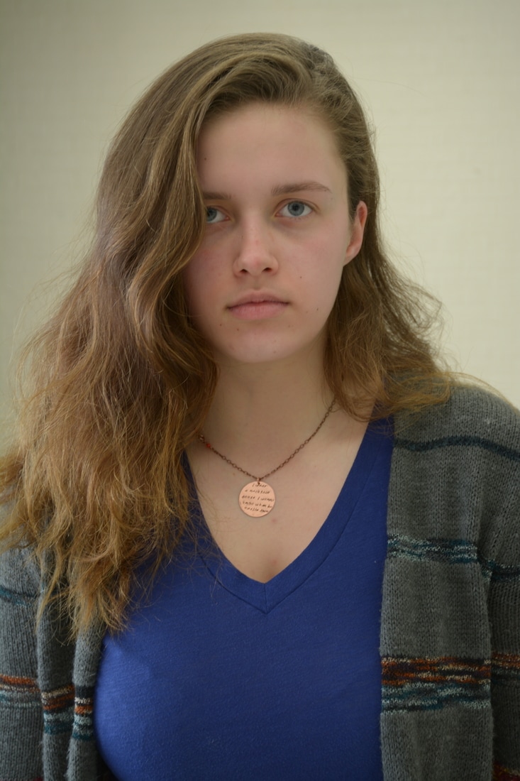
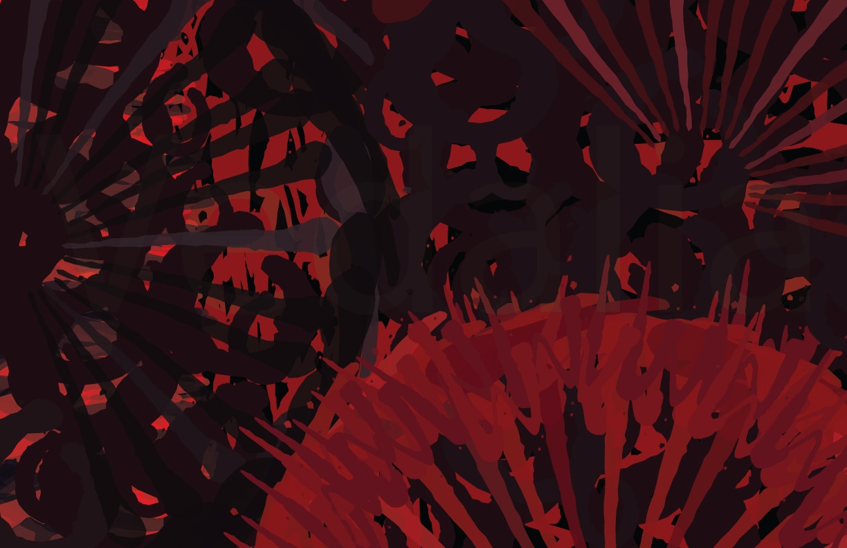
The theme I decided for my Movement pieces was domestic abuse. I was inspired by the Take Back the Night march in Ithaca, held by the Advocacy Center, that I volunteered at a few weeks prior. Domestic and relationship abuse is so common yet it is rarely talked about and is often seen as taboo. I originally wanted to create a piece I could use towards my concentration for AP art which is surrounding women’s empowerment but this theme came to me while gathering visual research and I felt like running with it. I used movement in the piece to signify a struggle as well as fear. It’s a tryptic and each photo portrays and uses movement in a different way - all pertaining to the theme. The first signifies an internal struggle to escape the confinements of an abusive relationship. There was not much photoshop used, I just adjusted the photo using levels, contrast, and brightness. The face looking up and the face looking down was create using a slow shutter speed on the camera. I also used the burn tool to intensify the hand bruises around her neck, which I made using purple lipstick and brown eyeshadow. The second was the only one I used photoshop to combine photos in. I used three photos taken with normal shutter speed and combined them using overlay and layer masks. This created a different look; the movement here is unique to the previous photo. It shows reflection as the woman touches the bruises on her eye and neck which became less visible with the additional layers. The black eye was made more visible using the burn tool as well. The last photo was altered using levels and brightness and contrast. This photo is striking because of the evident fear in the woman turning her head, it looks as if she is whipping around to face something or someone. This photo was also taken using slow shutter speed. Together, the three photos demonstrate the narrative of an unhealthy relationship of abuse, fear, and entrapment.
0 Comments
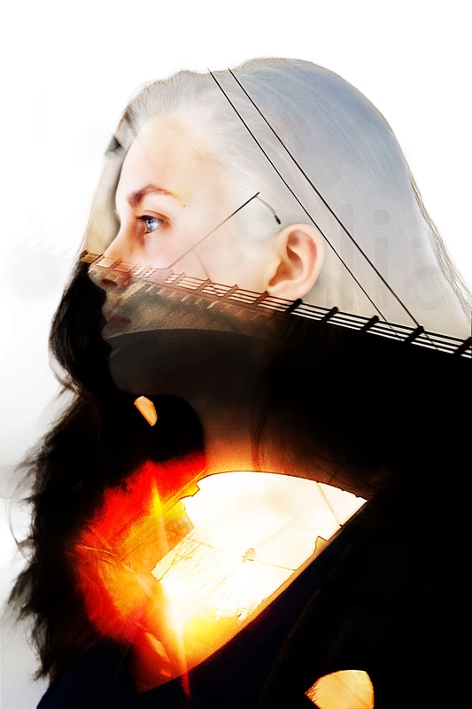
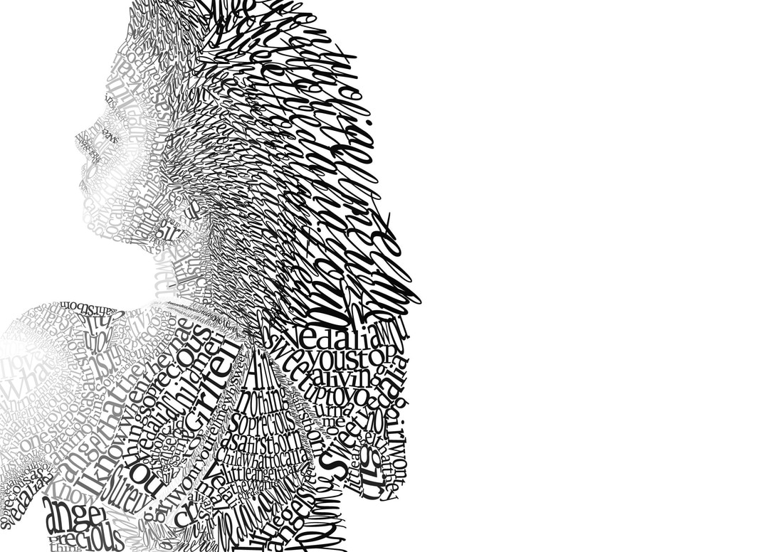
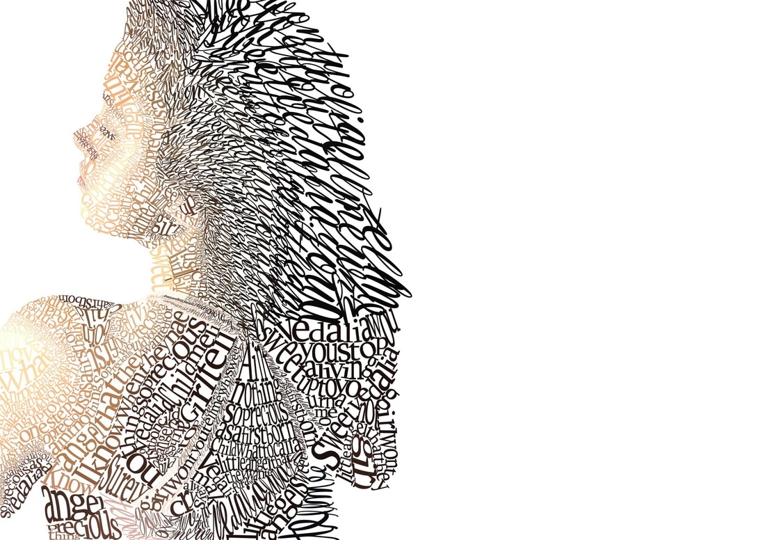
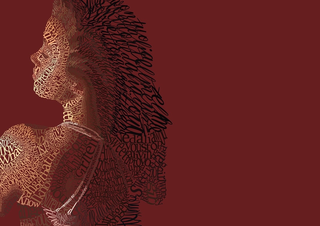
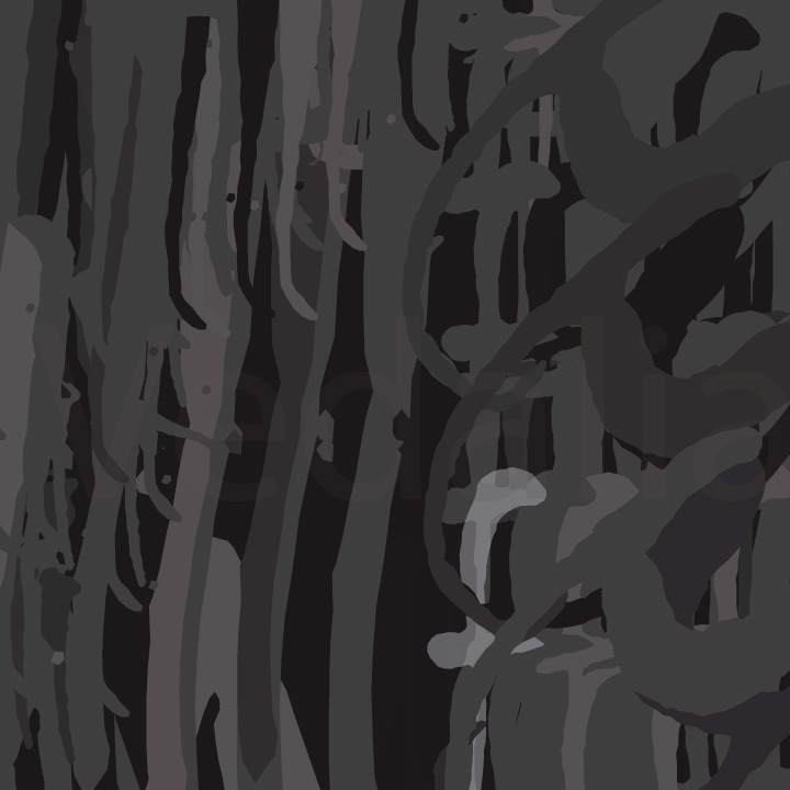
The narrative of my piece was the concept of Heart vs Head and the internal struggle of choosing which to follow. This is evident in the divide made by the bridge, leaving the head in the clouds and the heart or bottom half of the figure more dark but with emphasis on a bright light. Personally, I tend to lead by my heart and that is not always the best way to go. However, that is why the chest is so bright, it symbolizes letting the heart take over and rule the body. About 3/4ths of the figure is covered by the darkness of under the bridge which is the symbol of heart, making the piece much more personal to me as that is how I am. Though, rational thought is, I believe, much more valued in society. Thinking problems out before acting is usually the way to produce the best results out of life and everyone has the ability to step back and think. Because I am less likely to do so, the clear, unmuddled sky which represents rational thought takes up less of the piece.
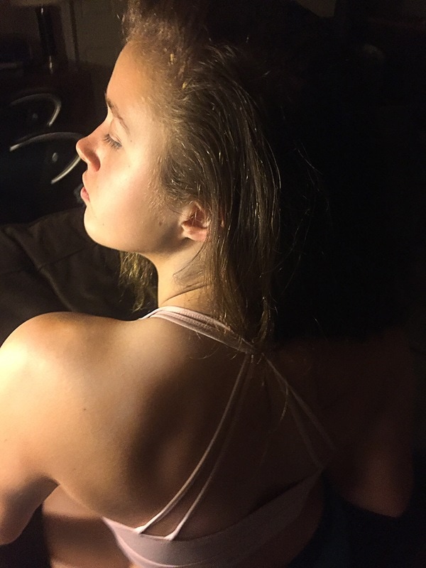
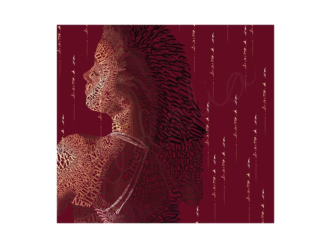
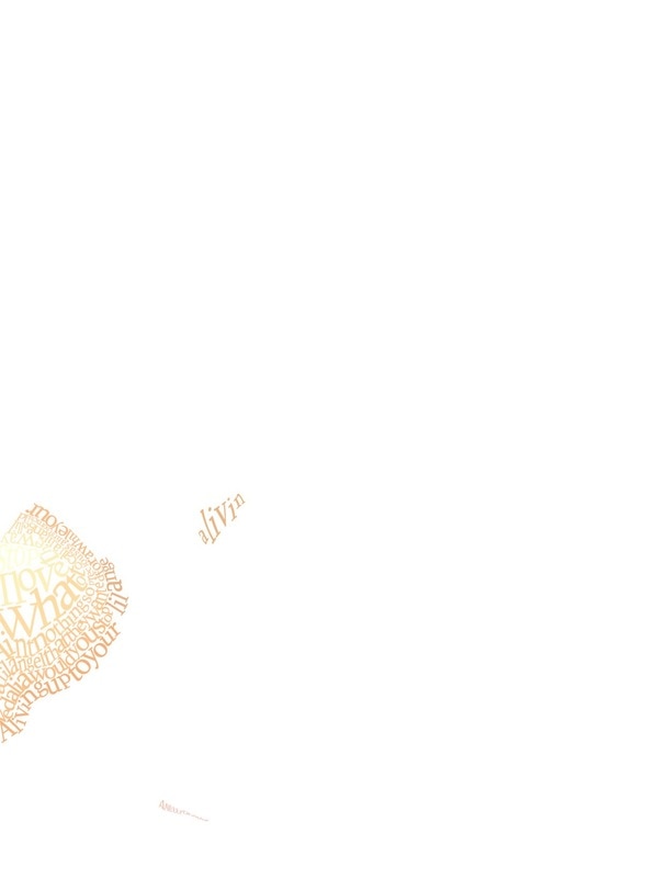
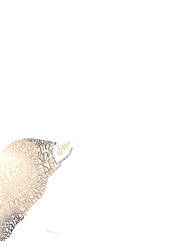
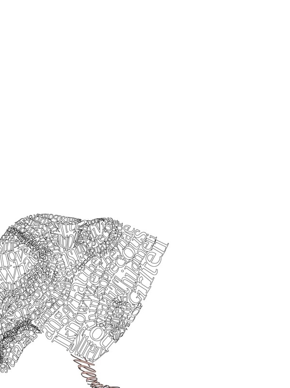
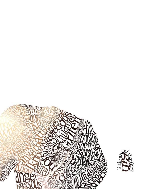
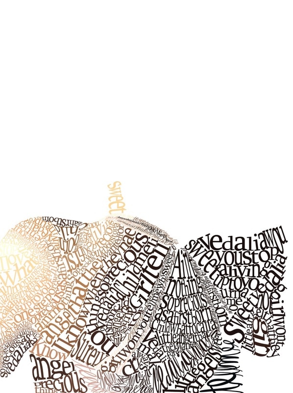
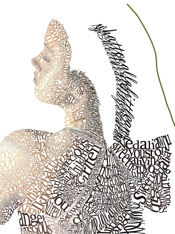
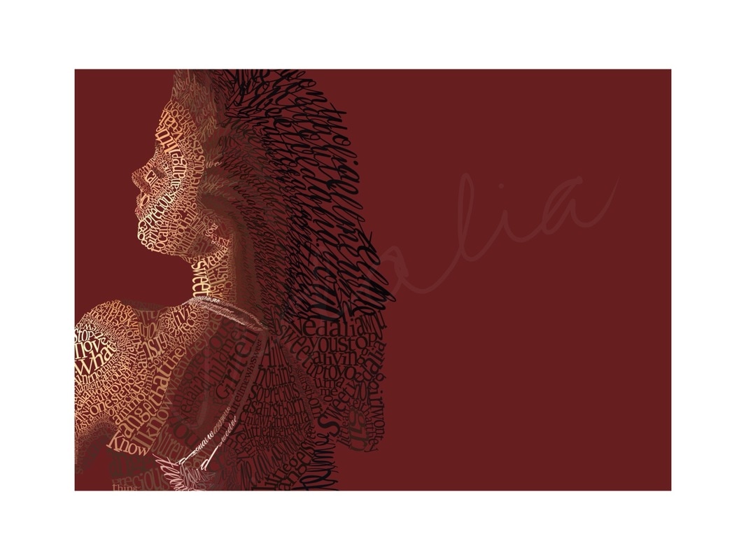
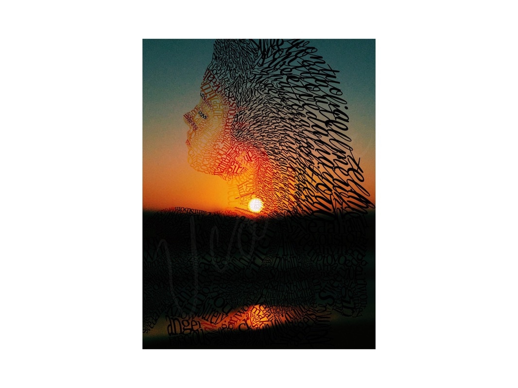
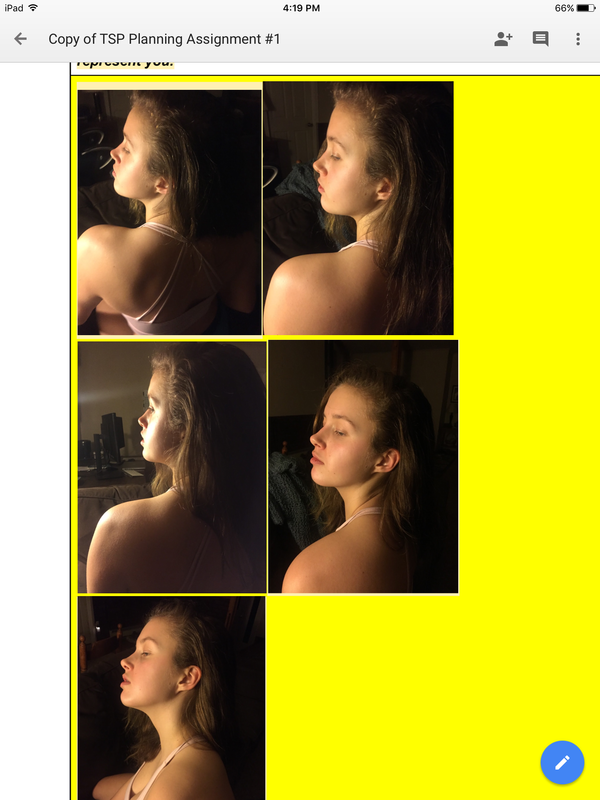
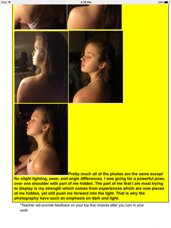
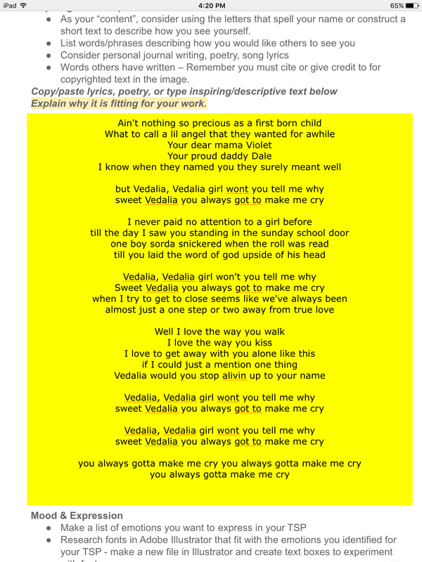
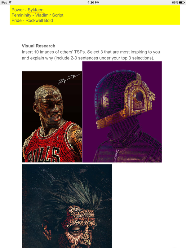
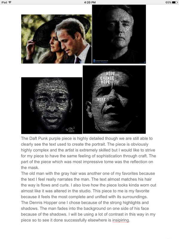
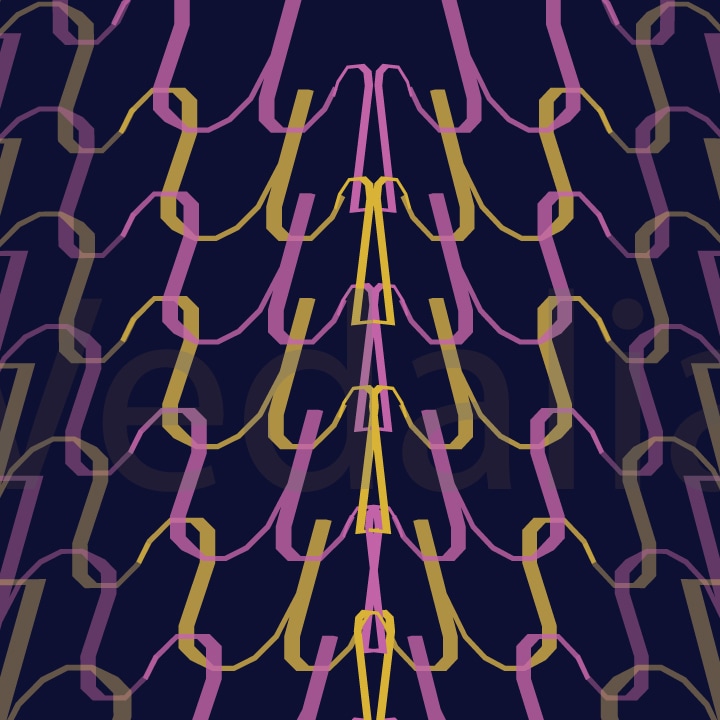
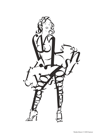
Contrast between the dark of the bridge and the vibrant blue sky communicates the exponential differences in the results of being ruled by heart or by head. Head creates more planned and well thought out results, whereas heart becomes muddled and complicated. On top of that, the contrast between the darkness around the growing bright light on the chest is another symbol in itself. Generally, letting your heart rule your life is looking down upon but in the end, heart is all we have. This is shown in the darkness surrounding the bright light emphasized in the center of the chest. The light expands throughout the chest and spreads across the black showing that heart with persist nonetheless. For this piece, I wanted to convey myself in a contrasting way. I planned on contradicting myself in many different ways such as in the photo I chose to create my piece around. The photograph I chose out of all of the photos I took for the project initially because I was drawn to the high contrast of dark and light on my body and the slightly overtop camera angle. The fact that it was not just my face was another reason I chose it because I was looking for a complete picture of me to create. In actuality, more of my face and my front was hidden because my back is to the camera. I liked this aspect because it felt as if some part of me was hidden, and it made the photo that more intriguing to me. I initially was drawn to three different fonts which I felt portrayed different emotions. I definitely wanted to use vladimir script because it was a very feminine and beautiful font to me. I wanted to use that font for only the specific lyrics, “Sweet Vedalia, girl won’t you tell me why you always got to make me cry” because it was a “sweet” font to me. I chose to use this font and lyrics only on the bra and the hair parts of the photograph. The second font I chose, Syfaken, was more clean and I saw as representing power. I used this for the rest of the portrait and found it to be substantially easier to work with. I used harsher quotes for this font such as, “Vedalia would you stop aliving up to your name”. For the portrait, I eyedropped all of the realistic colors from the photograph. The only additional color I used was the pink in the background which I thought brought out the portrait well, matched the pink in my bra, and fit with the term “Sweet Vedalia”.
To achieve texture in my project I used type on a path, especially in long continuous pieces of color like in the shoulder blade. My hair texture was due to the font that I used. I actually think that the font might have made my hair look too curly, but what is successful is that it looks like hair. In places that needed more form like the top of the shoulder and the face. It was more effective in making the text more rounded to fit the body parts. In terms of value, my there is a large range due to the photo that I chose. There are extreme lights in on the left side which is also where my face is towards. And on the right side, covering a majority of my back are very dark values. I liked this extreme contrast that I accomplished by using the actual colors in the photograph. Compositionally, I placed myself on the far left side of the page, which created more negative space in the back of me.The amount of space around me representative of something bigger than me even though all of the text is celebrating me and highlighting my importance to the people in my life -- Its contradicting which is something that I tried to do in much of my piece (contradict myself). In the negative space I placed “daggers” made out of a rough edge I cleaned up off of my left arm. They were in contrast to the “Sweet Vedalia” theme, and were visually pleasing to me. At first creating the piece was harder and took more time because of my unfamiliarity with the tools like type on a path and especially envelope distort, but it got easier to do things quickly as time went on and with more practice. I thought I would not finish in time for the deadline but when time became limited I set daily goals for myself in class and even if they were not completely accomplished each day it made me work faster towards a goal and I owe my finishing on time to this motivation. Also because of this, I didn’t have to spend any time outside of class creating the actual project. I did plan outside of class gathering visual research, photographs, and brainstorming the composition. Creating the piece, I used a lot of type on a path and spent time fitting each letter into its perfect space which was time consuming and not even necessary. I continued to do a lot of that but spent less time fine tuning each individual letter. With bigger spaces envelope distort made things easier. It took some time however trying to make the words fit through trial and error, but mapping out the spaces needed to be filled ahead of time made things go by faster. After this project, I am much more confident in using illustrator. In addition, I feel that I learned perseverance as during points didn't think i would finish at all, but I stuck with it and ended up with a piece I am very proud of. One aspect of the art which was a challenge was displaying the dark spaces on my back and my hair. Although I wanted the contrast of values, the dark was hard to compose as there were no variety in darks just huge black spaces which were difficult to communicate with text. Overall, I feel very accomplished after finishing this portrait. I feel that the contradictory pieces are representative of me as person -- complicated and not just one thing. I feel that was communicated successfully through this art. Process:
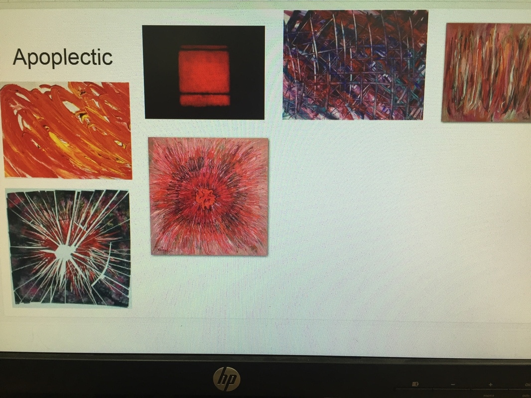
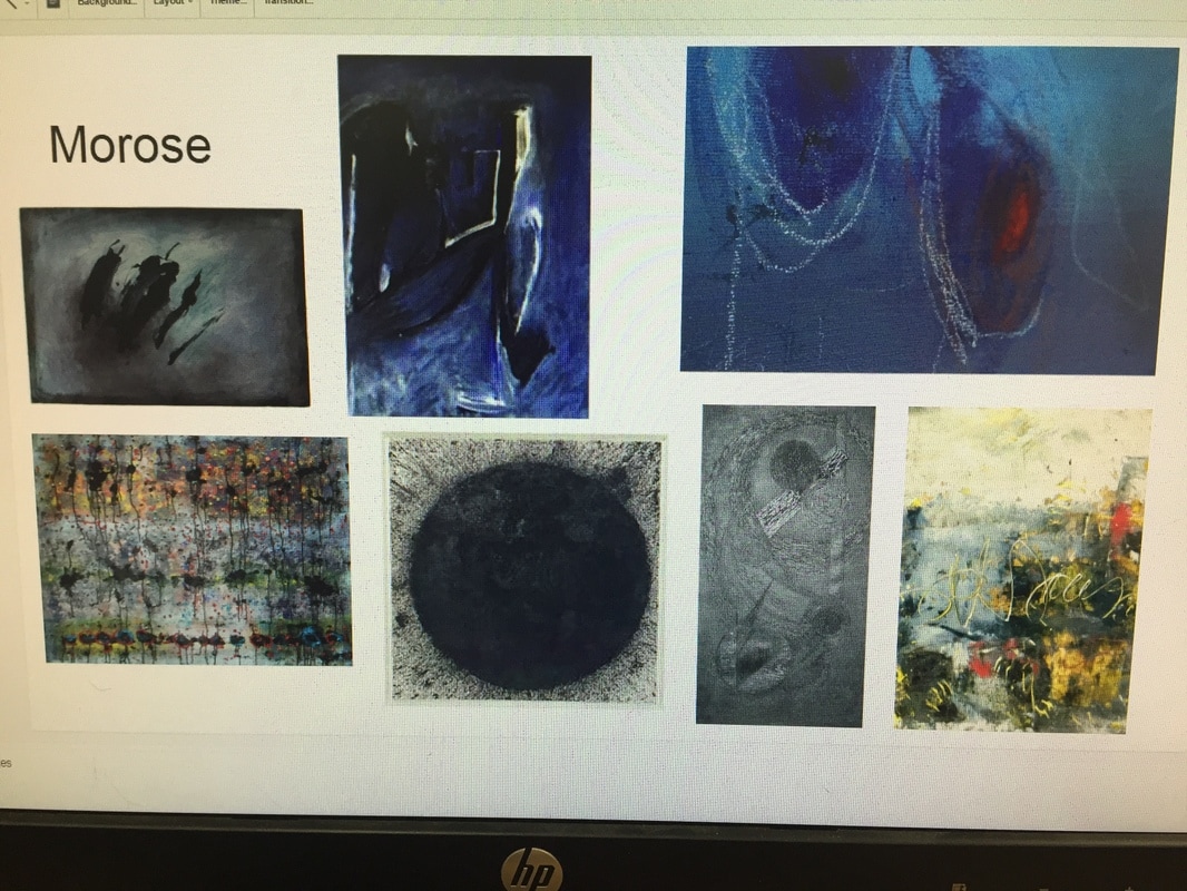
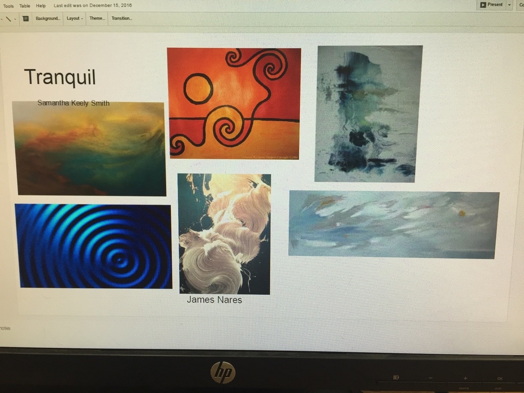
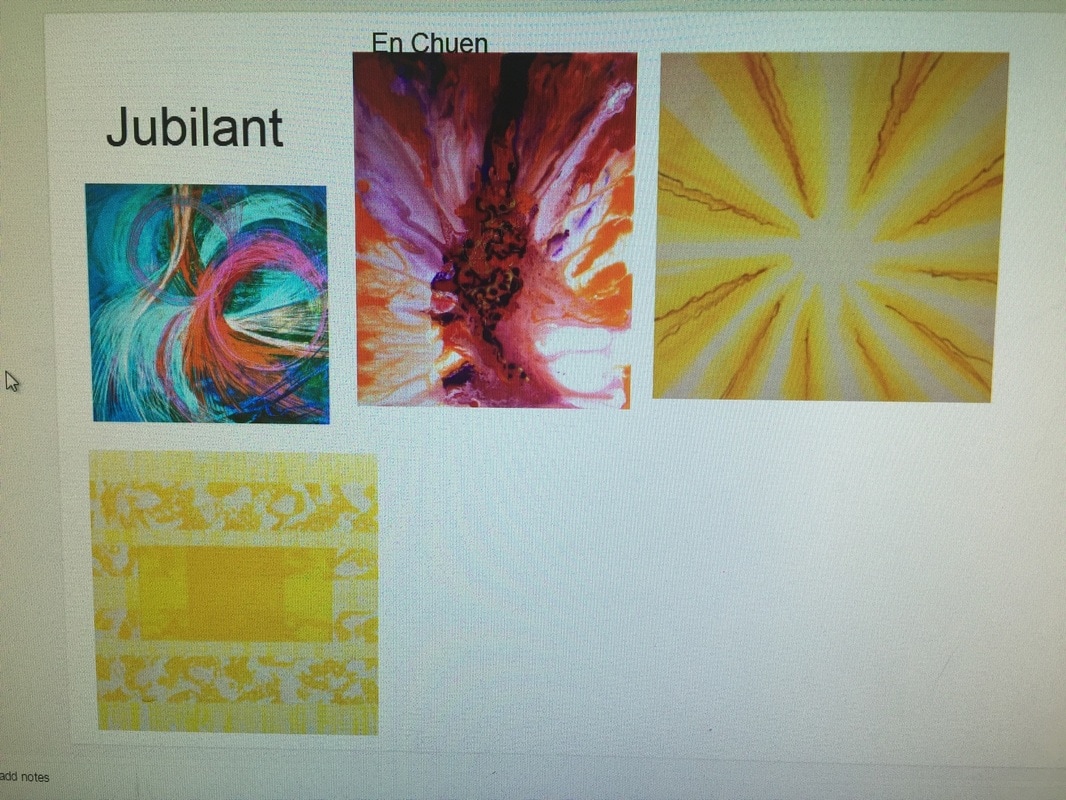
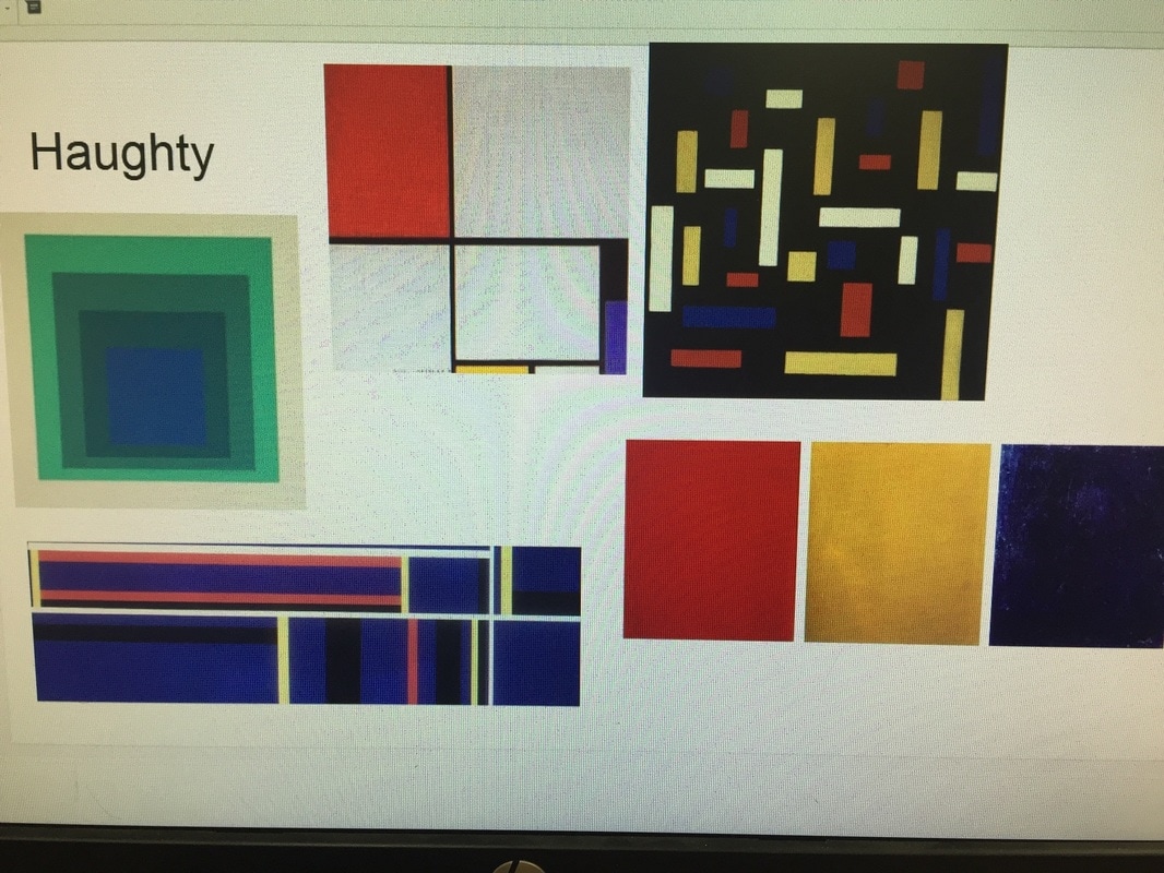
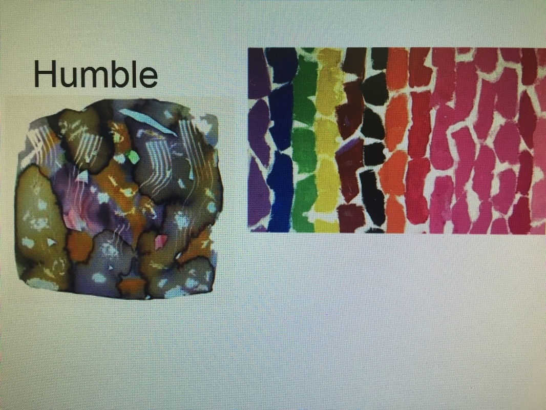
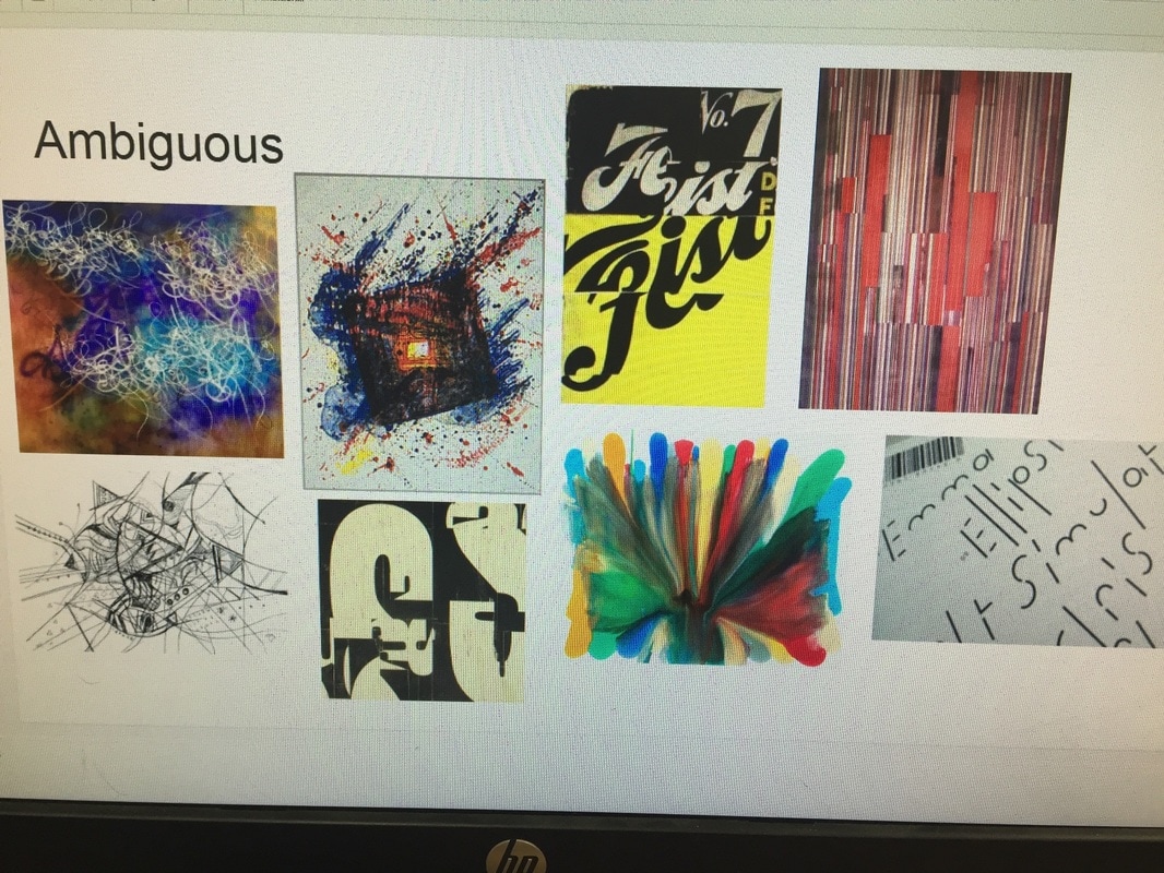
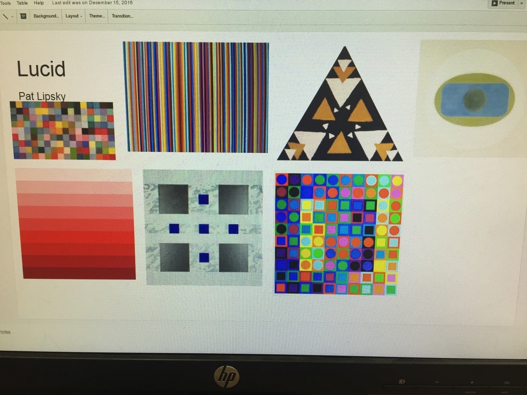
To get our minds into preparation for this project, we were forced to hear a description of all of the words. Apoplectic, tranquil, morose, jubilant, haughty, lucid, humble, and ambiguous, and with oil pastel non-objectively express them on a page. After, we did visual research, looking up artist movements such as color-field painting and lyrical abstraction. The images I gathered that inspired me are shown in the process pages above. Then, we experimented with every single word, making quick designs for each one as samples by choosing fonts we saw fit and experimenting with illustrator effects. Some of them I really liked, so I continued on with them for my final pieces, such as tranquil. We chose two word pairs, I chose tranquil and apoplectic, and humble, and haughty. Then I developed more in depth illustrations for those pieces for my final. Question: Describe the relationship between the fine art non-objective art movement and the graphic design world’s Typography movement (specifically, design with type or letter forms). How are these two similar? How are they different? What do you see as a major commonality between them? Specifically in your work, where is the connection? The non-objective art movement brought a focus to pieces that depicted a mood or emotion without the use of coherent objects. To do this, there was emphasis on the use of color, shape, line, proportion, and movement to convey a desired theme. In the same way, typography conveys a concept through type. Non-objective design with type focuses less on the creation of words, but random letters to do this - this is the most closely related to the art of the non-objective movement and this is how I created the pieces above. In other realms of typography, placement of words/letters, colors, opacity, and graphic design principles such as overlapping, illusory space and positive and negative space are utilized. Both movements, capture certain emotions or moods, solely through the use of art and design principles rather than the depiction of objects or people. Speaking upon my two specific word pairs, tranquil and apoplectic, haughty and humble, I started off with my tranquil solution. I took inspiration from water, and flowing paint strokes. I layered rounded letters on top of each other and made it look flowing and fluid, using only cool colors and changing the color of each letter gradually and sporadically, lowering the opacity as I did so. I also added a dark, but still cool toned color in the background for some contrast and to made the transparency of the letters pop more. For apoplectic, I used a sharp and splattered font to create spikes and chaos. I used dark colors, black and grey and many different reds to convey anger. This is by far my favorite solution because of the repetition of the wheel like figures and I feel as though the mood was efficiently conveyed. I started off wanting to create the word pairs morose and jubilant, so I started with morose. It took me awhile to get started but after doing visual research on the word, I took inspiration from foggy, rainy windows. I used the same font as I did for apoplectic because the letters were long and dip-like. I used many different colors of blue, grey and black. Then I moved to jubilant and found great difficulty in conveying the feeling. I ended up making pieces that were more haughty than jubilant which is odd because during the planning stages, haughty was by far the hardest word for me to convey. I ended up with a really successful haughty solution so to match it, I altered my morose a bit. I changed the ranges of blues to ranges of grays and black. It surprisingly altered the piece successfully to humble, so I was able to complete my word pair.
Process:
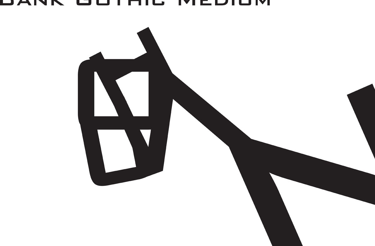
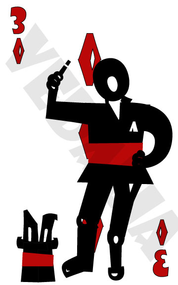
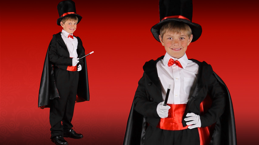
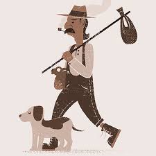
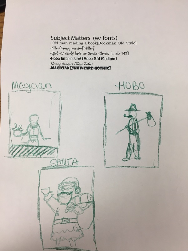
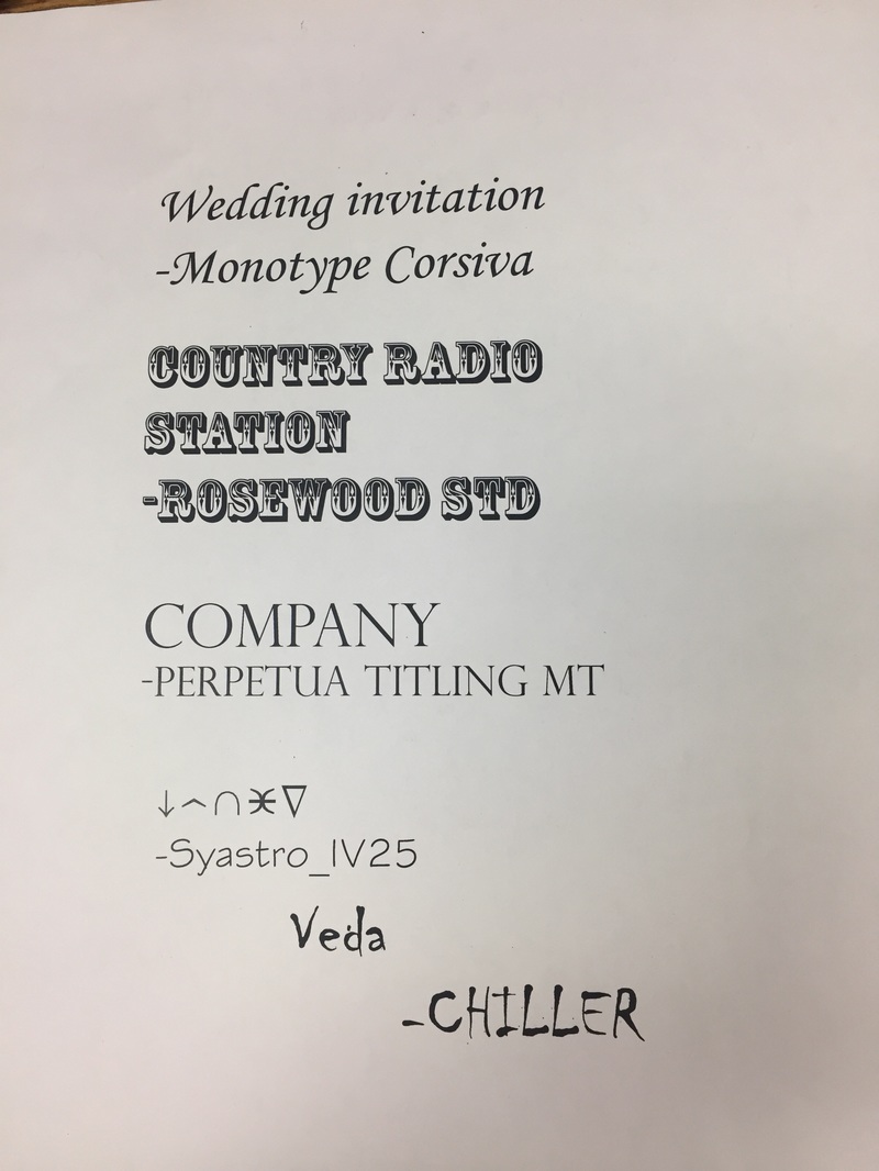
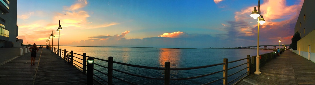
First, I did some visual research of previously created font bots by searching "font bot" on google images. Then, I typed a brainstorm list with pairing fonts and subject matter themes on Illustrator. Then I sketched out some of my favorite ideas I had. When I finally decided on a magician to pair with the font "Showcard Gothic" I took a picture fo my friend in the same pose I wanted my figure in and began working on the final piece. Questions: How did you decide on the theme of your Font Bot? What visual characteristics does your FontBot have that support that theme? What Illustrator tools were most useful to you? Explain. To decide on my theme, I scrolled through the fonts available and paired them with possible themes according to their visual quality but mostly with the names of the fonts. I came upon Showcard Gothic and immediately thought of a magician because of card tricks and when they say “show me your card” hence, Show-Card. I also had the idea to do a hobo with Hobo Std Medium. Because I thought it would be fun to try and create a prop to go with my figure, I chose to do the Magician because I liked the idea of creating a bunny coming out of a hat. To successfully portray a magician, I decided upon the color scheme of mostly black with accents of red because those are the colors of traditional playing cards as well as the colors I believe are most associated with magicians in their clothing and props. Therefore, my figure is wearing a black penguin tux with a red sash and his hat has accents of red as well. I also added in props such as the bunny popping out of the hat and the wand in his hand to go along with the magician theme. I specifically used the Q to create his head and hair because one of my photo references that gave me ideas upon what a magician looks like showed a man with long slicked back hair, and the Q’s tail created that hair. Lastly, the background of the piece is a card, the three of diamonds, because my lucky number is 3 and when I attempted to create all of the different symbols, the diamond came out the best, in my opinion. The illustrator tools which were most useful to me was what allowed me to flip and rotate the letters. Because we were unable to stretch or distort the letters, we had to become creative in which letters to use and where. I ended up flipping many in order for them to fit in places that others did not. Also, I merged the diamond which I had to repeat 5 times identically in the background which made it so I did not have to create a new diamond every time, I could just copy and paste the shape, which cut down my time greatly. Process: To brainstorm and ultimately find a theme, I began by looking through the photos I have taken on my phone and wrote down ideas as they came to me. Then I developed a basic idea of what I would include on each page of the zine and sketched different ways they could look once I created them. I narrowed down the photographs that I would like to include in the zine and started there. I faced some roadblocks along the way with page placement because I wanted my zine to be put in chronological order by the date the photos were taken, but I planned on putting one specific panorama photograph on the 4-5 full page, so I had to make sure I included just the right amount of photos from dates before and after that panorama.
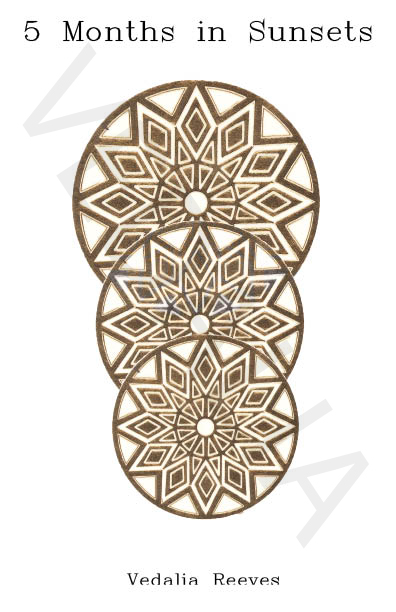
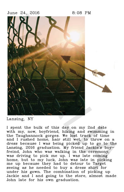
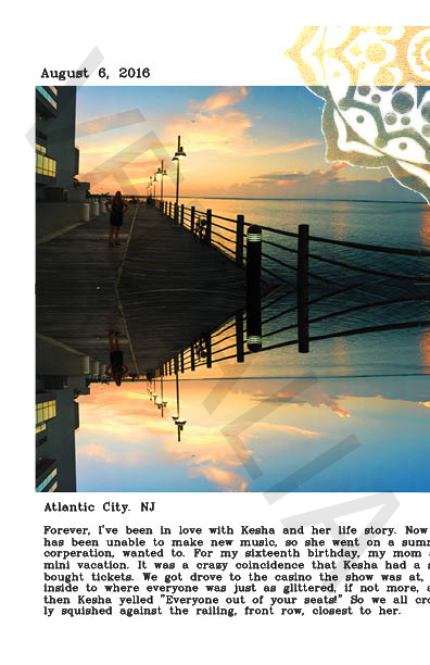
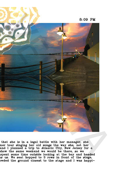
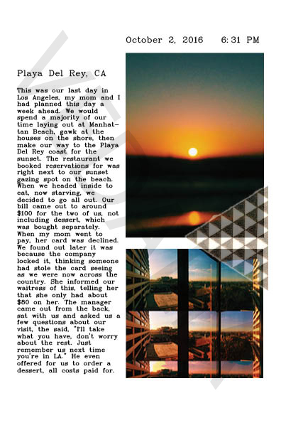
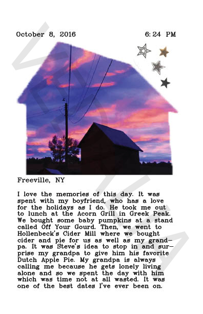
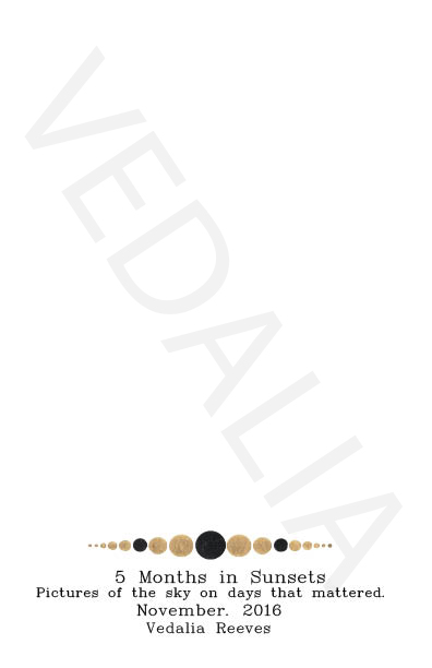
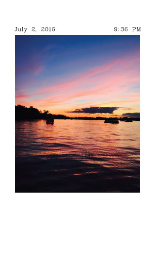
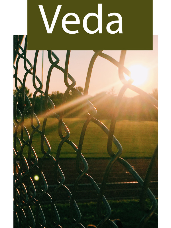
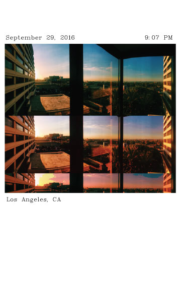
Reflection: Selecting a theme for my zine was one of the most difficult aspects to the project. Because it had such open ended criteria, tons of ideas raced through my mind and I honestly wanted to do them all. However, most of my ideas had overlap such as photography of sunsets, and vacations. So, combining a couple themes seemed to make the most sense. I ended up with the theme, the last 5 months in sunsets, where I’d have the picture of the sunset, date, time, and location, and write a little journal entry about that specific day. Although the open endedness caused me to struggle at first a bit with sticking to one specific theme, that broad freedom to choose what we were passionate about for the project was the part of the project that I liked the most because it gave me intrinsic motivation to put effort into the zine. There were very few requirements which allowed us to branch out into our different zones and as a result, nobodies zine in class was remotely the same. Through our different themes and processes, each person was individually able to show their personality through the pieces in the book. Throughout my zine, I attempted to utilize the graphic design principles wherever I could. Framal reference is the used on the title page with the 3 gold tattoos that roughly represent a sunset by their continuous overlapping descension and the fact that they’re getting smaller as they get lower on the page. On every page of the zine, I added a gold tattoo to further unify the pages. On the majority of the pages I overlapped the tattoos with the photographs and played with overlay edits so they weren't all the same on each page. As a designer, this project greatly increased my ability as well as comfort with the computer programs Indesign and Photoshop. At first, I had great difficulty finding my way around editing photos, selecting tattoos, cropping, and virtually most of the tools necessary to make my project visually appealing. After much practice and tons of help from Ms. Stratton, I now feel as though I have a largely better grasp at techniques and tools used through the programs, as well as problem solving
Reflection:
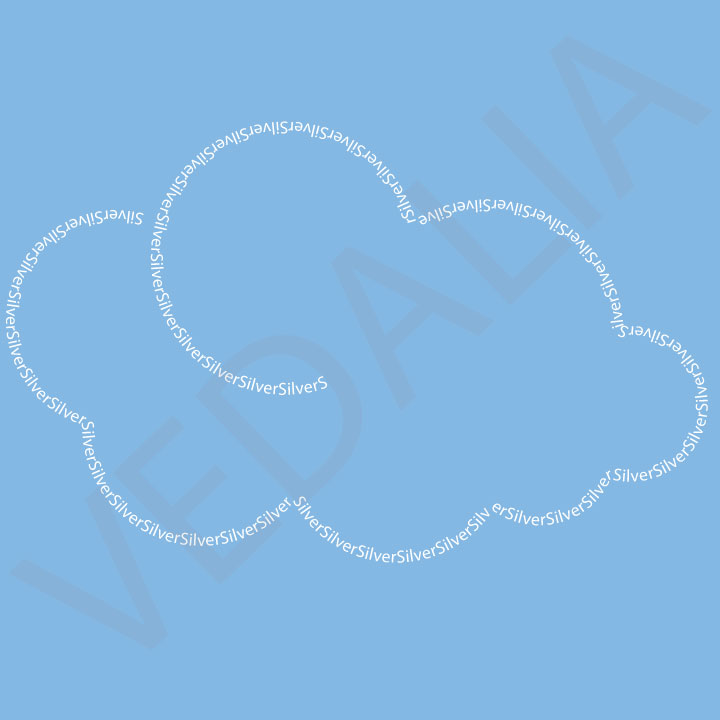
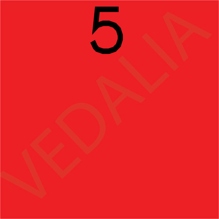
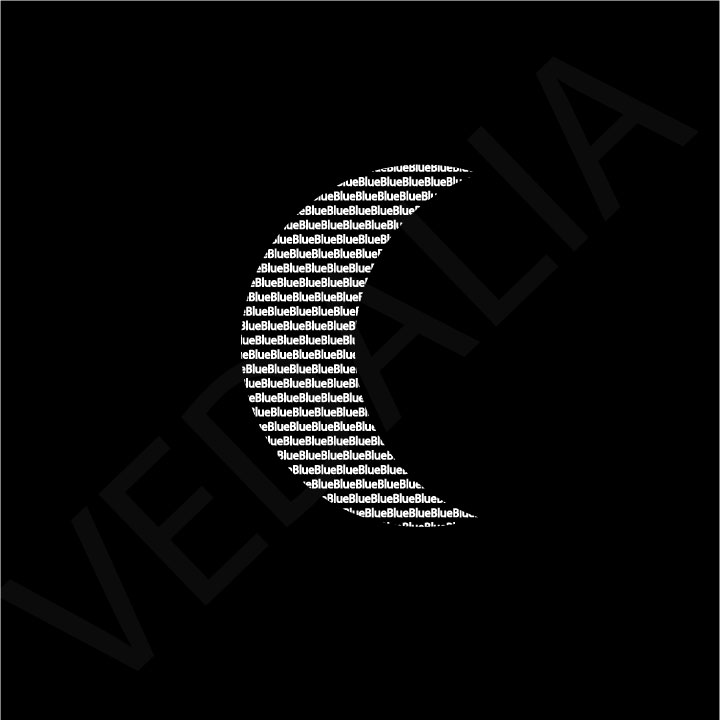
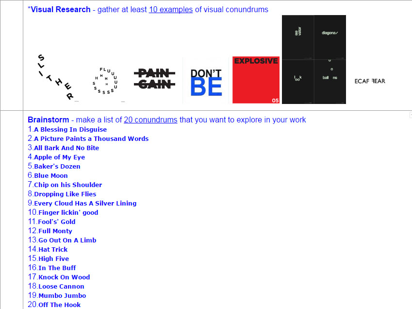
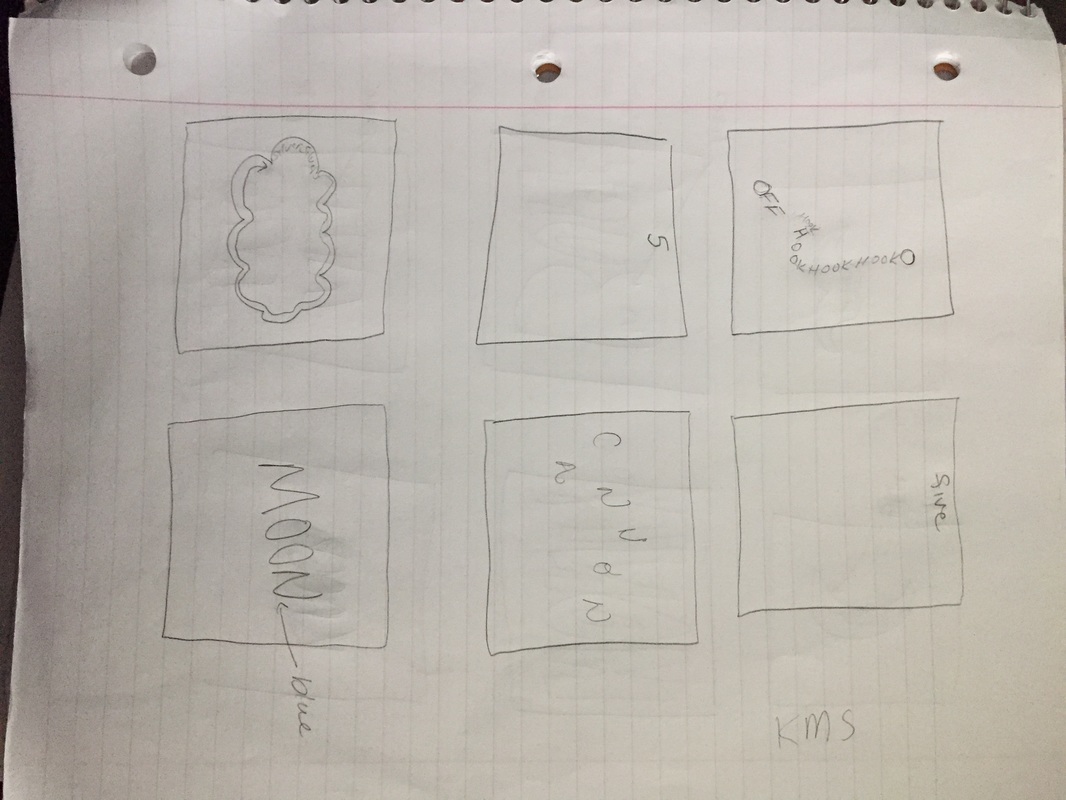
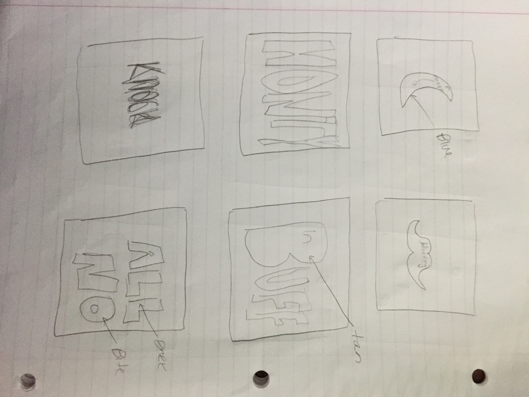
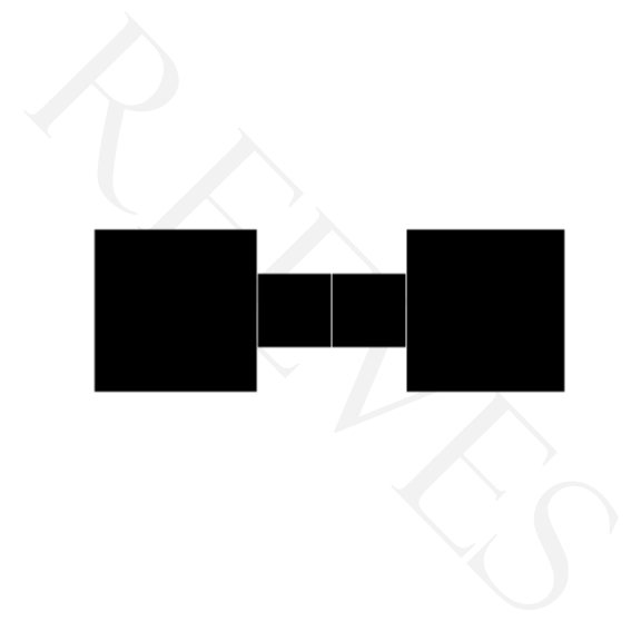
I attempted to incorporate the graphic design principles in each solution I made; I even added more after the class brainstorming session when we put post-it notes with principles the solutions displayed on the photographs and I only got 4. The “High Five” solution illustrates the use of framal reference as the number 5 is at the top of the page, hence high 5. After the session, I changed the background color to a bright red to create contrast with the black letter. In the “Full Monty” I touched many of the letters together and filled the page with the text by making it thicker and more “full”. I also incorporated contrasts easily in many of the solutions I created by simply adding pops of color. In my opinion, my most successful piece would be my “Silver Lining Cloud” because of three reasons. One, it was the solution that I demonstrated by far the most graphic design principles. There is overlapping of the cloud truffs, illusory space, illustrated by the overlapping and even some contrast with the blue background and white letters. Two, the solution illustrates that I am able to complete a complex, multi-step process.I first had to create the cloud with many circles and merge them all together, then I made the text follow the outside lines of the cloud. Which leads me to the third reason, I did not see any other student use text in their solution the way that I did by outlining the shape. Therefore, I saw this solution out of all of mine,by far the most unique. Process: First, I searched visual conundrums on google images and found an artist, Harry Pearce, who is very successful in creating these so I searched his name. I gathered 10 photographs, most of Pearce's works but a few outliers as well for visual research. I then searched “idioms” and found a website idiomsite.com, and wrote down my favorites as well as one’s I off the bat came up with solutions for, and added them to my brainstorm list. After I had done the online research aspect, I began to sketch the solutions that first popped in my head and following, wracked my brain to sketch even more solutions that were out of the box for the idioms I found. I then picked a few out that I was really excited about and started creating the solutions on illustrator. ique.
|
AuthorWrite something about yourself. No need to be fancy, just an overview. Archives
May 2017
Categories |

 RSS Feed
