|
Process:
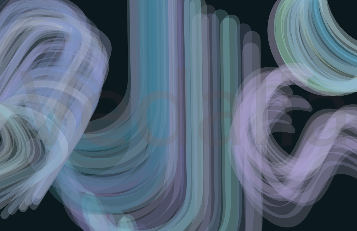
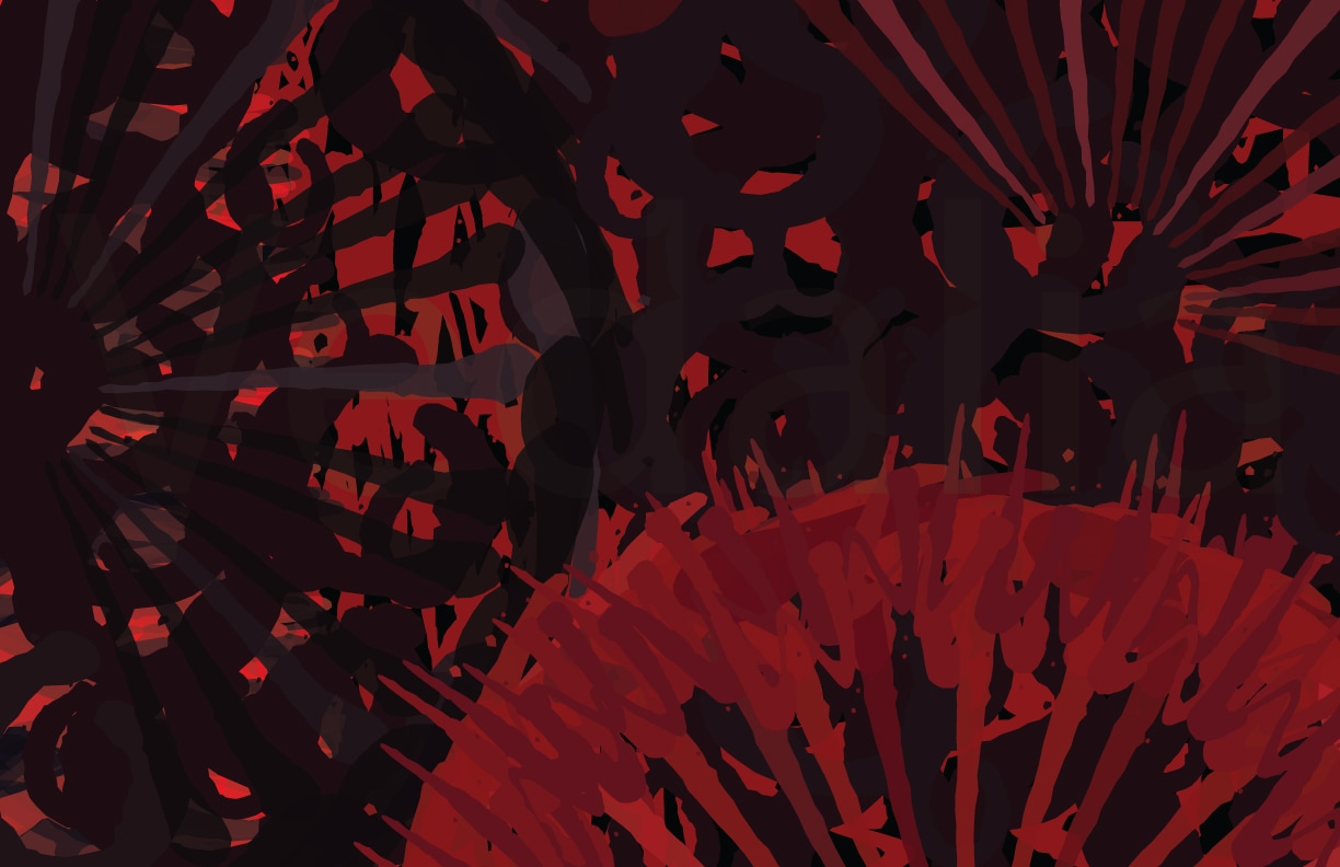
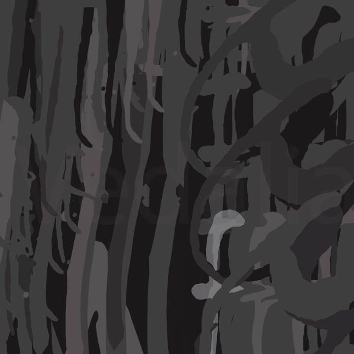
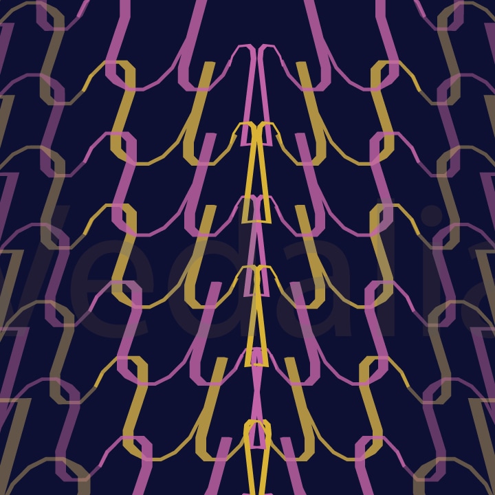
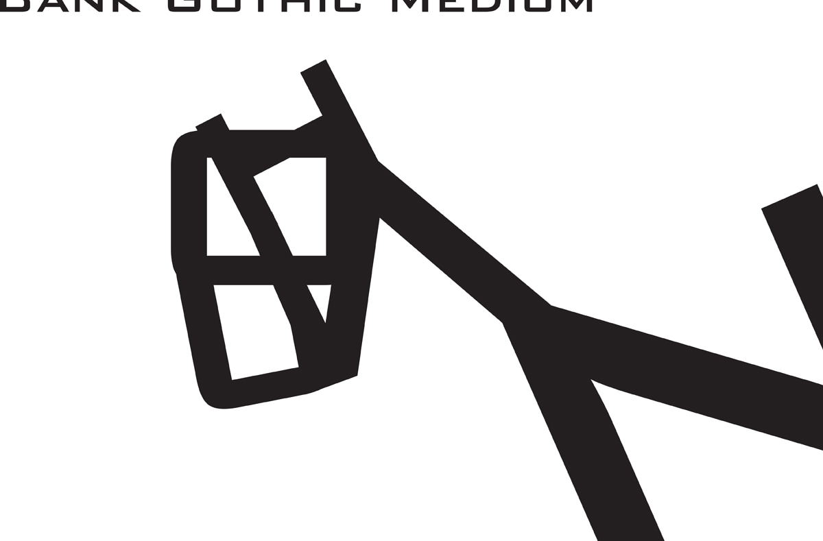
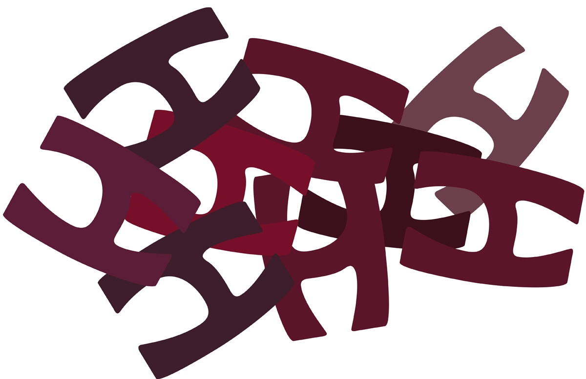
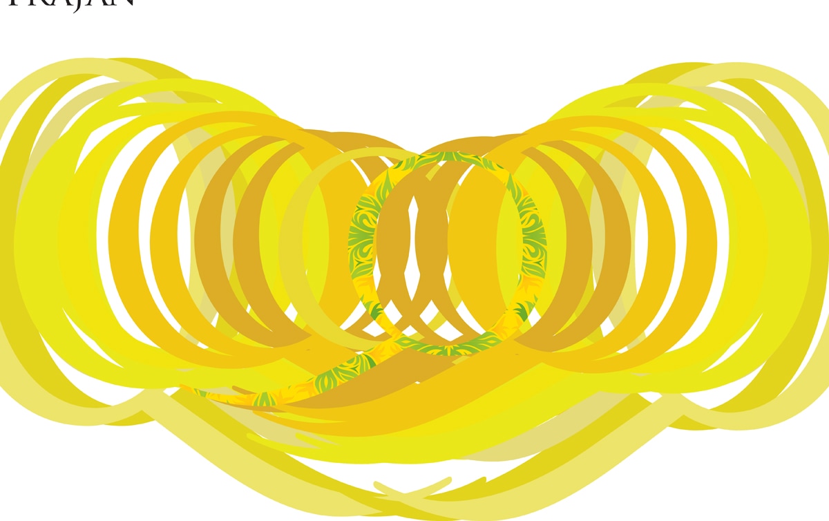
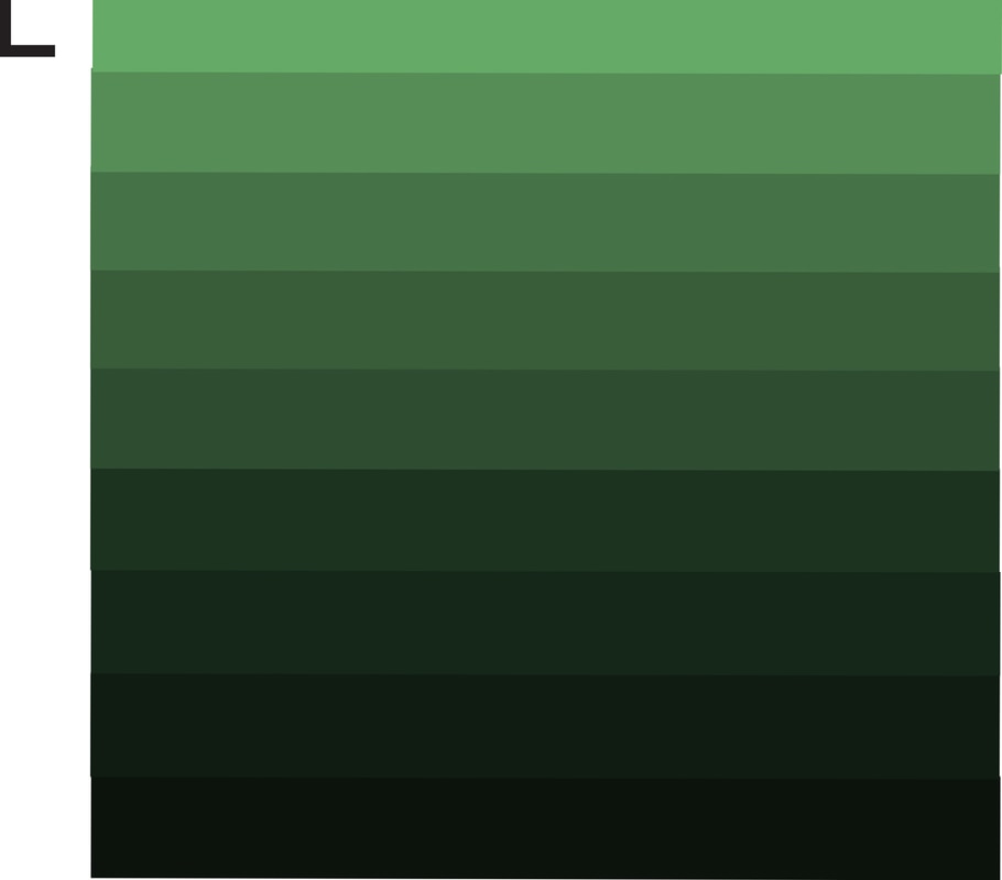
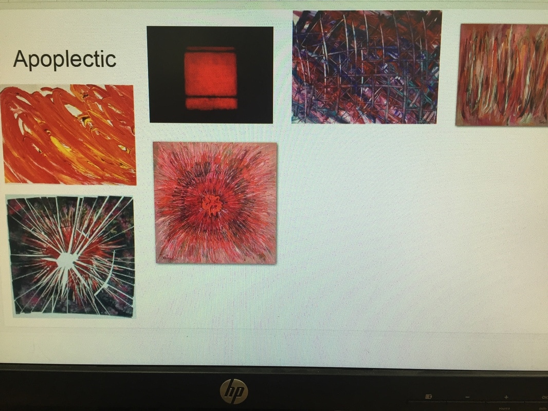
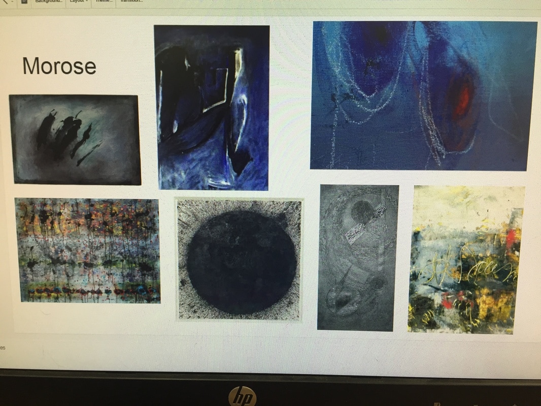
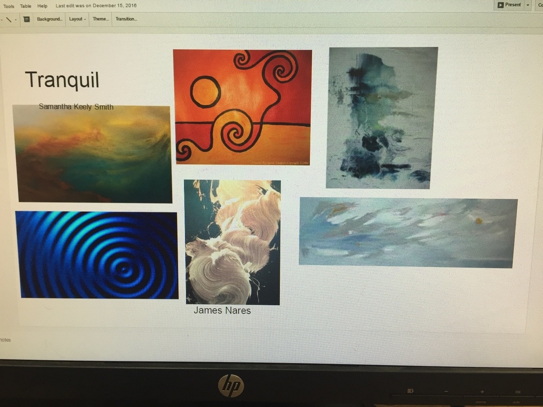
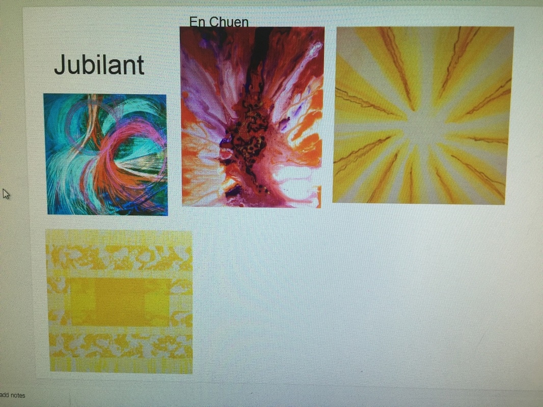
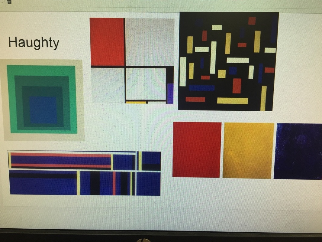
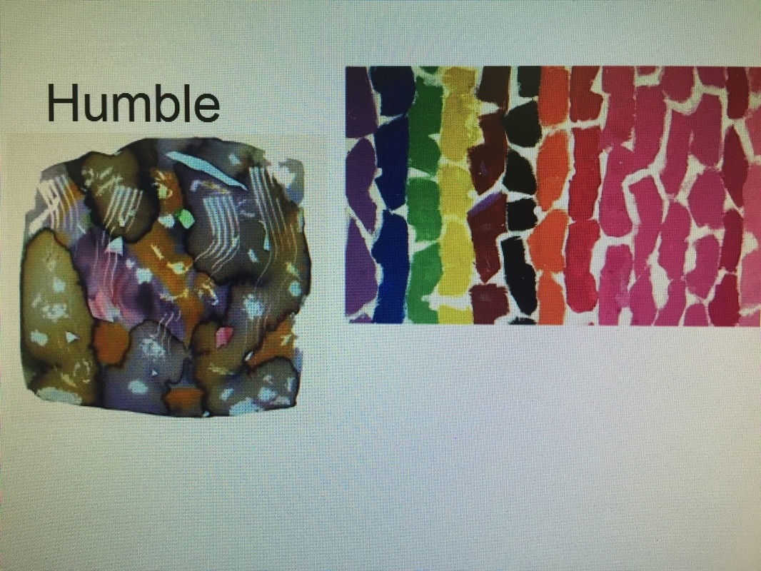
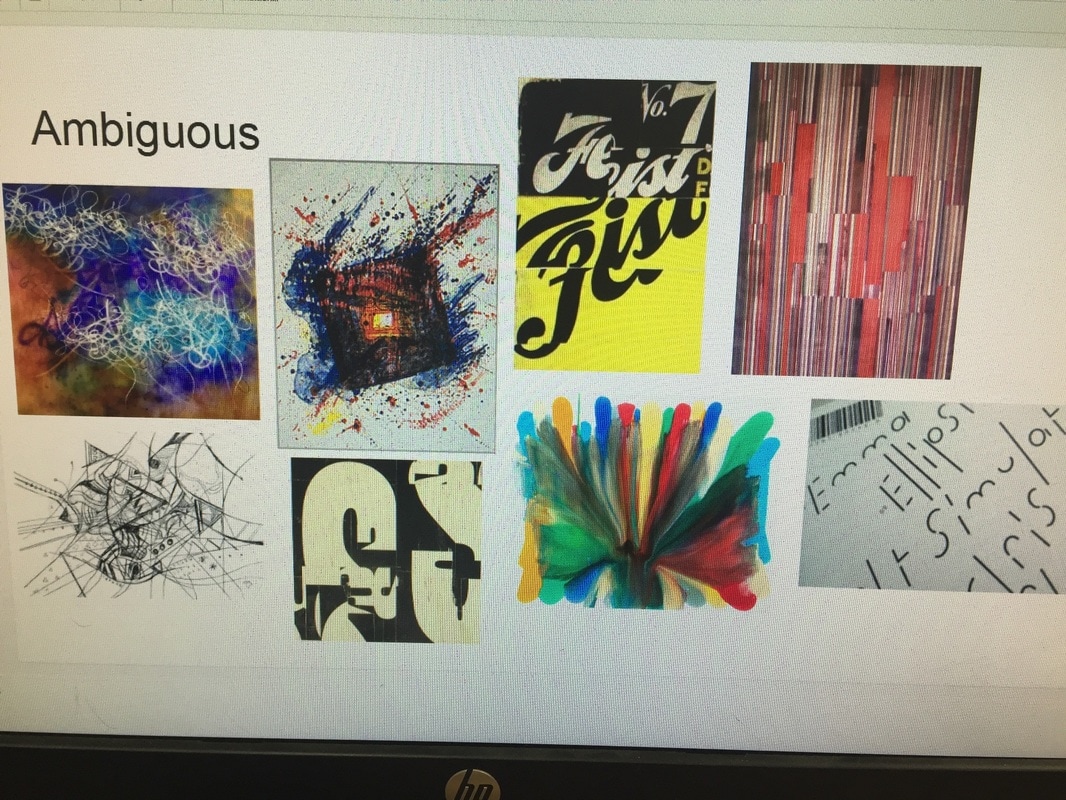
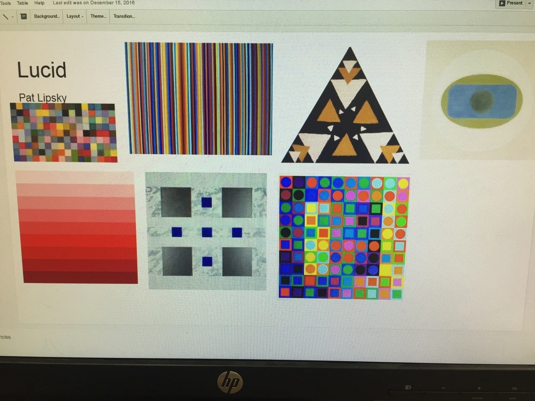
To get our minds into preparation for this project, we were forced to hear a description of all of the words. Apoplectic, tranquil, morose, jubilant, haughty, lucid, humble, and ambiguous, and with oil pastel non-objectively express them on a page. After, we did visual research, looking up artist movements such as color-field painting and lyrical abstraction. The images I gathered that inspired me are shown in the process pages above. Then, we experimented with every single word, making quick designs for each one as samples by choosing fonts we saw fit and experimenting with illustrator effects. Some of them I really liked, so I continued on with them for my final pieces, such as tranquil. We chose two word pairs, I chose tranquil and apoplectic, and humble, and haughty. Then I developed more in depth illustrations for those pieces for my final. Question: Describe the relationship between the fine art non-objective art movement and the graphic design world’s Typography movement (specifically, design with type or letter forms). How are these two similar? How are they different? What do you see as a major commonality between them? Specifically in your work, where is the connection? The non-objective art movement brought a focus to pieces that depicted a mood or emotion without the use of coherent objects. To do this, there was emphasis on the use of color, shape, line, proportion, and movement to convey a desired theme. In the same way, typography conveys a concept through type. Non-objective design with type focuses less on the creation of words, but random letters to do this - this is the most closely related to the art of the non-objective movement and this is how I created the pieces above. In other realms of typography, placement of words/letters, colors, opacity, and graphic design principles such as overlapping, illusory space and positive and negative space are utilized. Both movements, capture certain emotions or moods, solely through the use of art and design principles rather than the depiction of objects or people. Speaking upon my two specific word pairs, tranquil and apoplectic, haughty and humble, I started off with my tranquil solution. I took inspiration from water, and flowing paint strokes. I layered rounded letters on top of each other and made it look flowing and fluid, using only cool colors and changing the color of each letter gradually and sporadically, lowering the opacity as I did so. I also added a dark, but still cool toned color in the background for some contrast and to made the transparency of the letters pop more. For apoplectic, I used a sharp and splattered font to create spikes and chaos. I used dark colors, black and grey and many different reds to convey anger. This is by far my favorite solution because of the repetition of the wheel like figures and I feel as though the mood was efficiently conveyed. I started off wanting to create the word pairs morose and jubilant, so I started with morose. It took me awhile to get started but after doing visual research on the word, I took inspiration from foggy, rainy windows. I used the same font as I did for apoplectic because the letters were long and dip-like. I used many different colors of blue, grey and black. Then I moved to jubilant and found great difficulty in conveying the feeling. I ended up making pieces that were more haughty than jubilant which is odd because during the planning stages, haughty was by far the hardest word for me to convey. I ended up with a really successful haughty solution so to match it, I altered my morose a bit. I changed the ranges of blues to ranges of grays and black. It surprisingly altered the piece successfully to humble, so I was able to complete my word pair.
1 Comment
Mrs. Stratton
1/24/2017 07:42:02 am
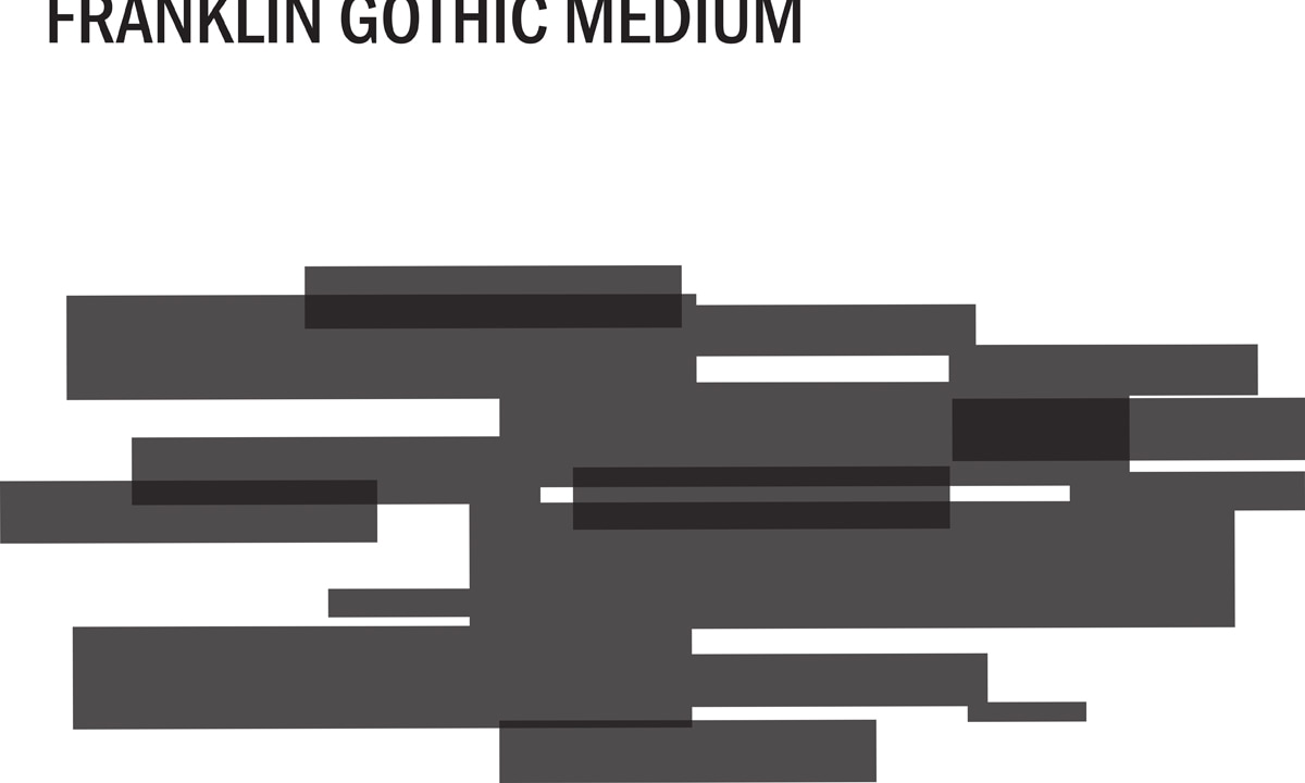
The experiment with the Franklin Gothic font has potential, also. I could see this going into a cover design. Leave a Reply. |
AuthorWrite something about yourself. No need to be fancy, just an overview. Archives
May 2017
Categories |
 RSS Feed
