Process:
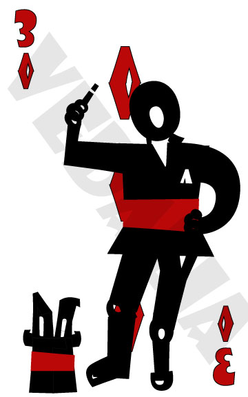
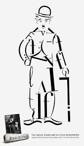
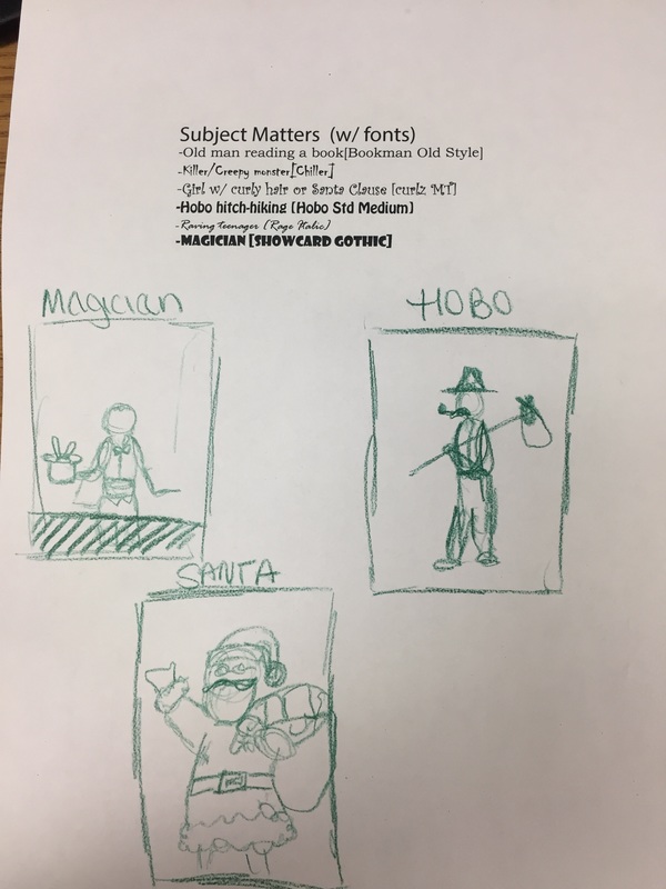
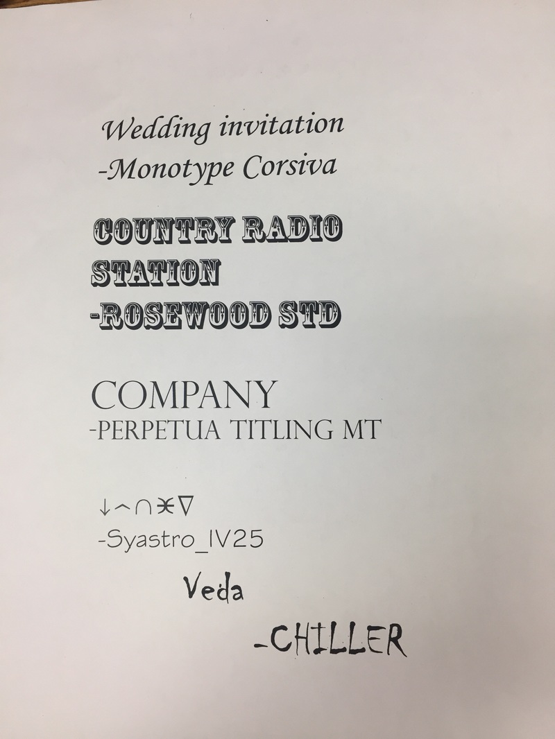
First, I did some visual research of previously created font bots by searching "font bot" on google images. Then, I typed a brainstorm list with pairing fonts and subject matter themes on Illustrator. Then I sketched out some of my favorite ideas I had. When I finally decided on a magician to pair with the font "Showcard Gothic" I took a picture fo my friend in the same pose I wanted my figure in and began working on the final piece. Questions: How did you decide on the theme of your Font Bot? What visual characteristics does your FontBot have that support that theme? What Illustrator tools were most useful to you? Explain. To decide on my theme, I scrolled through the fonts available and paired them with possible themes according to their visual quality but mostly with the names of the fonts. I came upon Showcard Gothic and immediately thought of a magician because of card tricks and when they say “show me your card” hence, Show-Card. I also had the idea to do a hobo with Hobo Std Medium. Because I thought it would be fun to try and create a prop to go with my figure, I chose to do the Magician because I liked the idea of creating a bunny coming out of a hat. To successfully portray a magician, I decided upon the color scheme of mostly black with accents of red because those are the colors of traditional playing cards as well as the colors I believe are most associated with magicians in their clothing and props. Therefore, my figure is wearing a black penguin tux with a red sash and his hat has accents of red as well. I also added in props such as the bunny popping out of the hat and the wand in his hand to go along with the magician theme. I specifically used the Q to create his head and hair because one of my photo references that gave me ideas upon what a magician looks like showed a man with long slicked back hair, and the Q’s tail created that hair. Lastly, the background of the piece is a card, the three of diamonds, because my lucky number is 3 and when I attempted to create all of the different symbols, the diamond came out the best, in my opinion. The illustrator tools which were most useful to me was what allowed me to flip and rotate the letters. Because we were unable to stretch or distort the letters, we had to become creative in which letters to use and where. I ended up flipping many in order for them to fit in places that others did not. Also, I merged the diamond which I had to repeat 5 times identically in the background which made it so I did not have to create a new diamond every time, I could just copy and paste the shape, which cut down my time greatly.
1 Comment
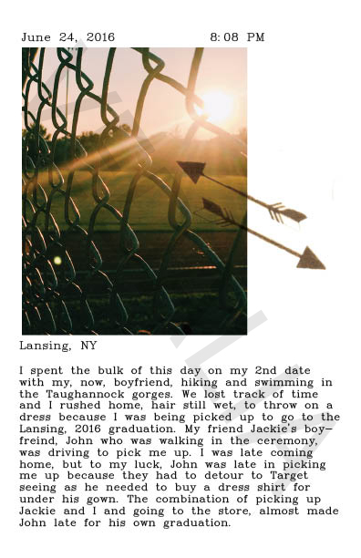
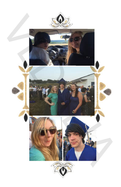
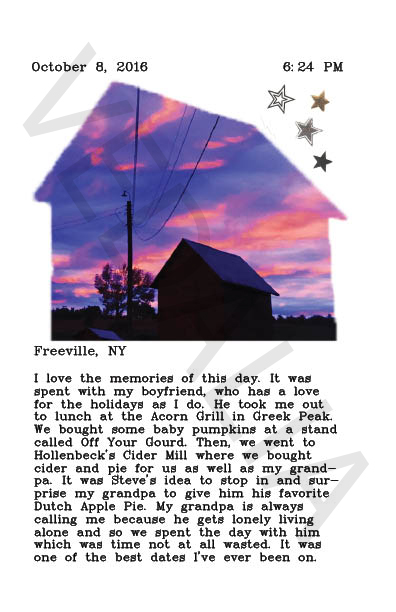
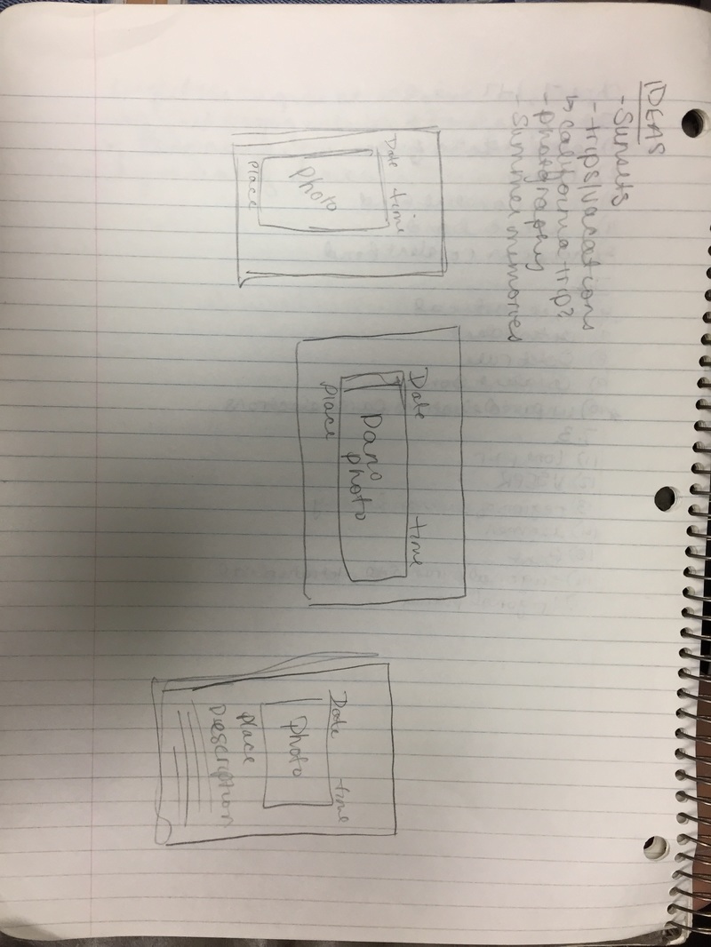
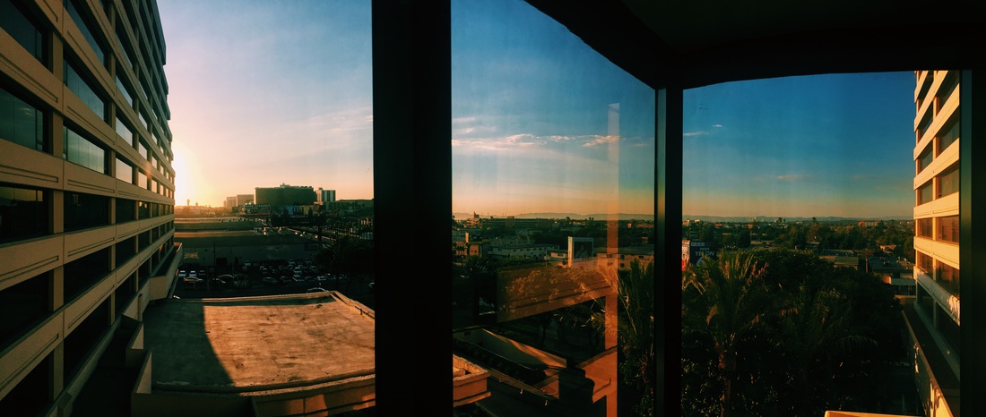
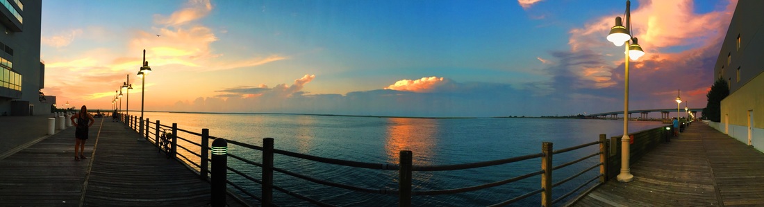
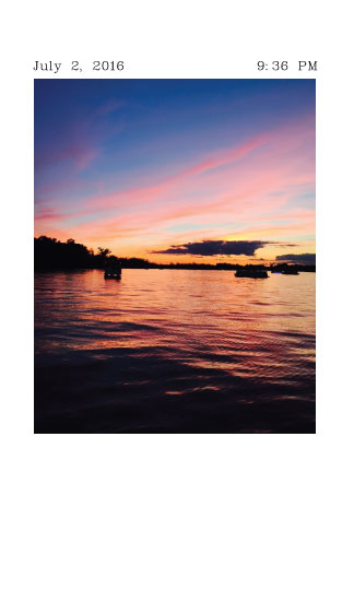
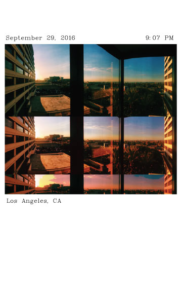
Process: To brainstorm and ultimately find a theme, I began by looking through the photos I have taken on my phone and wrote down ideas as they came to me. Then I developed a basic idea of what I would include on each page of the zine and sketched different ways they could look once I created them. I narrowed down the photographs that I would like to include in the zine and started there. I faced some roadblocks along the way with page placement because I wanted my zine to be put in chronological order by the date the photos were taken, but I planned on putting one specific panorama photograph on the 4-5 full page, so I had to make sure I included just the right amount of photos from dates before and after that panorama.
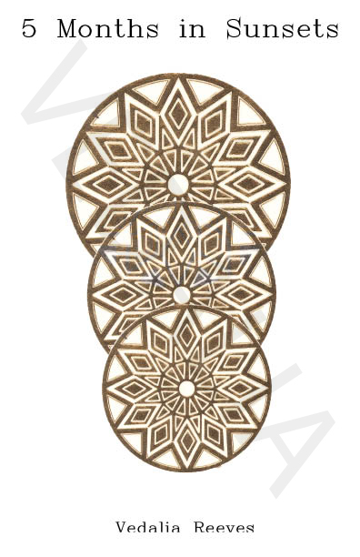
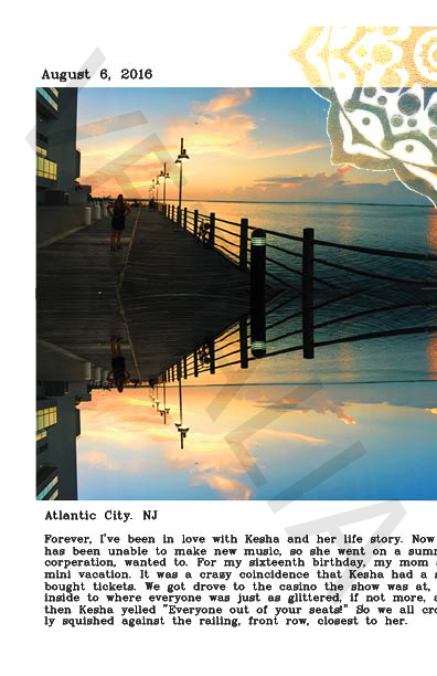
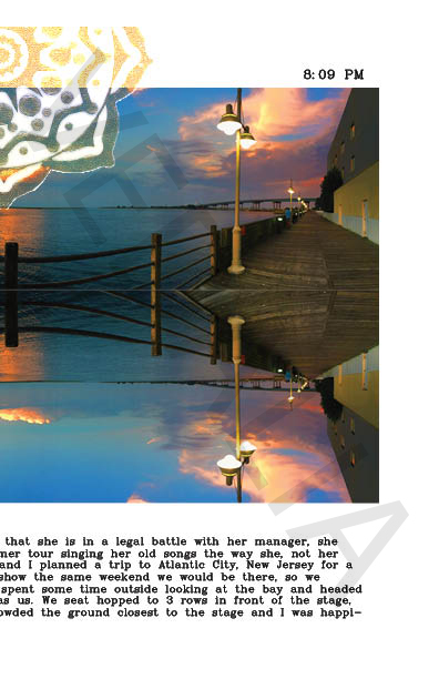
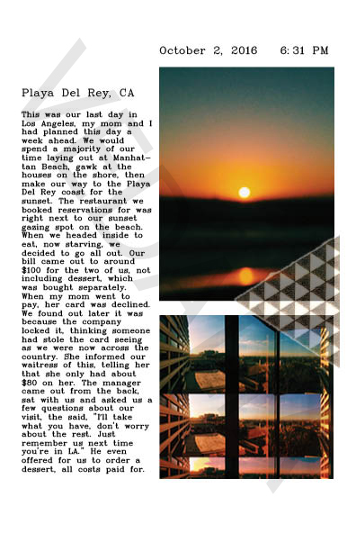
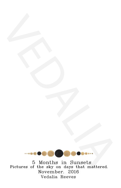
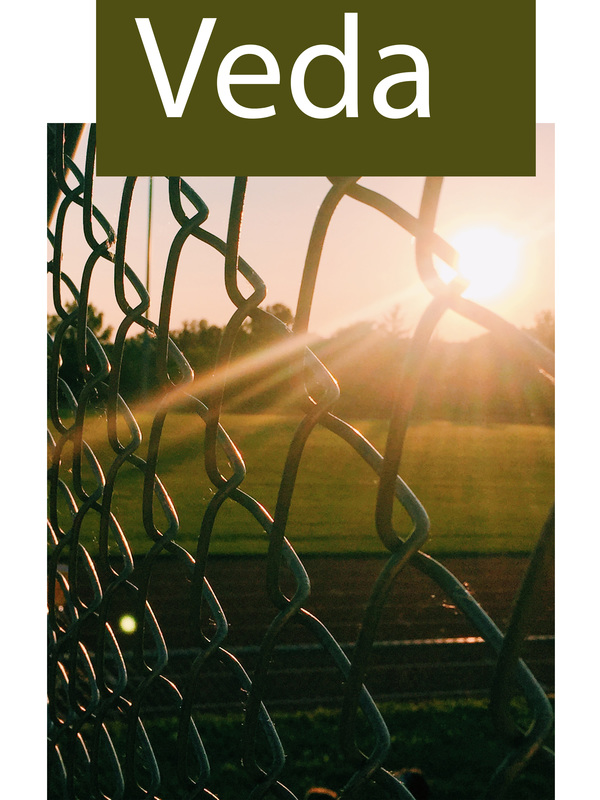
Reflection: Selecting a theme for my zine was one of the most difficult aspects to the project. Because it had such open ended criteria, tons of ideas raced through my mind and I honestly wanted to do them all. However, most of my ideas had overlap such as photography of sunsets, and vacations. So, combining a couple themes seemed to make the most sense. I ended up with the theme, the last 5 months in sunsets, where I’d have the picture of the sunset, date, time, and location, and write a little journal entry about that specific day. Although the open endedness caused me to struggle at first a bit with sticking to one specific theme, that broad freedom to choose what we were passionate about for the project was the part of the project that I liked the most because it gave me intrinsic motivation to put effort into the zine. There were very few requirements which allowed us to branch out into our different zones and as a result, nobodies zine in class was remotely the same. Through our different themes and processes, each person was individually able to show their personality through the pieces in the book. Throughout my zine, I attempted to utilize the graphic design principles wherever I could. Framal reference is the used on the title page with the 3 gold tattoos that roughly represent a sunset by their continuous overlapping descension and the fact that they’re getting smaller as they get lower on the page. On every page of the zine, I added a gold tattoo to further unify the pages. On the majority of the pages I overlapped the tattoos with the photographs and played with overlay edits so they weren't all the same on each page. As a designer, this project greatly increased my ability as well as comfort with the computer programs Indesign and Photoshop. At first, I had great difficulty finding my way around editing photos, selecting tattoos, cropping, and virtually most of the tools necessary to make my project visually appealing. After much practice and tons of help from Ms. Stratton, I now feel as though I have a largely better grasp at techniques and tools used through the programs, as well as problem solving |
AuthorWrite something about yourself. No need to be fancy, just an overview. Archives
May 2017
Categories |

 RSS Feed
