Process:
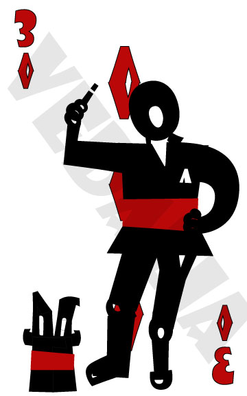
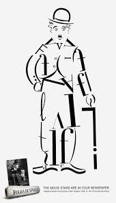
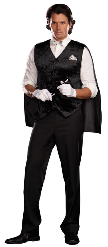
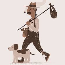
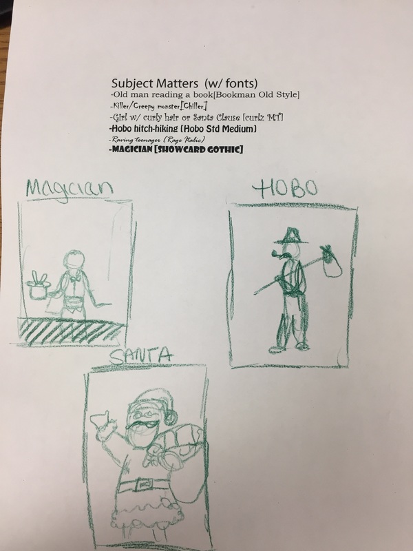
First, I did some visual research of previously created font bots by searching "font bot" on google images. Then, I typed a brainstorm list with pairing fonts and subject matter themes on Illustrator. Then I sketched out some of my favorite ideas I had. When I finally decided on a magician to pair with the font "Showcard Gothic" I took a picture fo my friend in the same pose I wanted my figure in and began working on the final piece. Questions: How did you decide on the theme of your Font Bot? What visual characteristics does your FontBot have that support that theme? What Illustrator tools were most useful to you? Explain. To decide on my theme, I scrolled through the fonts available and paired them with possible themes according to their visual quality but mostly with the names of the fonts. I came upon Showcard Gothic and immediately thought of a magician because of card tricks and when they say “show me your card” hence, Show-Card. I also had the idea to do a hobo with Hobo Std Medium. Because I thought it would be fun to try and create a prop to go with my figure, I chose to do the Magician because I liked the idea of creating a bunny coming out of a hat. To successfully portray a magician, I decided upon the color scheme of mostly black with accents of red because those are the colors of traditional playing cards as well as the colors I believe are most associated with magicians in their clothing and props. Therefore, my figure is wearing a black penguin tux with a red sash and his hat has accents of red as well. I also added in props such as the bunny popping out of the hat and the wand in his hand to go along with the magician theme. I specifically used the Q to create his head and hair because one of my photo references that gave me ideas upon what a magician looks like showed a man with long slicked back hair, and the Q’s tail created that hair. Lastly, the background of the piece is a card, the three of diamonds, because my lucky number is 3 and when I attempted to create all of the different symbols, the diamond came out the best, in my opinion. The illustrator tools which were most useful to me was what allowed me to flip and rotate the letters. Because we were unable to stretch or distort the letters, we had to become creative in which letters to use and where. I ended up flipping many in order for them to fit in places that others did not. Also, I merged the diamond which I had to repeat 5 times identically in the background which made it so I did not have to create a new diamond every time, I could just copy and paste the shape, which cut down my time greatly.
1 Comment
8/10/2022 12:07:03 pm
Süper içerik. Kemer transfer: https://www.alanyagroup.com/kemer-airport-transfer/ Leave a Reply. |
AuthorWrite something about yourself. No need to be fancy, just an overview. Archives
May 2017
Categories |
 RSS Feed
