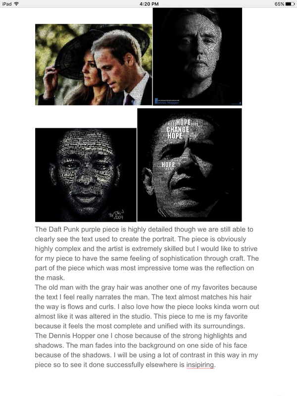
|
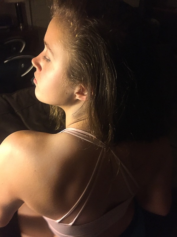
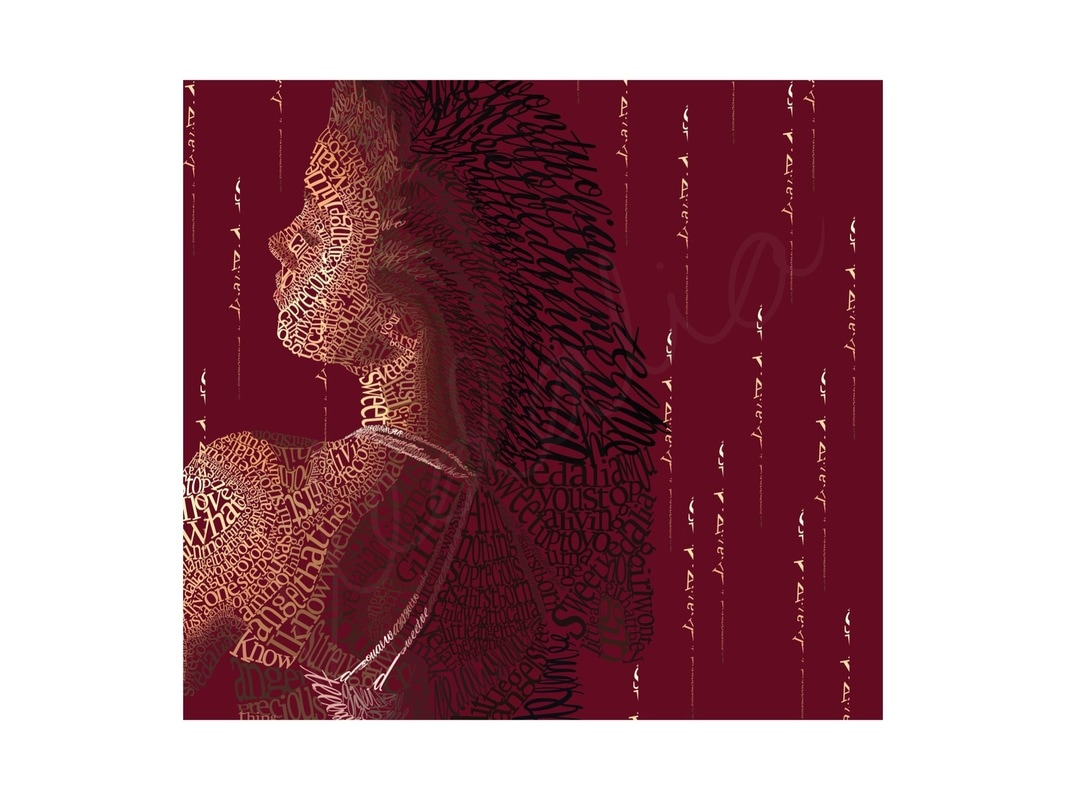
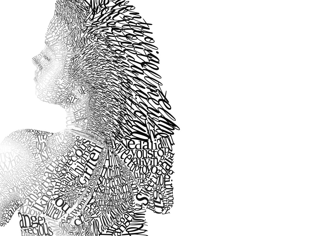
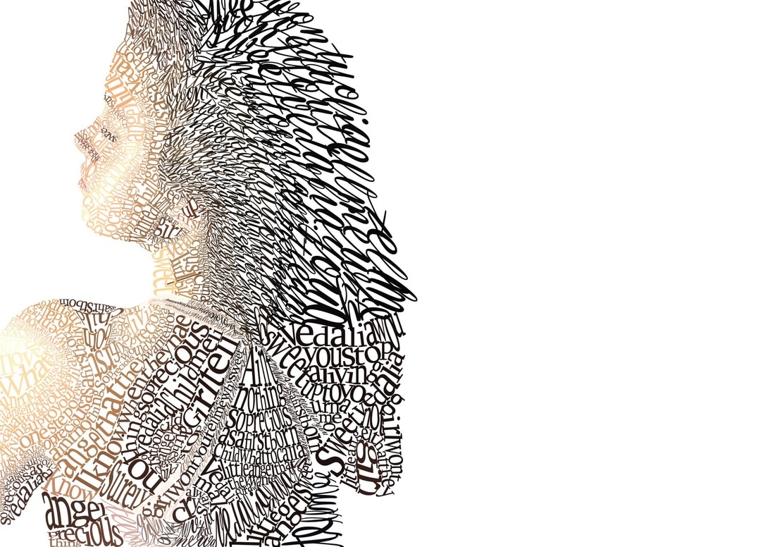
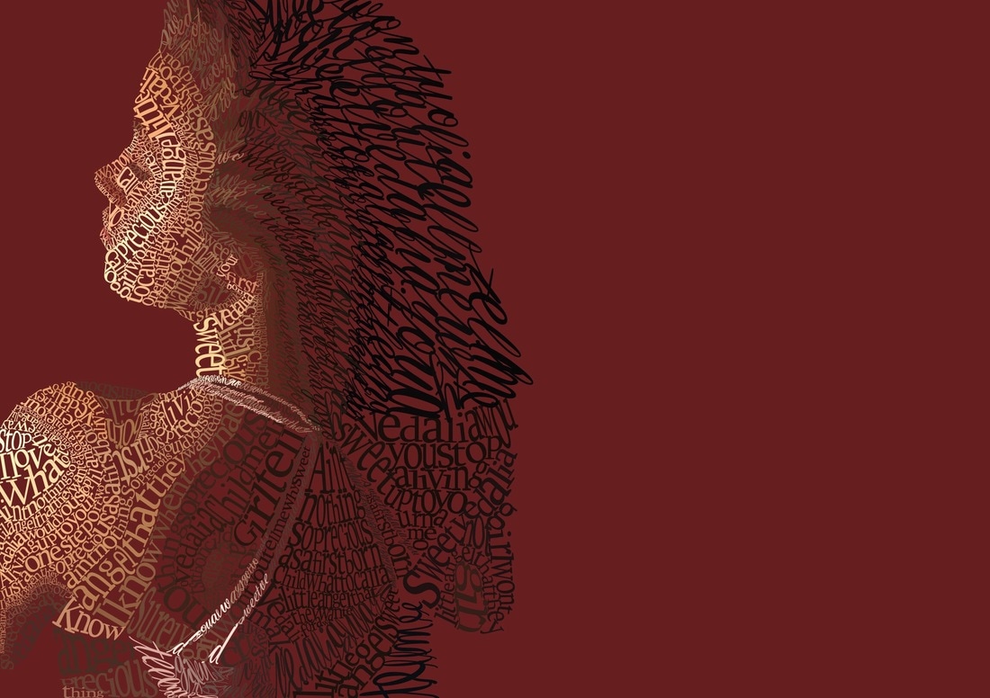
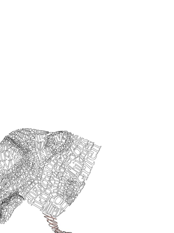
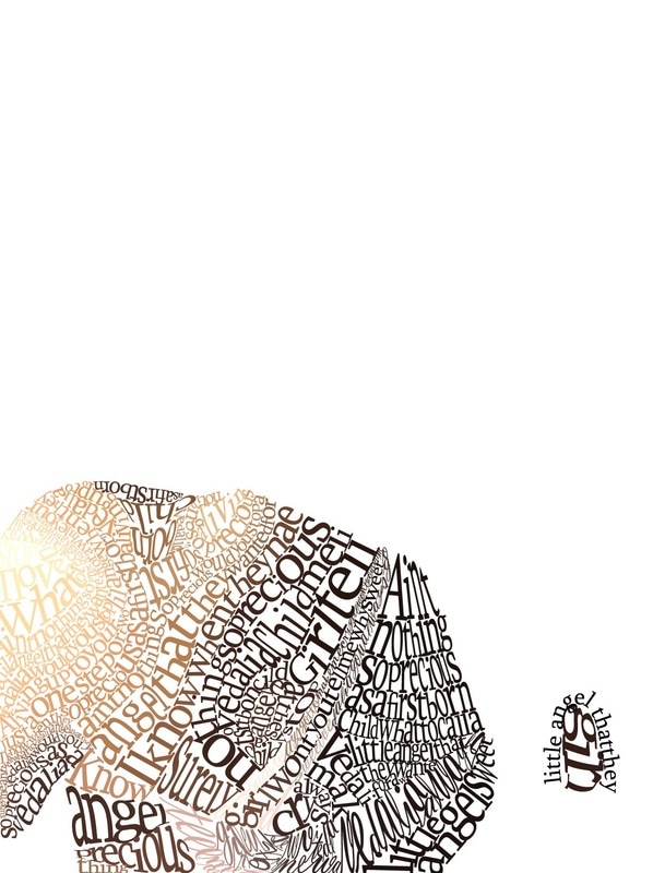
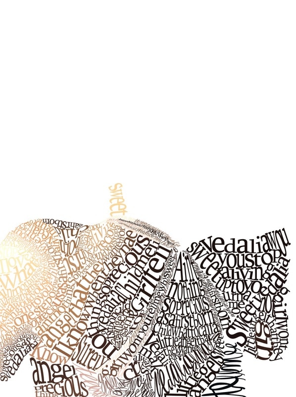
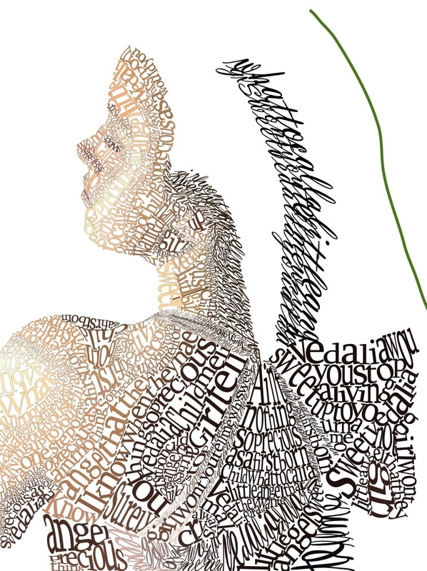
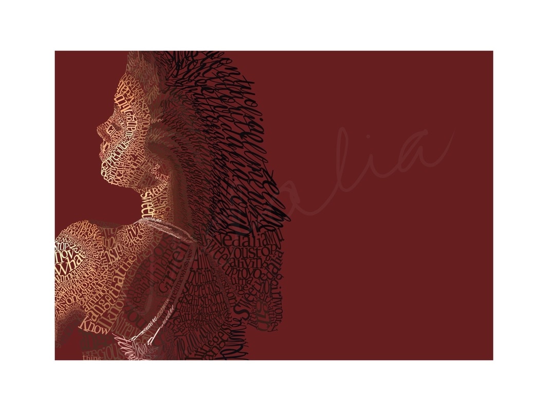
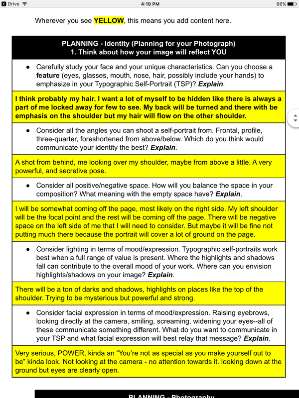
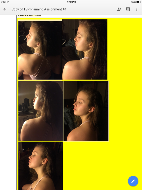
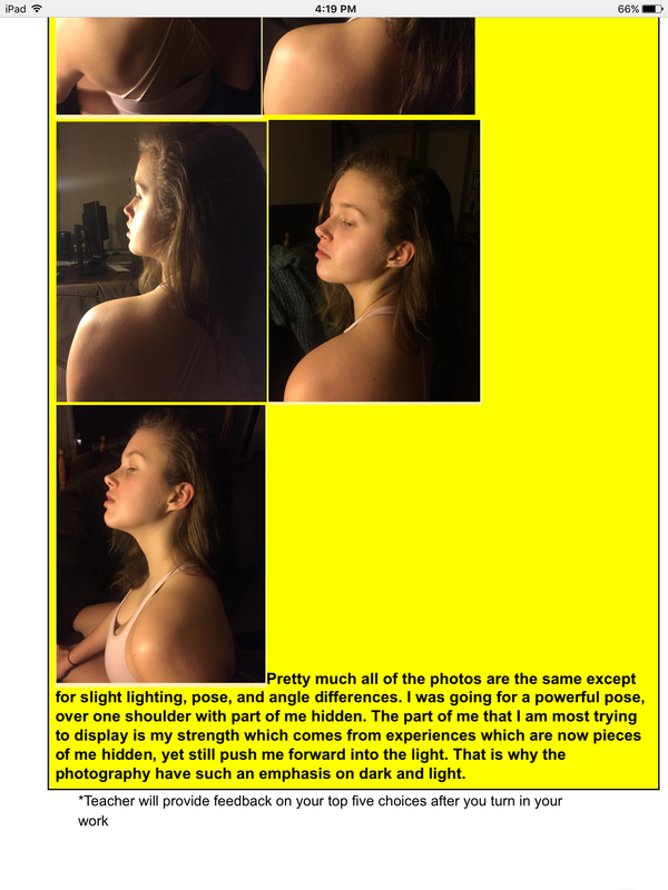
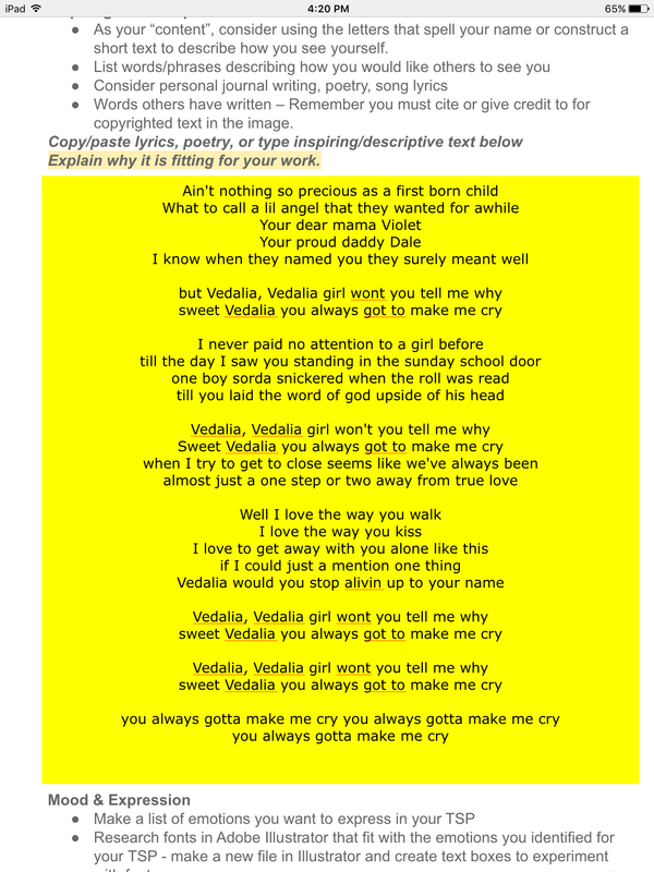
For this piece, I wanted to convey myself in a contrasting way. I planned on contradicting myself in many different ways such as in the photo I chose to create my piece around. The photograph I chose out of all of the photos I took for the project initially because I was drawn to the high contrast of dark and light on my body and the slightly overtop camera angle. The fact that it was not just my face was another reason I chose it because I was looking for a complete picture of me to create. In actuality, more of my face and my front was hidden because my back is to the camera. I liked this aspect because it felt as if some part of me was hidden, and it made the photo that more intriguing to me. I initially was drawn to three different fonts which I felt portrayed different emotions. I definitely wanted to use vladimir script because it was a very feminine and beautiful font to me. I wanted to use that font for only the specific lyrics, “Sweet Vedalia, girl won’t you tell me why you always got to make me cry” because it was a “sweet” font to me. I chose to use this font and lyrics only on the bra and the hair parts of the photograph. The second font I chose, Syfaken, was more clean and I saw as representing power. I used this for the rest of the portrait and found it to be substantially easier to work with. I used harsher quotes for this font such as, “Vedalia would you stop aliving up to your name”. For the portrait, I eyedropped all of the realistic colors from the photograph. The only additional color I used was the pink in the background which I thought brought out the portrait well, matched the pink in my bra, and fit with the term “Sweet Vedalia”.
To achieve texture in my project I used type on a path, especially in long continuous pieces of color like in the shoulder blade. My hair texture was due to the font that I used. I actually think that the font might have made my hair look too curly, but what is successful is that it looks like hair. In places that needed more form like the top of the shoulder and the face. It was more effective in making the text more rounded to fit the body parts. In terms of value, my there is a large range due to the photo that I chose. There are extreme lights in on the left side which is also where my face is towards. And on the right side, covering a majority of my back are very dark values. I liked this extreme contrast that I accomplished by using the actual colors in the photograph. Compositionally, I placed myself on the far left side of the page, which created more negative space in the back of me.The amount of space around me representative of something bigger than me even though all of the text is celebrating me and highlighting my importance to the people in my life -- Its contradicting which is something that I tried to do in much of my piece (contradict myself). In the negative space I placed “daggers” made out of a rough edge I cleaned up off of my left arm. They were in contrast to the “Sweet Vedalia” theme, and were visually pleasing to me. At first creating the piece was harder and took more time because of my unfamiliarity with the tools like type on a path and especially envelope distort, but it got easier to do things quickly as time went on and with more practice. I thought I would not finish in time for the deadline but when time became limited I set daily goals for myself in class and even if they were not completely accomplished each day it made me work faster towards a goal and I owe my finishing on time to this motivation. Also because of this, I didn’t have to spend any time outside of class creating the actual project. I did plan outside of class gathering visual research, photographs, and brainstorming the composition. Creating the piece, I used a lot of type on a path and spent time fitting each letter into its perfect space which was time consuming and not even necessary. I continued to do a lot of that but spent less time fine tuning each individual letter. With bigger spaces envelope distort made things easier. It took some time however trying to make the words fit through trial and error, but mapping out the spaces needed to be filled ahead of time made things go by faster. After this project, I am much more confident in using illustrator. In addition, I feel that I learned perseverance as during points didn't think i would finish at all, but I stuck with it and ended up with a piece I am very proud of. One aspect of the art which was a challenge was displaying the dark spaces on my back and my hair. Although I wanted the contrast of values, the dark was hard to compose as there were no variety in darks just huge black spaces which were difficult to communicate with text. Overall, I feel very accomplished after finishing this portrait. I feel that the contradictory pieces are representative of me as person -- complicated and not just one thing. I feel that was communicated successfully through this art.
0 Comments
|
AuthorWrite something about yourself. No need to be fancy, just an overview. Archives
May 2017
Categories |
 RSS Feed
