|
Henna: 3 hours
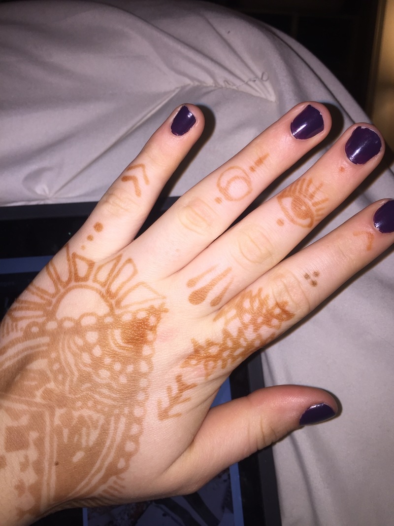
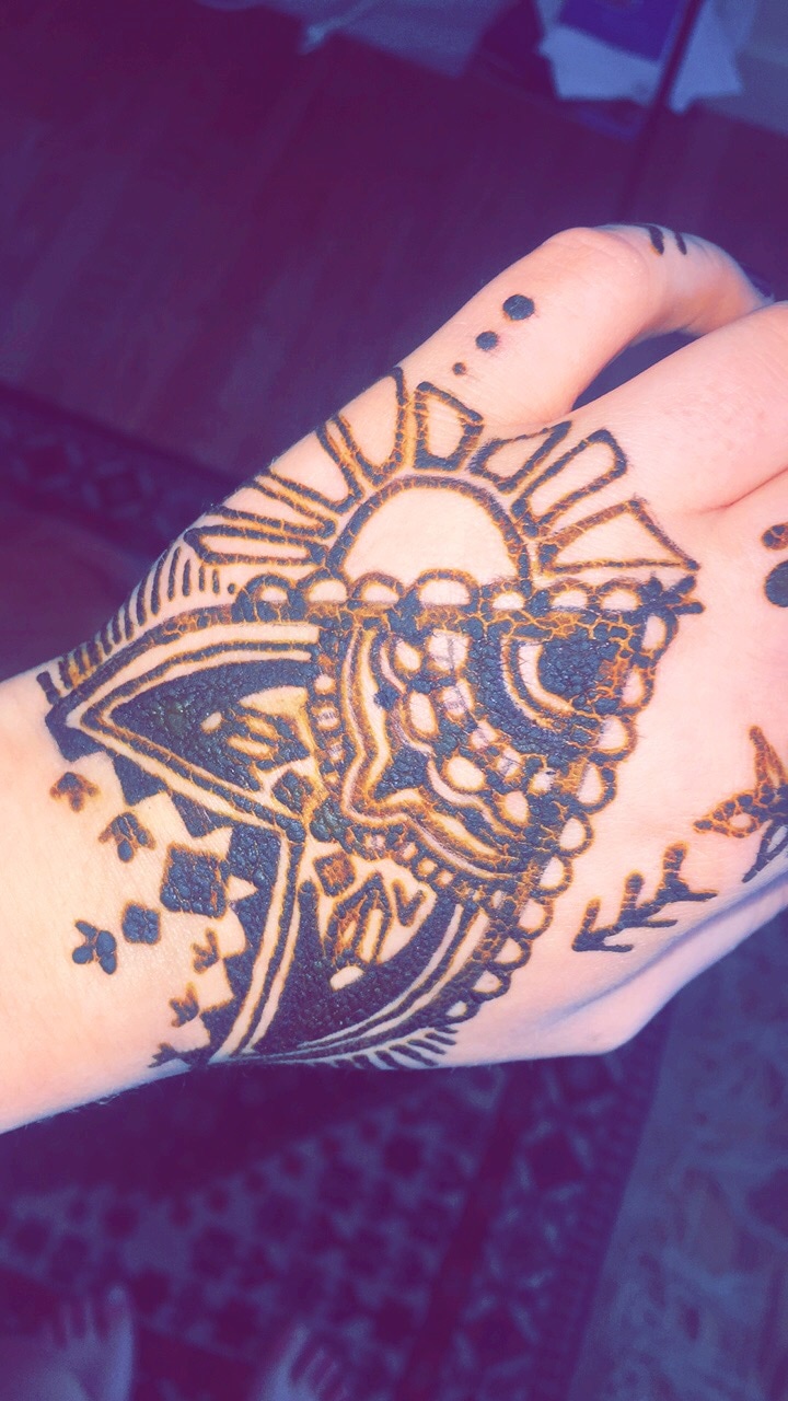
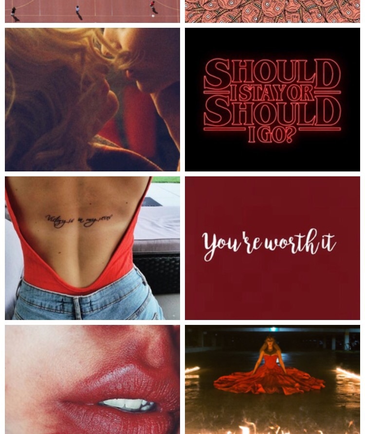
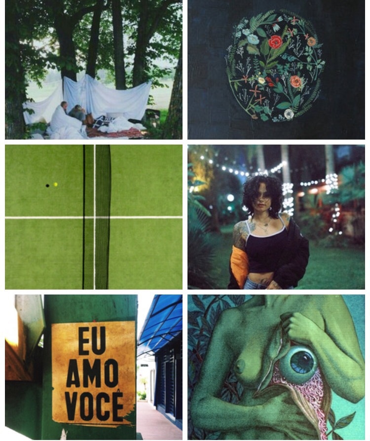
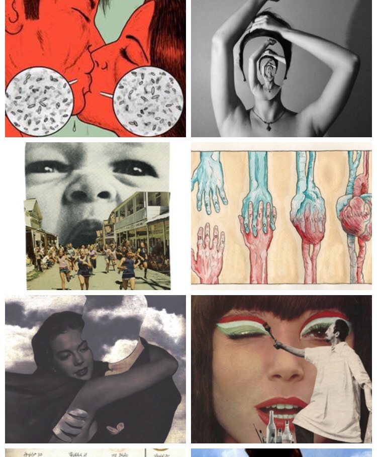
Inspiration boards: 3 hours I have an at home henna kit which I broke out during this week. I looked up henna designs and picked out pieces from some of them and some designs were my own like the sun on the left side of my hand. It wasn't as successful as I would've liked it to be. I didn't know that the henna would expand when it was on your hand so you can't out lines too close together or they would blend. I would like to do it again knowing what I do now. I spent a ton of time creating these by-color inspiration boards on an app called Weheartit. I took a small screen shot of the red and green boards as well as the art board that I created. I have one for almost every color and they're very fun to do.
0 Comments
Photography: 2 hours
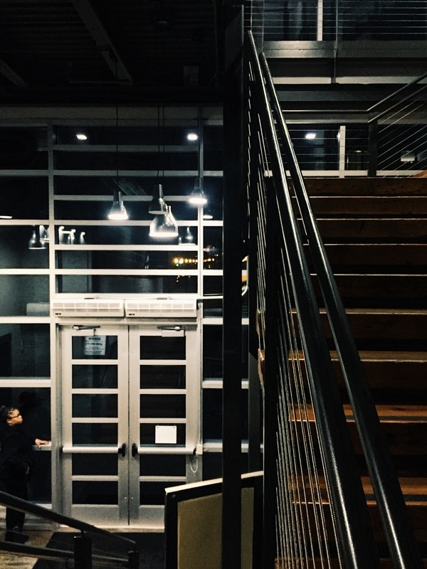
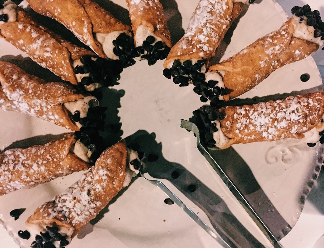
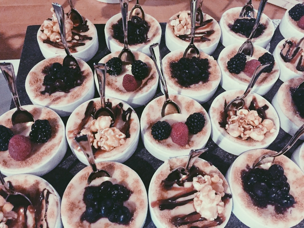
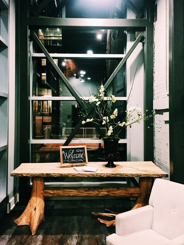
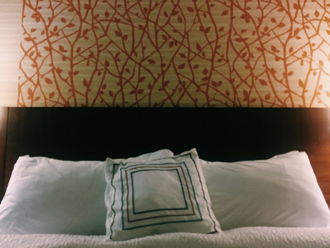
Shopping 30 mins I took these various photos some at the SCAD information session on Thursday like of the architecture as well as the food. The last photo was a picture of our hotel bed in Rochester for a volleyball tournament. I really like the photos of the building we were at in Syracuse especially the one of the front welcome area. I edited these in VSCO. I bought some glitter for my sweetheart project in a dark pinkish red but I realize now that it is holographic so I might have to go buy more. I have a ton of glitter already I'm just scared of running out and not being able to find the same exact color. Research: 2 hours
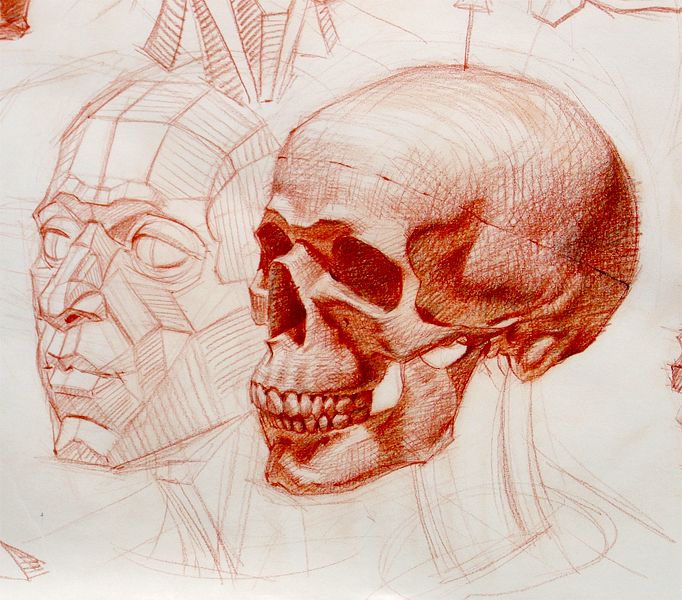
I spent time looking over what a "normal" or traditional conversation heart consists of. The usual colors and letter details that I will follow when completing this project. So far I am not too invested in what I have come up with. I think I need a better technique of actually creating the hearts. So far I am not to passionate about the ideas that I have. I starting thinking about creating a new observation piece of a skeleton for NYSATA using cross hatching. I might start on this and put the conversation hearts on a back burner. I really just want to create again. I am thinking about doing a skeleton jaw and incorporating words into the cross hatches. I think tomorrow when I get back to school I will get a skull and begin outlining it. I really like the red pen theme. 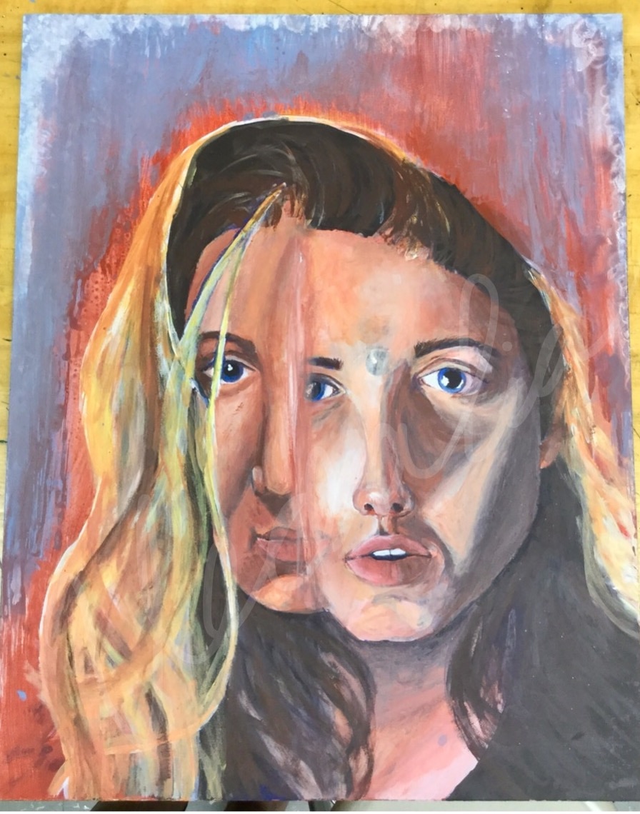 What was your inspiration for creating this artwork?
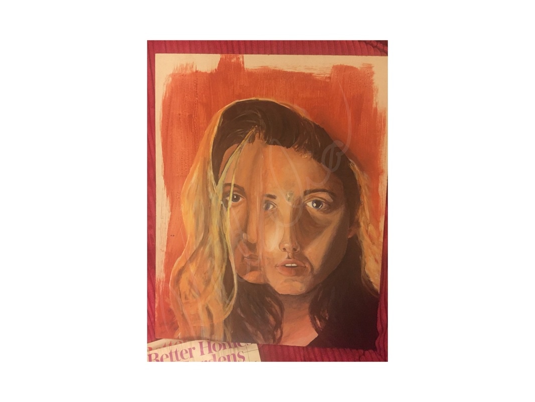
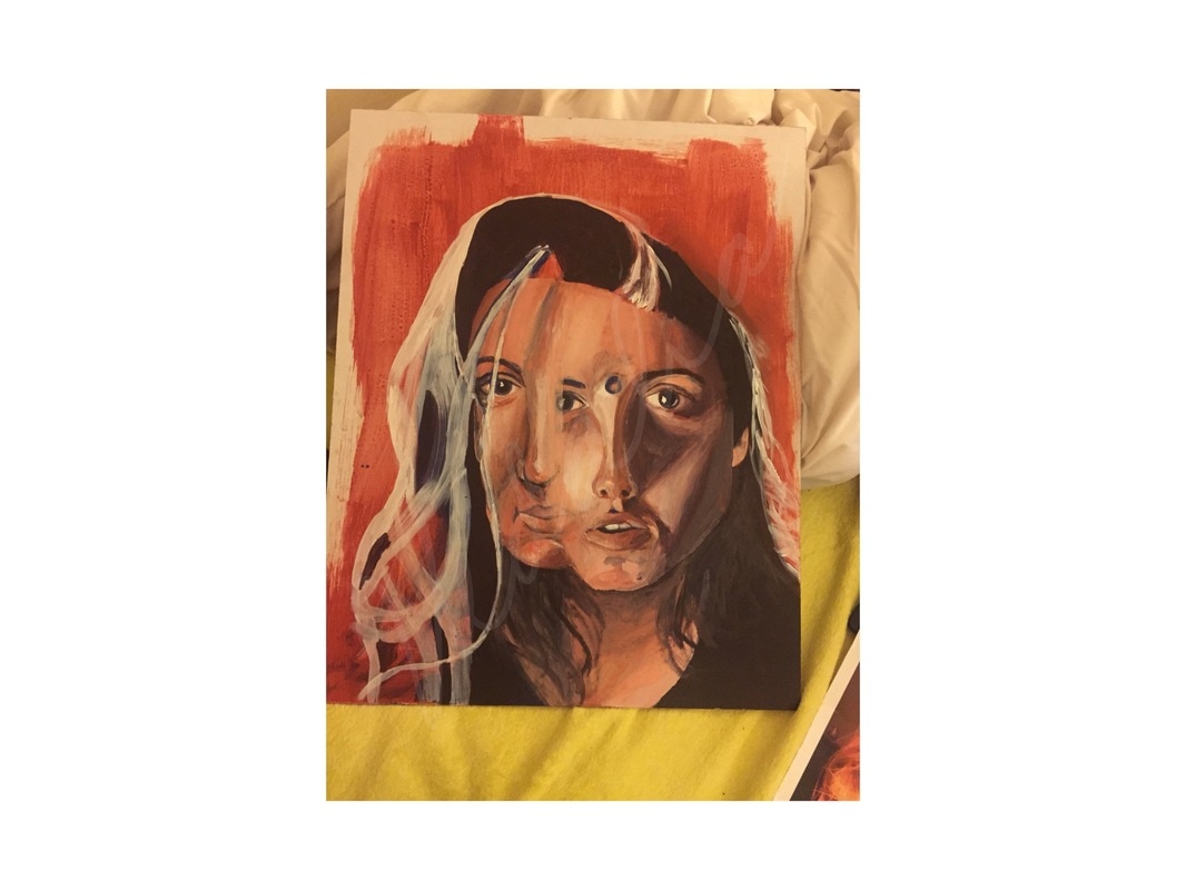
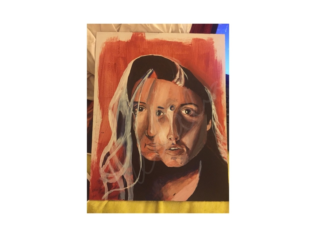
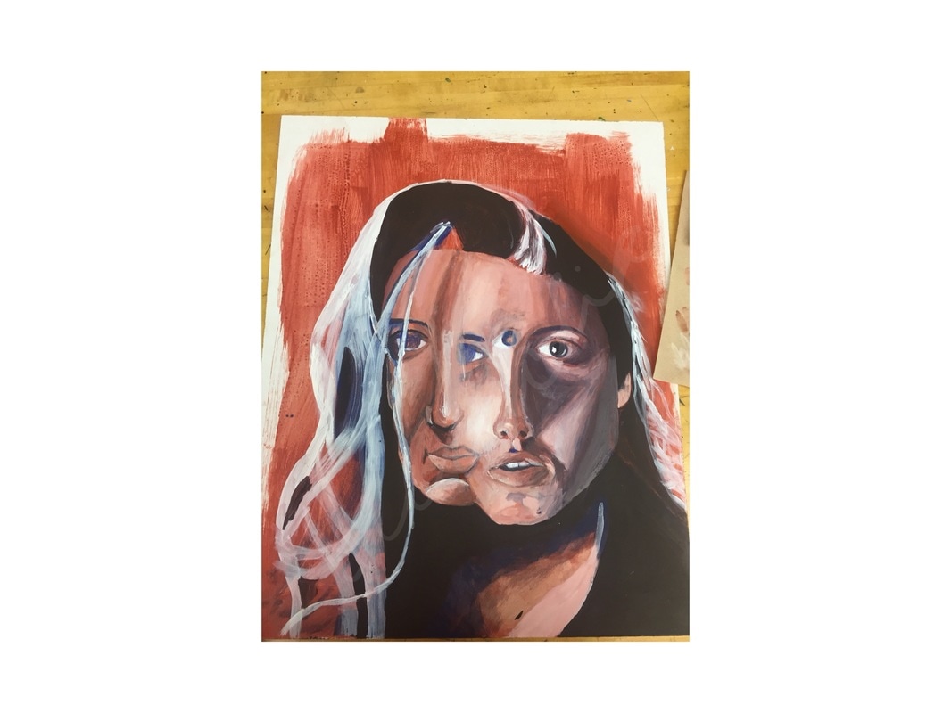
Which are the most successful aspects of your work? Is there anything about your work that you now think you should have done differently? If so, please explain what and why. My mother is the most important person in my life and I had already planned on doing a portrait piece of her so when I heard about this project I thought it was a good idea to incorporate her. I first planned on the piece being just of her but then I had the idea to also add me to demonstrate the bond we have. I had a couple of ideas, only knowing that I would want to include half of both of our faces. I ended up merging our faces together, demonstrating the idea that she is me and I am her. Also, I made part of our faces transparent where they meshed so some parts of her face were visible in my face and that worked out well with her eye in the center of my forehead which portrays the idea that she is my third eye, my intuition, and my guiding force. The background mix of blue and red also defines us as individuals coming together as her favorite color is blue and I identify with the color red. On top of that, I fingerprinted around the edges of the piece in the wet paint which adds a personal aspect even further. I think my technique with layering the paint was fairly successful because the dark values of the shadows and the light of the highlights created great form in the faces. They seemed to pop off the page especially on the right hand side of my face with the large shadow of my nose. I feel that I was able to follow the colors and shadows shown in the reference photos quite well. The underpainting technique was what took most of my time but it helped tremendously. I actually favored the aesthetic of the paint strokes in the underpainting over the cleaned up version of the finished product. However, the underpainting colors were not realistic enough to stand alone in this piece. I also think that my risk of forming the two faces together was successful. I love how some of the faces are transparent are you are able to see pieces of each face in the other. When I was in the process of mapping out the portrait by removing the red oxide paint to form the highlights in the faces, I don’t believe I paid enough attention to space and proportion. Because of this, and because I didn’t realize it until I had done enough work to fix it, The faces we a bit unproportional to the ones in the reference photos. Because I did notice this however, I was able to keep that into consideration and elongate all of the features so that the portrait in the piece was proportional to itself, though it wasn't fully accurate. I also think that more detail could have been added to the facial features such as the eyebrows, eyes, and mouths so that they were more realistic as well. |
 RSS Feed
